
BiostatLEARN
Simple and clear explanations of biostatistics methods, statistical concepts and more!
I try to keep them maths-free and straight to the point, with many examples of biological applications.
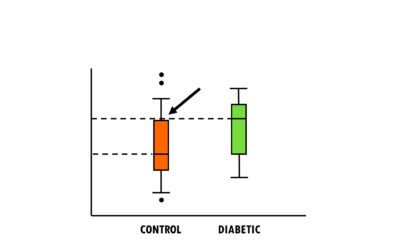
How to interpret boxplots and violin plots
Main concepts behind boxplots and violin plots and how to interpret them.
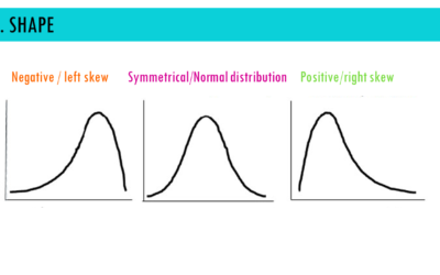
How to interpret density plots
How to interpret density plots in six steps: shape, central tendency, variability, tails, area under the curve and comparison.

Logistic regression – easily explained!
An simple explanation of logistic regression – easily explained with an example!

Top bioinformatic tools and resources
Top bioinformatics tools and resources for all levels! Check out my updated list!
Easy Cox regression for survival analysis
Follow this easy Cox regression for survival analysis explanation with an example: how to interpret hazard ratios, coefficients, and more!
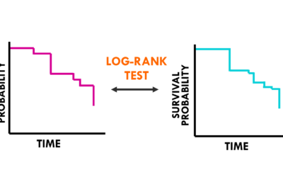
Easy log rank test for survival analysis
A simple explanation of the log rank test to evaluate differences between survival curves – easily explained with an exampl
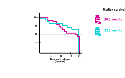
Kaplan-Meier curve – easily explained!
Simple explanation of survival analysis curves and how to interpret them. We will go through the main concepts of the Kaplan-Meier curve, easily explained!
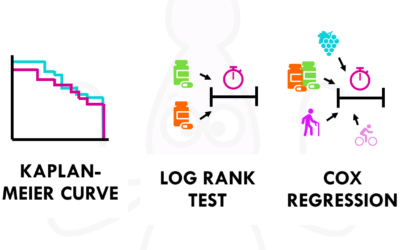
Survival time analysis: easily explained!
Easy introduction into time-to-event analysis, Kaplan-Meier curves, Cox regression and more! A brief and simple explanation of survival time analysis.

Easy confidence intervals and p-values
An easy and intuitive explanation of p-values and confidence intervals (CI) with an example.. or should I say, a squidsample!
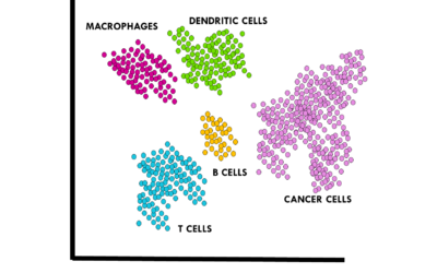
Cell type annotation for scRNAseq
In this post, I will discuss some common methods to perform cell type annotations on scRNA-seq data and I will also share some tips and tricks I use!