
BiostatLEARN
Simple and clear explanations of biostatistics methods, statistical concepts and more!
I try to keep them maths-free and straight to the point, with many examples of biological applications.
Latest posts
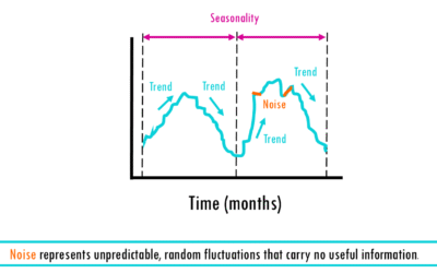
Time series analysis: easy explanation with examples
Introduction to time series forecastingFrom predicting a crash in the stock market, to estimating the temperature and wether you'll need an umbrella tomorrow - time series analysis is everywhere! In this blogpost, we’ll cover what a time series is, why order matters...
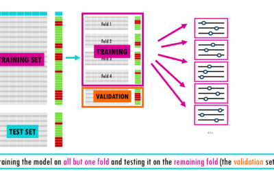
Types of Cross-Validation in Machine Learning
From a simple train-test split to stratified nested cross-validation!Imagine studying for a final exam by memorizing the exact answers to a practice test. You might feel like a genius while grading yourself, but if the actual exam asks the same questions in a slightly...
Comparing Gene Expression Across Integrated Single-Cell Datasets: NormalizeData(), SCTransform()
One of the most common questions in single-cell RNA sequencing analysis is deceptively straightforward: how many cells express a given gene, and are the expression levels truly comparable across datasets? If you have ever stared at your results wondering whether your...
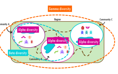
Beta diversity: Jaccard, Bray-Curtis, NMDS, PCoA and PERMANOVA
How different are communities from each other? Beta diversity easily explained!If you’ve ever hiked from a dense forest into an open grassland, you’ve probably noticed how dramatically the plants, insects, and animals can change within just a few miles. This variation...
Hill numbers and diversity profiles simply explained
Exploring Hill numbers to compare the diversity across communitiesWhether you are analyzing a rainforest ecosystem, a human gut microbiome, or a B-cell receptor (BCR) repertoire, the fundamental challenge is the same: How do we accurately measure the diversity within...
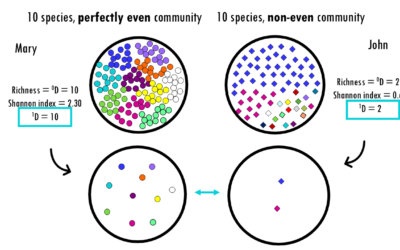
Diversity metrics simply explained: Shannon, Simpson, Chao1
Exploring alpha diversity indices and how to interpret them: Shannon, Simpson, Gini, Chao1 and more!Whether you are analyzing a rainforest ecosystem, a human gut microbiome, or a B-cell receptor (BCR) repertoire, the fundamental challenge is the same: How do we...
scRNAseq
Statistics and machine learning
RNAseq
Comparing Gene Expression Across Integrated Single-Cell Datasets: NormalizeData(), SCTransform()
One of the most common questions in single-cell RNA sequencing analysis is deceptively straightforward: how many cells express a given gene, and are the expression levels truly comparable across datasets? If you have ever stared at your results wondering whether your...
Which is the best scRNAseq integration method?
Comparing top integration methods for scRNAseq dataWhen we want to combine multiple scRNA-seq datasets to answer bigger questions, we encounter batch effects - unwanted technical variations that arise from differences in how the experiments were performed. These batch...
Integration methods in scRNAseq: easily explained!
An overview of the most popular integration methods for single-cell dataSingle-cell RNA sequencing (scRNA-seq) has revolutionized our understanding of biology by allowing us to measure gene expression in individual cells rather than bulk tissue samples. This...
MSigDB gene sets: easy msigdbr in R
MSigDB gene sets: easy msigdbr in R MSigDB gene sets: easy msigdbr in R Welcome to this comprehensive guide on MSigDB (Molecular Signatures Database) and the msigdbr R package! If you’ve ever wondered which gene sets to use for your pathway enrichment analysis, or...
Pathway Enrichment Analysis with clusterProfiler (old version)
Hey! You're looking at an old post. Newer version here: clusterProfiler tutorial in RR TUTORIAL: Perform pathway enrichment analysis with clusterProfiler() in RBefore you start...Welcome to Biostatsquid's easy and step-by-step tutorial on ClusterProfiler! In this...
Understanding Seurat objects – simply explained!
Understanding the structure of Seurat objects version 5 - step-by-step simple explanation!If you've worked with single-cell RNAseq data, you've probably heard about Seurat. In this blogpost, we'll cover the the Seurat object structure,in particular the new Seurat...
SCTransform – simple and intuitive explanation
SCTransform (Single-Cell Transform) is a normalization method primarily used in scRNA-seq data analysis. It was developed to address limitations in standard normalization approaches when dealing with single-cell data. You can check how to apply SCTransform on your...
PCA vs UMAP vs t-SNE
Understanding similarities and differences between dimensionality reduction algorithms: PCA, t-SNE and UMAPPCA, t-SNE, UMAP... you've probably heard about all these dimensionality reduction methods. In this series of blogposts, we'll cover the similarities and...
Easy UMAP – explained with an example
A short but simple explanation of UMAP- easily explained with an example!PCA, t-SNE, UMAP... you've probably heard about all these dimensionality reduction methods. In this series of blogposts, we'll cover the similarities and differences between them, easily...
Easy t-SNE – explained with an example
A short but simple explanation of t-SNE - easily explained with an example!PCA, t-SNE, UMAP... you've probably heard about all these dimensionality reduction methods. In this series of blogposts, we'll cover the similarities and differences between them, easily...
Time series analysis: easy explanation with examples
Introduction to time series forecastingFrom predicting a crash in the stock market, to estimating the temperature and wether you'll need an umbrella tomorrow - time series analysis is everywhere! In this blogpost, we’ll cover what a time series is, why order matters...
Types of Cross-Validation in Machine Learning
From a simple train-test split to stratified nested cross-validation!Imagine studying for a final exam by memorizing the exact answers to a practice test. You might feel like a genius while grading yourself, but if the actual exam asks the same questions in a slightly...
Beta diversity: Jaccard, Bray-Curtis, NMDS, PCoA and PERMANOVA
How different are communities from each other? Beta diversity easily explained!If you’ve ever hiked from a dense forest into an open grassland, you’ve probably noticed how dramatically the plants, insects, and animals can change within just a few miles. This variation...
Hill numbers and diversity profiles simply explained
Exploring Hill numbers to compare the diversity across communitiesWhether you are analyzing a rainforest ecosystem, a human gut microbiome, or a B-cell receptor (BCR) repertoire, the fundamental challenge is the same: How do we accurately measure the diversity within...
Diversity metrics simply explained: Shannon, Simpson, Chao1
Exploring alpha diversity indices and how to interpret them: Shannon, Simpson, Gini, Chao1 and more!Whether you are analyzing a rainforest ecosystem, a human gut microbiome, or a B-cell receptor (BCR) repertoire, the fundamental challenge is the same: How do we...
How to interpret MA plots
How to interpret MA plots How to interpret MA plots In this blogpost, we will go over the basics of an MA plot which is a very useful visualisation for genomics and transcriptomics data. We will go over the basics of MA plots and how to interpret them. This is the...
ANOVA (analysis of variance) easily explained
How to interpret ANOVA (analysis of variance) easily explained!When you're working with data and want to determine whether different groups have significantly different averages, simply eyeballing the numbers won’t cut it. That’s where ANOVA (Analysis of Variance)...
How to choose log2FC thresholds for DGE analysis
Setting thresholds for differential gene expression (DGE) analysis is crucial and depends on several factors. In essence, for a list of genes, we are trying to define what counts as biologically meaningful versus just statistically significant. The question is... How...
Comparing multiple groups: Kruskal-Wallis test in R
When working with biological data, we often want to compare measurements across multiple groups. However, these measurements aren't always normally distributed. In such cases, non-parametric methods like the Kruskal-Wallis test and Dunn’s post-hoc test are ideal...
SCTransform – simple and intuitive explanation
SCTransform (Single-Cell Transform) is a normalization method primarily used in scRNA-seq data analysis. It was developed to address limitations in standard normalization approaches when dealing with single-cell data. You can check how to apply SCTransform on your...
MSigDB gene sets: easy msigdbr in R
MSigDB gene sets: easy msigdbr in R MSigDB gene sets: easy msigdbr in R Welcome to this comprehensive guide on MSigDB (Molecular Signatures Database) and the msigdbr R package! If you’ve ever wondered which gene sets to use for your pathway enrichment analysis, or...
How to interpret MA plots
How to interpret MA plots How to interpret MA plots In this blogpost, we will go over the basics of an MA plot which is a very useful visualisation for genomics and transcriptomics data. We will go over the basics of MA plots and how to interpret them. This is the...
Pathway Enrichment Analysis with clusterProfiler (old version)
Hey! You're looking at an old post. Newer version here: clusterProfiler tutorial in RR TUTORIAL: Perform pathway enrichment analysis with clusterProfiler() in RBefore you start...Welcome to Biostatsquid's easy and step-by-step tutorial on ClusterProfiler! In this...
Understanding Seurat objects – simply explained!
Understanding the structure of Seurat objects version 5 - step-by-step simple explanation!If you've worked with single-cell RNAseq data, you've probably heard about Seurat. In this blogpost, we'll cover the the Seurat object structure,in particular the new Seurat...
Easy t-SNE – explained with an example
A short but simple explanation of t-SNE - easily explained with an example!PCA, t-SNE, UMAP... you've probably heard about all these dimensionality reduction methods. In this series of blogposts, we'll cover the similarities and differences between them, easily...
Cell type annotation for scRNAseq
Top tips and resources to perform cell type annotation on scRNAseq dataOnce you preprocess your single-cell RNA sequencing (scRNAseq) data, it is time for one of the biggest challenges in a standard scRNAseq pipeline: annotating cell types. The scientific community...
Heatmaps for gene expression analysis – simple explanation with an example
In this post, you will learn how to interpret a heatmap for differential gene expression analysis. Find out why heatmaps are a great way of visualising gene expression data with this simple explanation. Let's dive in!Prefer to listen? Watch my Youtube video on...
Gene Set Enrichment Analysis (GSEA) – simply explained!
What is gene set enrichment analysis and how can you use it to summarise your differential gene expression analysis results?This post will give you a simple and practical explanation of Gene Set Enrichment Analysis, or GSEA for short. You will find out: What is Gene...
Pathway enrichment analysis for DGE – simply explained
An overview of pathway enrichment analysis and how you can use it for your differential gene expression analysis data. In this post, you will find pathway enrichment analysis explained in a simple way with examples. I will try to give you a simple and practical...
How to interpret a volcano plot
What is a volcano plot?Imagine you are carrying out an RNAseq experiment. You have a group of cells A and a group of cells B. Group B was treated with a drug. Now you want to see what effect the drug has in gene expression. Does the drug cause some genes to be...