
A short but simple explanation of density plots – easily explained with an example!
Density plots are a great way to visualise the distribution of continuous variables.
For example, you might want to find out within which range of weights most of your mice fall. Or if there are two main age groups in a population. Or if the expression of a particular gene in a population is higher or lower than another in your sample. Density plots allow you to answer these questions by enabling you to visualise how are your data points distributed.
In this post, you will find out how to interpret a density plot.
So if you are ready… let’s dive in!
Click on the video to follow my easy density plots explanation with an example on Youtube!
6 steps to interpret a density plot
1. SHAPE
First, the shape of the density curve tells you a lot about the distribution of your data. The curve can be:
- symmetric –the data is evenly distributed around the central value, with similar frequencies of observations on both sides.
- skewed – asymmetrical, with a tail extending more to one side than the other. Positive skewness (right-skewed) means the tail extends to the right, while negative skewness (left-skewed) means the tail extends to the left.

A curve can also be unimodal, if it has just one peak, bimodal, if it has two, or multimodal. multiple peaks indicates that the data contains distinct subgroups or clusters.
For example, in our cancer tissue we might have 3 clusters of cells based on TP53 expression. Cells with very little TP53 expression (maybe they have a deletion and lost one of the copies), cells with normal expression, and cells that duplicated their DNA and have an overexpression of TP53.

Squidtip
The shape of a density plot can tell you if the data is evenly distributed around a central value or not, and if there are groups or subclusters.
2. CENTRAL TENDENCY
The central tendency of a distribution is just a fancy way of saying the mode or the most frequent value. And we know already that this is represented by the peak or peaks in our density distribution.

3. VARIABILITY
A density distribution can tell us a lot about the spread or variability of the distribution. For that we must look at the width of the density curve.
- A wider curve indicates greater variability
- A narrower curve suggests less variability.

4. TAILS or OUTLIERS
The tails of the density curve represent the probabilities of extreme values. Longer tails indicate a greater probability of observing extreme values in the dataset, in other words, outliers.
For example, in this curve, there is one or two outliers that are making the curve right skewed, there is a long tail. So maybe we could have a look at those values. Sometimes, it’s a good quality check. For example, we might realise that there are two cells in our dataset that had crazy measurements of TP53 because of a sequencing error – if this is a single-cell experiment, we might be measuring the expression levels of two cells, or doublets, instead of just 1, so we might need to discard these two cells from our analysis.

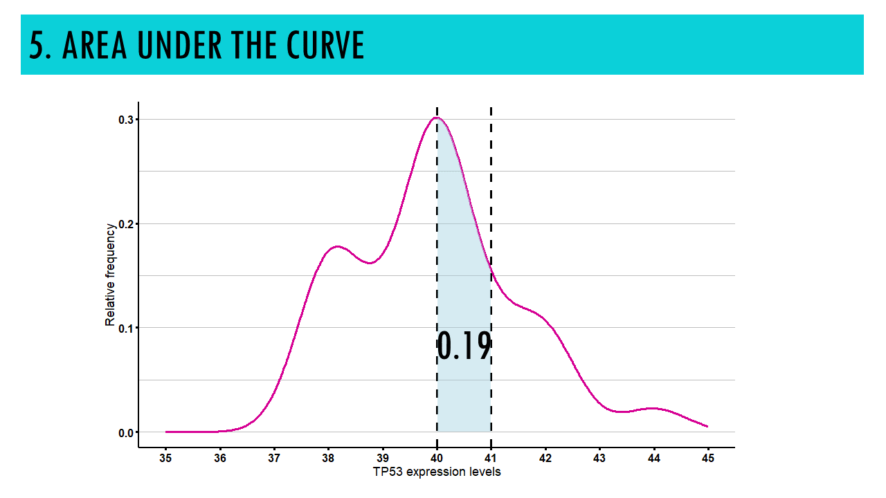
5. AREA UNDER THE CURVE
This is a bit less intuitive, but the area under the curve within a specific interval on the x-axis represents the probability of observing values within that interval.
For example, the probability of observing a TP53 expression value lower than 41 is the area in pink, which is around 70%. The probability of observing a value between 40 and 41 is around 19%. This means that:
- The area under the curve always adds up to 100% (or 1 if we are talking about relative frequencies).
- The curve will never go under the x axis, which makes sense, because frequencies / probabilities can never be under 0.

6. COMPARISON
Density curves can also be used to compare distributions between different groups or conditions. By overlaying multiple density curves on the same plot, you can visually assess differences in shape, central tendency, and variability between groups.
For example, we could compare the expression levels of cells in normal tissue, and cells in cancer.

Final notes on density plots
In summary, density plots are a powerful tool for visualizing the distribution of continuous variables, offering insights into the shape, spread, and central tendency of the data.
If you’d like to see a tutorial on how to create your own density plots in R, leave me a comment below!
Want to know more?
Additional resources
If you would like to know more about density plots, check out:
You might be interested in…
Ending notes
Wohoo! You made it ’til the end!
In this post, I shared some insights on density plots.
Hopefully you found some of my notes and resources useful! Don’t hesitate to leave a comment if there is anything unclear, that you would like explained differently/ further, or if you’re looking for more resources on biostatistics! Your feedback is really appreciated and it helps me create more useful content:)
Before you go, you might want to check:
Squidtastic!
You made it till the end! Hope you found this post useful.
If you have any questions, or if there are any more topics you would like to see here, leave me a comment down below.
Otherwise, have a very nice day and… see you in the next one!
Squids don't care much for coffee,
but Laura loves a hot cup in the morning!

If you like my content, you might consider buying me a coffee.
You can also leave a comment or a 'like' in my posts or Youtube channel, knowing that they're helpful really motivates me to keep going:)
Cheers and have a 'squidtastic' day!
And that is the end of this tutorial!
In this post, I explained the differences between log2FC and p-value, and why in differential gene expression analysis we don't always get both high log2FC and low p-value. Hope you found it useful!
Before you go, you might want to check:
Squidtastic!
You made it till the end! Hope you found this post useful.
If you have any questions, or if there are any more topics you would like to see here, leave me a comment down below.
Otherwise, have a very nice day and... see you in the next one!
