
In this post, you will learn how to interpret a heatmap for differential gene expression analysis. Find out why heatmaps are a great way of visualising gene expression data with this simple explanation.
Let’s dive in!
Prefer to listen? Watch my Youtube video on heatmaps for gene expression analysis by clicking on the video or here.
If you are more of a reader, find out how to interpret heatmaps in the sections below.
What is a heatmap?
A heatmap is just a type of plot. It is just one of the many ways we can visualise data. In the context of gene expression data, it is a great way to display the expression of many genes across many samples. Heatmaps allow us to find and visualise patterns in gene expression data.
A heatmap looks something like this:

In a heatmap, each row usually represents a gene. Each column represents a sample.
What about the colours? The colour and intensity of the tiles or rectangles is used to represent changes (not absolute values) of gene expression. So, basically, instead of numbers, we use colours.
Let’s take a look at an example. Imagine you are comparing samples of cancer tissue and healthy tissue. You get gene expression data for many different genes from both tissues. The differential gene expression analysis results will tell you how much each gene is upregulated, or downregulated in the cancer samples compared to control samples. Our table would look something like this:

Instead of a table full of numbers, we can just convert them to a grid of colours. If our number is negative, we will give it a blue colour. If our number is positive, we will give it a red colour. The colour will be more intense the lower (or higher) the value is. If a gene does not change much between conditions (so it’s differential gene expression is close to 0), we will just give it a white colour.
And voila! We have our beautiful heatmap!
This way, we can easily visualise which genes are mostly upregulated, or downregulated, across samples.

Squidtip
In a heatmap, gene expression values are depicted by colour. This way it is much easier to get a general overview of our gene expression data.
Clustered heatmaps
But, how can we see patterns with so many coloured tiles? The answer is to cluster the tiles. This involves a meaningful reordering of the rows and columns. And this is how we get a clustered heatmap. A clustered heatmaps looks something like this:
Cool right? The dendograms on the sides just indicate the results of clustering both genes and samples.
Clustered heatmaps are just heatmaps that are combined with clustering methods. This just means we group the samples and/or genes together based on the similarity of their gene expression pattern. This way, we can quickly identify samples that are more similar to each other based on their overall gene expression patterns. And we can also identify genes that have the same expression profile across all, or a certain subset of samples.
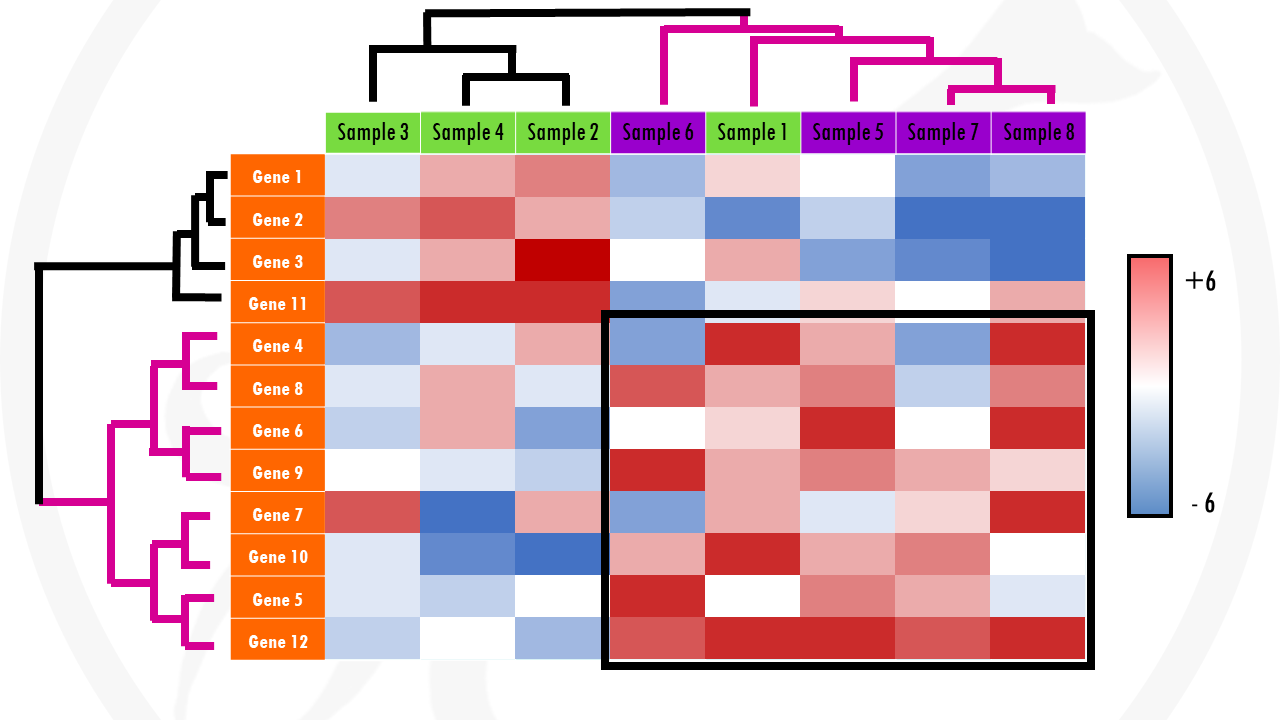
Going back to our example, a clustering algorithm will group genes with a similar expression across samples together: genes that are upregulated in all or most cancer samples, and downregulated in most or all healthy samples) will be clustered together. In a similar way, samples with a similar expression pattern (in general having certain sets of genes upregulated and certain sets of genes downregulated) will be clustered together. In our example, we expect cancer samples to cluster together, and healthy samples to cluster together… but clustering might show us unexpected (and interesting!) groupings.
In summary, adding clustering to our heatmap can be useful for identifying genes that are commonly regulated, or biological signatures associated with a particular condition (for example, a disease).
How to interpret a heatmap
There are very fancy heatmaps out there, which sometimes makes them a bit overwhelming to interpret. But don’t worry! Interpreting a heatmap is very easy.
If you would like to see a guided interpretation of a heatmap with a real-life example, check out my video! Or keep reading for a set of general guidelines to help you interpreting heatmaps.

Here are some tips to understanding any heatmap:
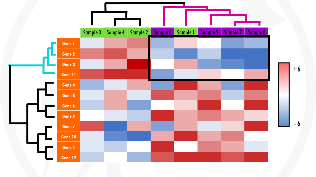
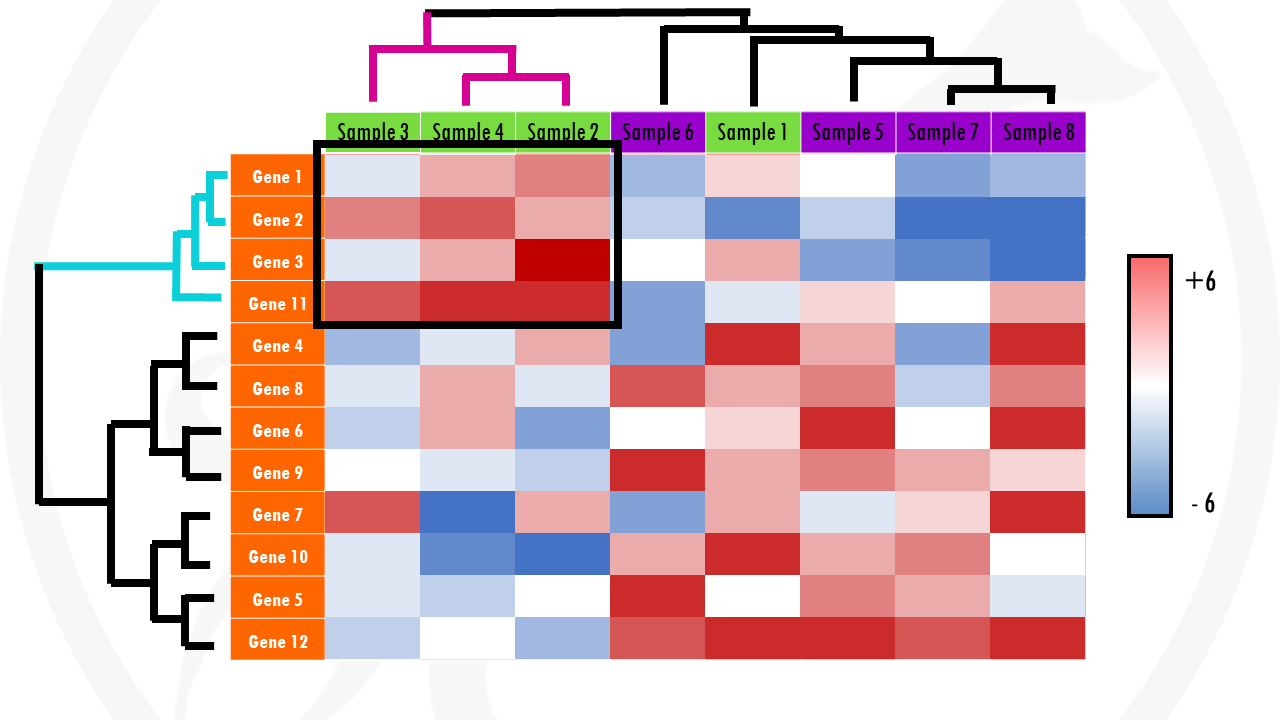
Check the x axis. In general, every column of the heatmap represents a different sample (cells, patients…). There should be labels – this will give you an idea of which samples are more similar to each other.
Check the y axis. In general, here you will find the genes. In cases were the heatmaps display gene expression data of hundreds of genes, the gene names may not be displayed. But it is still informative! You just have to imagine that every row of the heatmap shows the expression of a particular gene across the samples.
Check colour scale. Usually, the log2 fold change for each gene will be shown. This means that gene expression values with a log2FC > 0 will be upregulated and log2FC < 0 will be downregulated. But you do not need to worry about the actual values – check the colours! For example, upregulated genes might be in green, and downregulated genes might be displayed in red (terrible, terrible choice of colours for your colour-blind audience by the way!). Then, with a quick glance you can see patterns of upregulated (generally green areas) and downregulated genes (generally red areas).
Finally, can you identify any interesting patterns? Are there certain gene sets with differential gene expression that stand out? For example, groups of genes upregulated or downregulated in certain samples? Are there any samples that are clustered together – especially samples you didn’t expect to cluster together?
Squidtip
By the way, in this post I mainly talk about differential gene expression results, but you can also use heatmaps to display your pathway enrichment analysis results. In that case, each row is a different biological pathway.
And that is all for today! At least, concerning heatmaps. Squidtastic:)
Did you find this post useful? Is there any more topics you would like to see here?
Let me know what you think in the comments down below!
And that is the end of this tutorial!
In this post, I explained the differences between log2FC and p-value, and why in differential gene expression analysis we don't always get both high log2FC and low p-value. Hope you found it useful!
Before you go, you might want to check:
Squidtastic!
You made it till the end! Hope you found this post useful.
If you have any questions, or if there are any more topics you would like to see here, leave me a comment down below.
Otherwise, have a very nice day and... see you in the next one!

Hey, thanks very much. I wish I could get in touch.
Hi! Of course you can get in touch – you can send me a message through the Contacts page:)
Very interesting and understandable. Thank you for your effort. Actually we need also tutorial on PCA and OPLS-DA.
hi,can i discuss my data with you ? how can i get in touch
Hi! For sure, just write me an email https://biostatsquid.com/contact/
Hi! Thank you very much for your information. I’m a newbie in this field so I have a question hope you can answer. You said that “If our number is negative, we will give it a red colour. If our number is positive, we will give it a blue colour.” But when I see in your heatmap, the color is opposite, so I am confused about that. And this color is fixed or we can choose any color to be shown for data with color scale? I’m so sorry if this is a silly question. Have a nice day
Hi! Thanks so much for your comment! And not a silly question at all, that was my mistake! I just edited the post, so thanks for spotting this. And for sure, you can choose any colour you want for your colour scale, this is just an example:) Have a great day!
Hello! Thanks for this blog. I have a question, is it possible to do a heatmap with only one sample value and several genes? I have the fold change (tumor/normal), FDR-value and p-value but all these values are means of different samples.
Thanks for your comment! Technically you can build a heatmap with any given set of values. I guess the question is whether it helps you visualise what you’d like to show. From what you tell me, it would be better to build a heatmap with the values for all your samples, tumour and normal separately, across all your genes, which would show you how they cluster and trends in gene expression. If you’d like to show the average fold change / p-value across many genes, perhaps barplots are a better way to do it? Or a volcano plot!
Hello, what is the information for citing this page. Thank you for the insightful and informative explanation.
Thank you so much!
You can cite Biostatsquid the same way you would cite any other website or YouTube video. For example:
Biostatsquid. “ UMAP – simple explanation with an example!” YouTube, Laura Twomey, 14 March. 2025, https://youtu.be/m3s0Tgh8ofg.
Blogposts work the same way, styles can change a bit but essentially you should include: Author(s) Last name, First name. (Year site published/Last updated) ‘Title of message’, Title of internet site, Day Month of posted message. Available at: URL (Accessed Day Month Year). For example:
Twomey, Laura (2025) ‘Easy UMAP – explained with an example’, https://biostatsquid.com/umap-simply-explained/, accessed March 2025.