by Biostatsquid | Jul 22, 2026 | Learning, Machine learning, Statistics
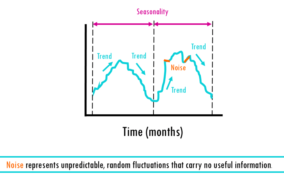
Introduction to time series forecasting From predicting a crash in the stock market, to estimating the temperature and wether you’ll need an umbrella tomorrow – time series analysis is everywhere! In this blogpost, we’ll cover what a time series is, why...
by Biostatsquid | Apr 19, 2026 | Machine Learning, Tutorials
Introduction to tidymodels: logistic regression in R Introduction to tidymodels: logistic regression in R A step-by-step tutorial In this blogpost, we will learn how to build a complete logistic regression workflow using the tidymodels framework in R. The goal is to...
by Biostatsquid | Apr 9, 2026 | Learning, Machine learning, Statistics
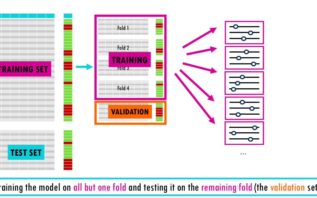
From a simple train-test split to stratified nested cross-validation! Imagine studying for a final exam by memorizing the exact answers to a practice test. You might feel like a genius while grading yourself, but if the actual exam asks the same questions in a...
by Biostatsquid | Apr 1, 2026 | Learning, scRNAseq
One of the most common questions in single-cell RNA sequencing analysis is deceptively straightforward: how many cells express a given gene, and are the expression levels truly comparable across datasets? If you have ever stared at your results wondering whether your...
by Biostatsquid | Feb 21, 2026 | Learning, Statistics
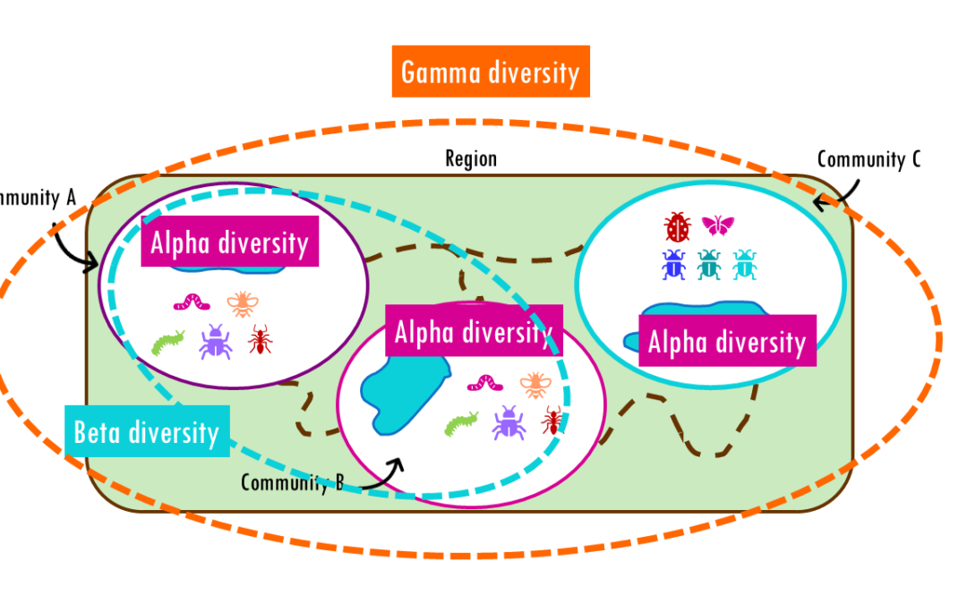
How different are communities from each other? Beta diversity easily explained! If you’ve ever hiked from a dense forest into an open grassland, you’ve probably noticed how dramatically the plants, insects, and animals can change within just a few miles. This...

 This work is licensed under
CC BY-NC-SA 4.0
.
This work is licensed under
CC BY-NC-SA 4.0
.