A step-by-step easy R tutorial for survival analysis, Cox regression and Kaplan-Meier curves
In this easy, step-by-step tutorial you will learn how to conduct survival analysis in R, including log rank test, Cox regression, Kaplan-Meier curves, and more!
If you are not familiar with survival analysis, check my posts on introduction to survival analysis, Kaplan-Meier curves, log rank test and Cox regression. They are easy explanations with examples and how to interpret the results of your survival analysis.
Now it’s time to all that theory into practice and do survival analysis in R. In this tutorial, we will learn how to do a complete survival analysis including:
- plotting a Kaplan Meier curve
- testing for differences between groups using the log rank test
- building a survival model with Cox regression
- and visualising our results with a forest plot.
We will use the R packages:
- ggsurvfit
- survminer
- survival
If you are more of a video-based learner, you can check out my Youtube video on how to perform survival analysis in R. Otherwise, just keep reading! And remember you can just copy the code by clicking on the top right corner of the code snippets in this post.
Let’s dive in!
Check out my Youtube video to follow this survival analysis in R tutorial with me!
Before you start…
In this tutorial, we will learn how to do a complete survival analysis including plotting a Kaplan Meier curve, testing for differences using the log rank test, building a survival model with Cox regression, and visualising our results with a forest plot. We will use sample data from the package survival so if you don’t have a dataset to play around with, you can totally follow this tutorial
If you are not that familiar with survival analysis, you might want to check my other posts on on introduction to survival analysis, Kaplan-Meier curves, log rank test and Cox regression. I go over the basic concepts and how to interpret the results.
If you are a beginner in R, don’t be overwhelmed! This tutorial will go step-by-step and I will explain (almost!) every line of code so you know what is happening at each point of the workflow.
For this tutorial you will need R, or Rstudio, and you will need to install the following packages.
BiocManager::install("survival")
BiocManager::install("ggsurvfit")
BiocManager::install("survminer")
We will also use the tidyverse() package for dataframe manipulation.
Set up your environment
It’s good practice to clear up your environment before you load in any data. This is the general structure I like to keep in all my scripts:
# ---------------------- #
# KM_curve_tutorial.R
# ---------------------- #

# Setting up environment ===================================================
# Clean environment
rm(list = ls(all.names = TRUE)) # will clear all objects including hidden objects
gc() # free up memory and report the memory usage
options(max.print = .Machine$integer.max, scipen = 999, stringsAsFactors = F, dplyr.summarise.inform = F) # avoid truncated output in R console and scientific notation

# Set seed
set.seed(42)

# Theme ====================================================================
biostatsquid_theme <- theme(plot.title = element_text(size = rel(2)),
                            panel.grid.major.y = element_line(colour = 'gray'),
                            panel.grid.minor.y = element_line(colour = 'gray'),
                            panel.grid.major.x = element_blank(),
                            panel.grid.minor.x = element_blank(),
                            plot.background = element_rect(fill = NULL, colour = 'white'),
                            panel.background = element_rect(fill = 'white'),
                            # Axis stuff
                            axis.line = element_line(colour = 'black', linewidth = 1),
                            axis.text = element_text(colour = "black", face = 'bold'),
                            axis.text.x = element_text(size = rel(1)),
                            axis.text.y = element_text(size = rel(1)),
                            axis.title = element_text(size = rel(1.2)),
                            axis.ticks = element_line(colour = 'black', linewidth = 1.2),
                            # Legend stuff
                            legend.position = "bottom",
                            legend.margin = margin(6, 6, 6, 6),
                            legend.title = element_text(face = 'bold'),
                            legend.background = element_blank(),
                            legend.box.background = element_rect(colour = "black"))
If you want to know more about the theme() option to customise plots in an easy and quick way, check out this post. We also need to load the necessary libraries.
# Loading relevant libraries
library(tidyverse) # includes ggplot2, for data visualisation. dplyr, for data manipulation.
library(survival)
library(ggsurvfit)
library(survminer)
Explore the dataset
We’ll start by loading the data, we will load the dataset rotterdam into our object df. We can call ??rotterdam to read more about the dataset and the columns. And to explore it call head() and colnames().
# Load the data ============================================================
df <- survival::rotterdam
head(df)
colnames(df)
1. Prepare your dataset
The key columns for survival analysis are:
- censoring status: the values in this column are 1 = event happened, 0 = censored (or TRUE and FALSE).
- time to event: from the start time (e.g., time of diagnosis) to the end time (the event happened or the last day of follow-up.
Censoring status
Our event in this case, is death, and we see that this dataset already has a column death, and its values are already coded with 1s and 0s. I will create a new column called status that will be identical to death. If that were not the case, you could easily add an ifelse() statement or use the tidyverse function recode() to recode your values.
# Key columns for survival analysis
# 1. Censoring status: 1 = event happened, 0 = censored (or TRUE and FALSE)
unique(df$death)
df <- df %>% mutate(status = death)
head(df)
table(df$status)Squidtip
The censoring_status column should have 0 if the event did not happen, and 1 if it did. If our event of interest is relapse time, then it would be 0 = patients who did not relapse, 1 = patients who relapsed.
Warning! I made a mistake and took rtime (relapse time) in my time-to-event, but censoring status based on death. I corrected the code but the screenshots are NOT updated! So don’t be confused if your results don’t match. Hopefully my point still gets across:)
Time to event
Next, time to event. We can either use relapse time or time til death, but since our event of interest is death, I’ll use dtime. I’ll convert it to years since it will be easier to interpret in the plots later on.
# 2. Time-to-event (we can use either rtime or dtime)
df$dtime %>% head()
df <- df %>% mutate(dtime_yrs = dtime/365.25)
head(df)
Perhaps you just have the start time for example, surgery date, and the day of last follow up, but you don’t have the actual duration since the start time to the end time. Remember we need the actual duration, from the start of the event to the end, when the event happened or the patient was censored. I’ll just make up a quick example to show you how to calculate time-to-event from dates.
# # If you need to calculate time-to-event from dates
df2 <- data.frame(surgery_date = sample(seq(as.Date('1999/01/01'), as.Date('2000/01/01'), by = 'day'), 12),
                  day_of_last_followup = sample(seq(as.Date('2000/01/01'), as.Date('2020/01/01'), by = 'day'), 12))

head(df2)
class(df2$surgery_date)
df2 <- df2 %>% mutate(os_yrs = as.numeric(as.duration(day_of_last_followup - surgery_date), 'years'),
                      os_days = as.numeric(as.duration(day_of_last_followup - surgery_date), 'days'))
head(df2)
Nice! So now that we have our two essential columns, we can start our analysis. The next step is to create a survival object.
2. Create a survival object
We can create a ‘survival object’ in R with the function Surv() from the package survival.
# Create a survival object
surv_obj <- Surv(time = df$dtime_yrs, event = df$status)
head(surv_obj)
Easy! We’ve just created our survival object, which we will use for Cox regression, log rank test and… our Kaplan Meier curves!

Squidtip
The + sign at the end of the time value means its right-censored. Learn more about censoring here.
3. Kaplan Meier curves in R
Wohoo! After all this preparation, we are ready to start our survival analysis! Excited?
One of the most common ways of visualising survival data is through the Kaplan-Meier curve.
The first step is to create a survival curve with the function survfit. This is the syntax, we have ~1 because for now we have no groups. Later on I’ll show you how to plot different groups.
# Create survival curve
s1 <- survfit(surv_obj ~ 1, data = df)
summary(s1)
Great! So how can we plot this data? The answer of course is a Kaplan-Meier plot.
We can do it really easily with ggsurvfit. It has additional options like add_confidence interval and adding a risktable, quantiles… you can edit it like a normal ggplot object, for example, I will add my theme.
And then I can add the limits in the x axis with coord_cartesian() to show only the first 8 years.
# Kaplan-Meier plots ======================================================
## Plot -------------------------
km_curve <- ggsurvfit(s1, linewidth = 1) +
  labs(x = 'Years', y = 'Overall survival') +
  add_confidence_interval() +
  add_risktable() +
  scale_ggsurvfit() +
  biostatsquid_theme +
  coord_cartesian(xlim = c(0, 8))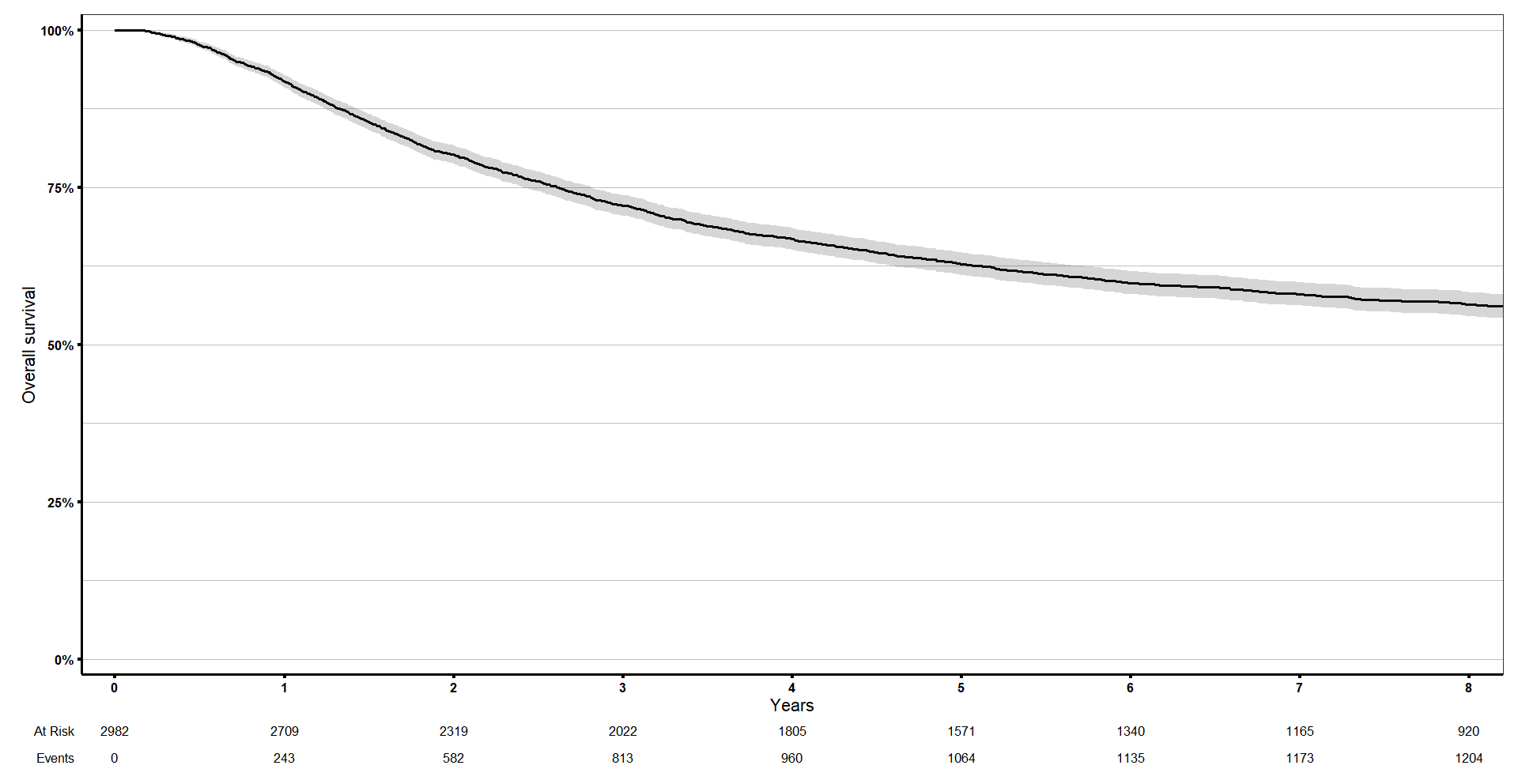
4. Estimating survival after x years
You might want to know what is the probability of surviving beyond a certain number of years, x? You can add 1 or more durations to the argument ‘times’ and just run summary() on our survival object to get the answer.
## Estimating x-year survival ----------------------
# What is the probability of surviving beyond a certain number of years, x?
summary(s1, times = c(0, 0.5, 2, 5, 7))$surv
This is what I got:
> summary(s1, times = c(0, 0.5, 2, 5, 7))$surv
[1] 1.0000000 0.9757823 0.8020095 0.6279401 0.5802597
If we check in our curve, the survival at time 5 is exactly what we showed above.
km_curve +
  geom_vline(xintercept = 1, linetype = 'dashed', colour = 'red', size = 1) +
  geom_hline(yintercept = summary(s1, times = 5)$surv, linetype = 'dashed', colour = 'red', size = 1) +
  coord_cartesian(xlim = c(0, 8))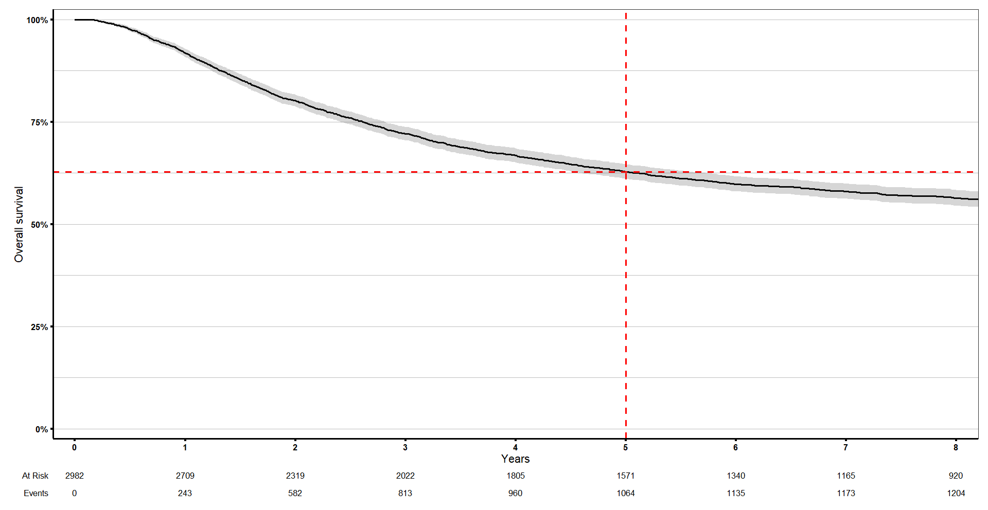
For the median survival time, just call your survival object.
# Estimating median survival dtime ======================================================
s1
> s1
Call: survfit(formula = surv_obj ~ 1, data = df)
n events median 0.95LCL 0.95UCL
[1,] 2982 1272 11.3 10.4 155. Log rank test
The log rank test lets us test whether there is a difference in survival times between groups of patients. For example, we might want to find out whether there is a significant difference in survival between patients who received chemo or not.
This time let’s use the ggsurvplot function to build a Kaplan meier curve. survminer functions like ggsurvplot require that you specify the survival object and again specify the data used to fit the survival object. Remember to do this to avoid non-specific error messages.
Now we can compute the test of the difference between the survival curves using survdiff. We will compare survival rtimes between groups using the Log rank test.
The log rank test lets us test whether there is a difference in survival times between groups of patients. For example, we might want to find out whether there is a significant difference in survival between patients who received chemo or not.
This time let’s use the ggsurvplot function to build a Kaplan meier curve. survminer functions like ggsurvplot require that you specify the survival object and again specify the data used to fit the survival object. Remember to do this to avoid non-specific error messages.
# Log rank test ======================================================
table(df$chemo)

s2 <- survfit(surv_obj ~ chemo, data = df)
ggsurvplot(s2, data = df,
           size = 1,
           palette = c('#E7B800', '#2e9fdf'),
           censor.shape = '|', censor.size = 4,
           conf.int = TRUE,
           pval = TRUE,
           risk.table = TRUE,
           risk.table.col = 'strata',
           legend.labs = list('0' = 'No chemo', '1' = 'Chemo'),
           risk.table.height = 0.25,
           ggtheme = theme_bw())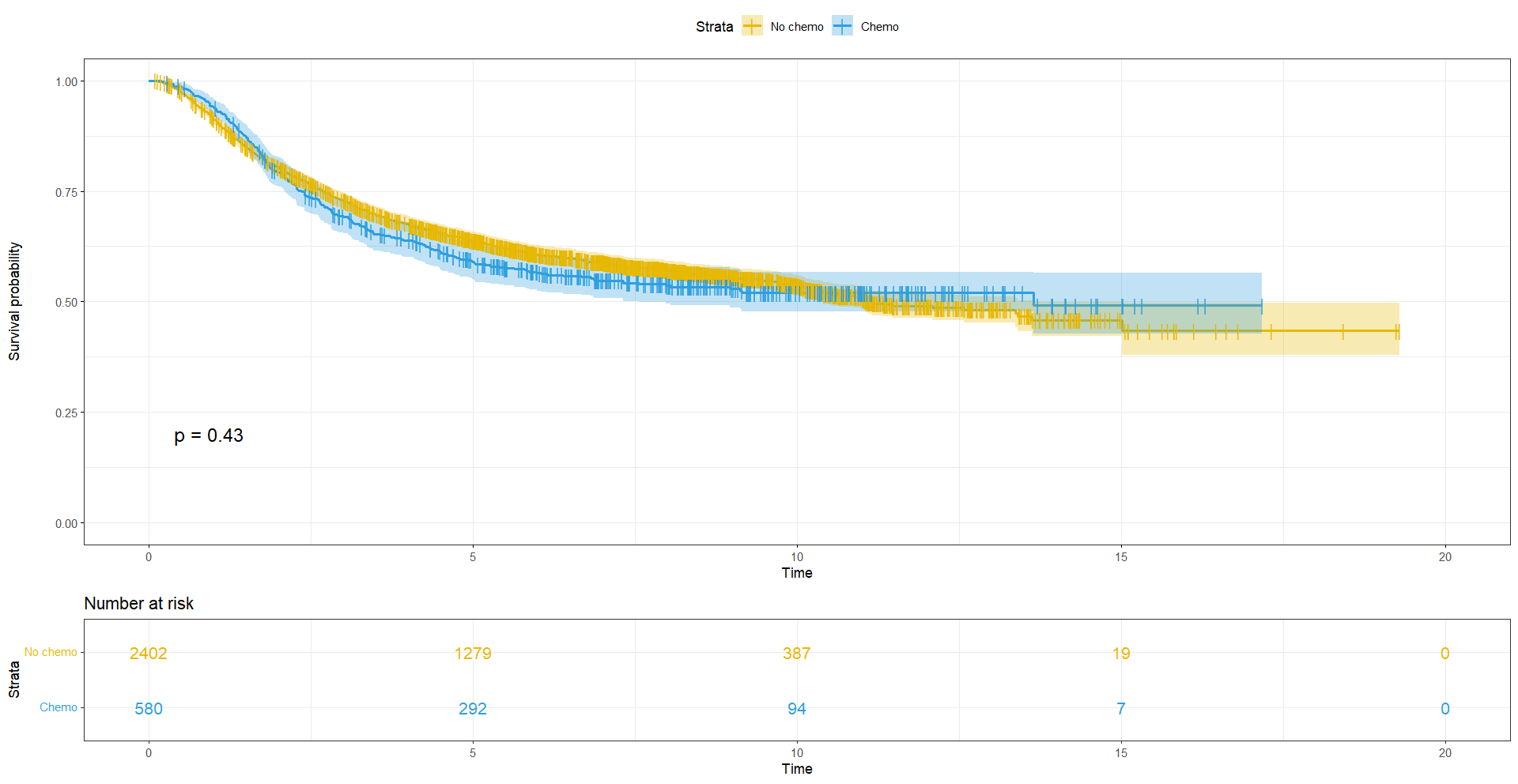
The curves are slightly divergent, but is the difference significant? We can compute the test of the difference between the survival curves using survdiff. We will compare survival rtimes between groups using the Log rank test.
# Log rank test ======================================================
# Now we can compute the test of the difference between the survival curves using survdiff
# Comparing survival dtimes between groups aka Log rank test
logrankres_chemo <- survdiff(Surv(dtime_yrs, status) ~ chemo, data = df)
logrankres_chemo
> logrankres_chemo
Call:
survdiff(formula = Surv(rtime_yrs, status) ~ chemo, data = df)
N Observed Expected (O-E)^2/E (O-E)^2/V
chemo=0 2402 1014 1025 0.120 0.618
chemo=1 580 258 247 0.498 0.618
Chisq= 0.6 on 1 degrees of freedom, p= 0.4 With p-val > 0.05, there is no significant difference in survival between patients who received chemotherapy or not.
# What about hormonal treatment?
logrankres_hor <- survdiff(Surv(dtime_yrs, status) ~ hormon, data = df)
logrankres_hor
> logrankres_hor
Call:
survdiff(formula = Surv(rtime_yrs, status) ~ hormon, data = df)
N Observed Expected (O-E)^2/E (O-E)^2/V
hormon=0 2643 1113 1145 0.886 8.9
hormon=1 339 159 127 7.974 8.9
Chisq= 8.9 on 1 degrees of freedom, p= 0.003 With p < 0.05, seems like the difference in survival probabilities between patients who received hormonal data or not is significant!
6. Cox regression
Great! One more thing we learned about is taking into account more than one variable when comparing survival times. The log rank test doesn’t let us do that, but Cox regression analysis allows us to fit a model with many covariates that we think may influence the survival time.
To fit a Cox model, we use coxph() function.
# Cox regression ======================================================
# Fit the model
cox_res <- coxph(Surv(dtime_yrs, status) ~ hormon + chemo + size + er + pgr + nodes + meno + grade + age, data = df)
cox_res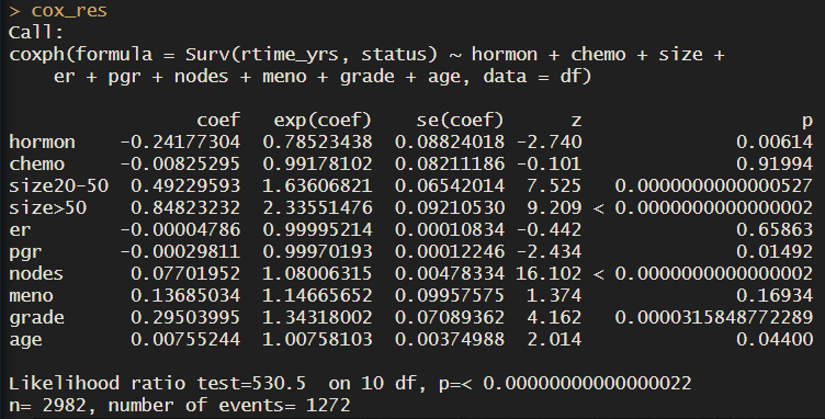
Notice that for all groups we have one row with the coefficients, and the hazard ratios (exponentiated coefficients). For a more direct interpretation of how each variable influences survival time, take a look at the hazard ratios.
About the references – increased survival compared to what?
For example, patients who received hormonal treatment have a 0.78 probability of the outcome (death) compared to patients who didn’t receive it, at any given time. In other words, they have a 22% increase in survival. For each of the groups, we are comparing the presence (=1) versus the absence (=0) of that trait. For example, for hormonal treatment, we have 2600 patients who didn’t receive hormonal treatment, versus 300 who did. So the coefficient refers to the change in the log hazard rate of having the treatment compared to not having it, in other words, the group ‘no hormonal treatment’ is our reference.
For size, we have 3 groups, so the model took the first group, tumour size < 20, as reference.
Changing the reference
What if we wanted to change this? For example, I’ll make up a column called treatment. I’ll make it really simple and just give half the patients ‘drugA’ and half of the patients ‘placebo’. I’ll run a simple Cox regression, just including the covariates hormon and treatment.
# If we have a binary categorical column
df$treatment <- rep(c('drugA', 'placebo'), nrow(df)/2)
table(df$treatment)
cox_res2 <- coxph(Surv(dtime_yrs, status) ~ hormon + treatment, data = df)
cox_res2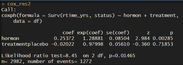
So here we see drugA is the reference. But usually we want to see how drug A improves or worsens survival time compared to the placebo. If we wanted placebo to be the reference group, we just need to make the column a factor and redefine the levels with ref.
df$treatment <- factor(df$treatment, levels = c('drugA', 'placebo'))
class(df$treatment)
df$treatment <- relevel(df$treatment, ref = 'placebo')
unique(df$treatment)
cox_res2 <- coxph(Surv(dtime_yrs, status) ~ hormon + treatment, data = df)
cox_res2
df$treatment <- NULL
Great! We can also get a summary of the model, the CI of the estimated HR and the different test scores.
# Get a summary of the model - we get the CI of the estimated HR and the different test scores
summary(cox_res)
Verifying the proportional hazards assumptions
Before interpreting the results of Cox regresison, verify whether the proportional hazards assumptions are respected.
The Cox model assumes that the HR between any two groups remains constant over time. We can test it really easily with cox.zph.
# Before interpreting the results, verify whether the proportional hazards assumptions are respected
# Cox model assumes that the HR between any two groups remains constant over time
test <- survival::cox.zph(cox_res)
test
This tests for proportional hazards asumptiom based on Schoenfeld residuals. I won’t go into detail, but what you need to know to interpret the results is that:
- p-val < 0.05: there is evidence against proportional hazards assumption, HRs are not constant over time
- chisq results: the bigger the value, the stronger violation of assumptions
In our case, we see that many of the covariates have HR that are not constant over time, so maybe cox regression isn’t the best option.
We can also plot the Schoenfeld residuals over time for each covariate.
# Plot the Schoenfeld residuals over time for each covariate
survminer::ggcoxzph(test, point.size = 0.1)
If the residuals show a clear pattern over time, it may indicate a violation of the proportional hazards assumption.
Some tips to help interpretation:
- No Pattern (Constant Residuals): If the residuals appear randomly scattered around zero, with no clear trend or pattern, it suggests that the proportional hazards assumption is reasonable:)
- Linear Trend: A linear trend (increasing or decreasing) in the residuals over time might suggest a violation of the proportional hazards assumption. For example, if the residuals are consistently positive or negative across time, it indicates a time-dependent effect.
- Nonlinear Pattern: If the residuals exhibit a non-linear pattern or specific shapes (e.g., U-shape, V-shape), it may indicate deviations from proportional hazards.
- Parallelism: Parallelism means that the spread and distribution of residuals are relatively constant across time. If the residuals widen or narrow over time, it may suggest a violation of the assumption.
Cox regression summary stats
Once we verify none of the covariates violate the Cox proportional hazards assumption, we can get a summary of our Cox model.
# Plot the Schoenfeld residuals over time for each covariate
survminer::ggcoxzph(test, point.size = 0.1)
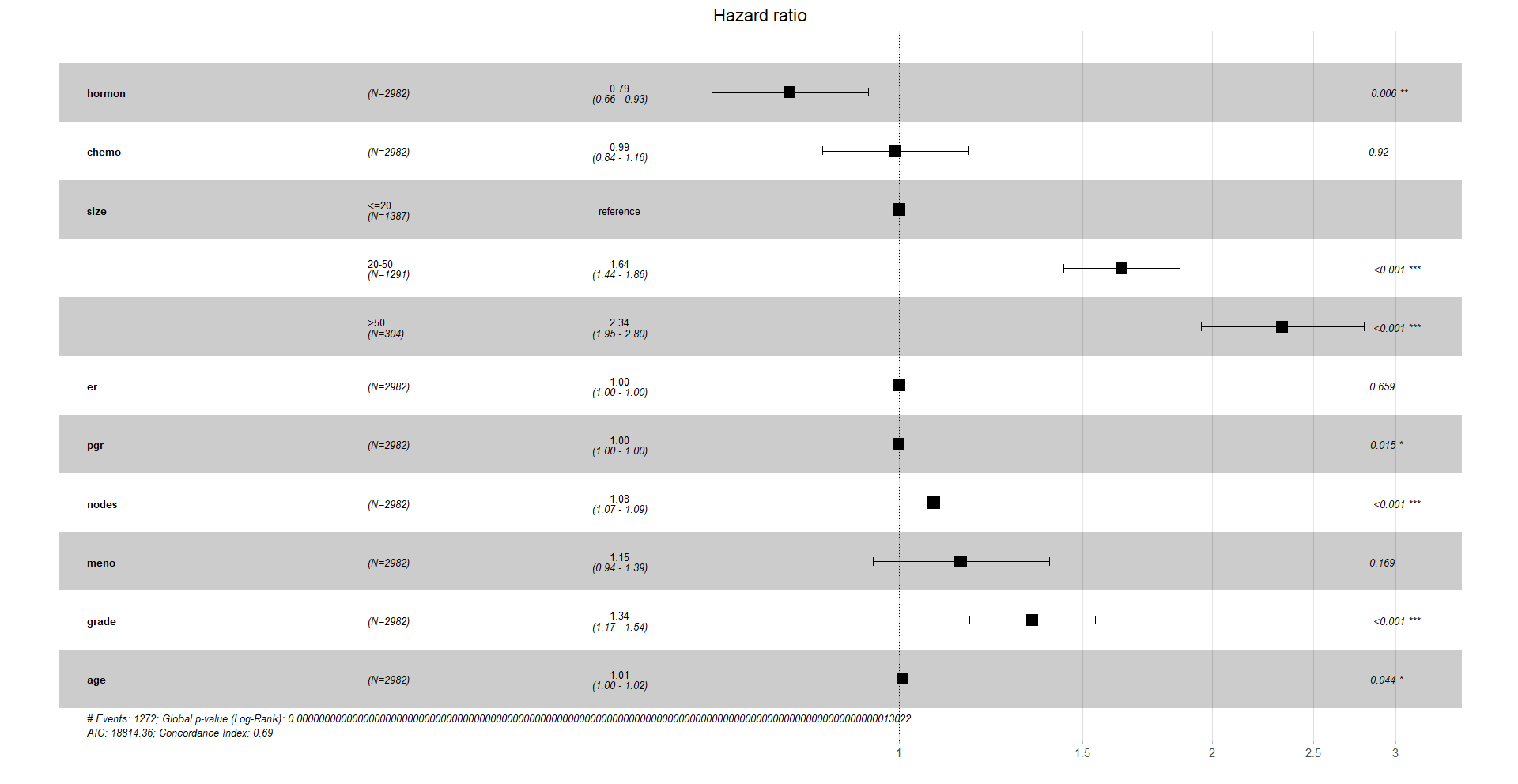
We see that hormonal treatment has a HR of 0.79. This means that if we hold all the other covariates constant, patients who get hormonal treatment have a decrease in the risk of death of 21%.
There is also a positive association between the size of the tumour and mortality: 2.33 times higher chance of death if the tumour is bigger than 50 mm, compared to the reference.
7. Forest plots
Finally, a very nice way to visualise the hazard ratios is with a forest plot. In the x-axis we have the hazard ratios. Remember that a HR of 1 means no significant difference compared to the reference, a HR higher than 1 means it increases the hazard ratio of the event, death, and a HR lower than 1 decreases it.
# Forest plots ================================================================
# Visualise your Cox model results
ggforest(cox_res, data = df)
Again, you can customise this plot, like a ggplot object.
Nice! And that is it for today!
sessionInfo()
Check my sessionInfo() here in case you have trouble reproducting my steps:
> sessionInfo()
R version 4.2.3 (2023-03-15 ucrt)
Platform: x86_64-w64-mingw32/x64 (64-bit)
Running under: Windows 10 x64 (build 22621)

Matrix products: default

locale:
[1] LC_COLLATE=English_Ireland.utf8  LC_CTYPE=English_Ireland.utf8    LC_MONETARY=English_Ireland.utf8
[4] LC_NUMERIC=C                     LC_TIME=English_Ireland.utf8

attached base packages:
[1] stats     graphics  grDevices datasets  utils     methods   base

other attached packages:
 [1] survminer_0.4.9 ggpubr_0.6.0    ggsurvfit_1.0.0 survival_3.5-3  lubridate_1.9.3 forcats_1.0.0   stringr_1.5.0
 [8] dplyr_1.1.3     purrr_1.0.2     readr_2.1.4     tidyr_1.3.0     tibble_3.2.1    ggplot2_3.4.3   tidyverse_2.0.0

loaded via a namespace (and not attached):
 [1] zoo_1.8-12        tidyselect_1.2.0  xfun_0.40         splines_4.2.3     lattice_0.20-45   carData_3.0-5     colorspace_2.1-0
 [8] vctrs_0.6.3       generics_0.1.3    utf8_1.2.3        survMisc_0.5.6    rlang_1.1.1       gridtext_0.1.5    pillar_1.9.0
[15] glue_1.6.2        withr_2.5.1       lifecycle_1.0.3   commonmark_1.9.0  munsell_0.5.0     ggsignif_0.6.4    gtable_0.3.4
[22] labeling_0.4.3    knitr_1.44        tzdb_0.4.0        markdown_1.11     fansi_1.0.4       Rcpp_1.0.11       broom_1.0.5
[29] xtable_1.8-4      renv_1.0.3        scales_1.2.1      backports_1.4.1   abind_1.4-5       farver_2.1.1      km.ci_0.5-6
[36] gridExtra_2.3     hms_1.1.3         stringi_1.7.12    rstatix_0.7.2     KMsurv_0.1-5      cowplot_1.1.1     grid_4.2.3
[43] cli_3.6.1         tools_4.2.3       magrittr_2.0.3    patchwork_1.1.3   crayon_1.5.2      car_3.1-2         pkgconfig_2.0.3
[50] ellipsis_0.3.2    Matrix_1.5-3      xml2_1.3.5        data.table_1.14.8 timechange_0.2.0  rstudioapi_0.15.0 R6_2.5.1
[57] ggtext_0.1.2      compiler_4.2.3
And that is the end of this tutorial!
In this post, I explained how to perform survival analysis using the packages survival, ggsurvfit and survminer. Hope you found it useful!
Before you go, you might want to check:
Squidtastic!
You made it till the end! Hope you found this post useful.
If you have any questions, or if there are any more topics you would like to see here, leave me a comment down below.
Otherwise, have a very nice day and… see you in the next one!
Squids don't care much for coffee,
but Laura loves a hot cup in the morning!

If you like my content, you might consider buying me a coffee.
You can also leave a comment or a 'like' in my posts or Youtube channel, knowing that they're helpful really motivates me to keep going:)
Cheers and have a 'squidtastic' day!


0 Comments