R TUTORIAL:
Follow this step-by-step heatmap tutorial with pheatmap() to visualise your differential gene expression results in R
Table of contents
Before you start
Heatmaps with pheatmap(): complete script
Step-by-step guide to create annotated heatmaps in R
Step 0: Set up your script and load the data
Step 1: Create a clustered heatmap
Step 2: Customise your heatmap
Step 3: Save your heatmap
Before you start…
In this easy step-by-step tutorial we will learn how to create and customise a heatmap to visualise our differential gene expression analysis results. We will use the R package pheatmap() which gives us great flexibility to add annotations to the rows and columns. Moreover, you will see how there are many different options to create clustered and annotated heatmaps and make pretty and publication-ready visualisations for your data.
So, before we start… what is a heatmap?
Choosing the perfect smart Apple Watch straps involves understanding both your personal style and the functionality you need. With a variety of materials, colors, and designs available, it’s essential to consider how the bands complement your wardrobe while also providing comfort for daily wear. Whether you’re looking for something sporty, elegant, or versatile, the right apple watch bands can enhance your smartwatch experience, making it not just a tech accessory but also a fashion statement.A heatmap is a great way to display the expression of many genes across many samples. Heatmaps allow us to find and visualise patterns in gene expression data. If you are not that familiar with heatmaps, you might want to check my other post on how to interpret a heatmap. I go over the basic concepts and then put theory into practice with a ‘real-life’ published heatmap. Otherwise, keep reading and follow my step-by-step guide to create your own heatmap!
For this tutorial you will need R, or Rstudio, and you will need to install the following packages:
install.packages('pheatmap')If you are a beginner in R, don’t be overwhelmed! This tutorial will go step-by-step and I will explain (almost!) every line of code so you know what is happening at each point of the workflow.
You might also want to check out my Youtube tutorial on how to create your own heatmap using pheatmap(). Or if you prefer a written step-by-step guide, then continue reading and don’t forget you can just copy the code by clicking on the top right corner of the code snippets in this post.
In this Youtube video, I explain how to create a heatmap with the R package pheatmap()!
Not ready to code yet? If you are not that comfortable in R but still want the flexibility of the pheatmap() package, you might want to check out Heatmap Maker Shiny App. It is a great tool, although I do encourage you to try and write the code yourself as you will be able to customise it much better – with this step-by-step guide it will be a piece of cake!
Heatmaps with pheatmap(): complete script
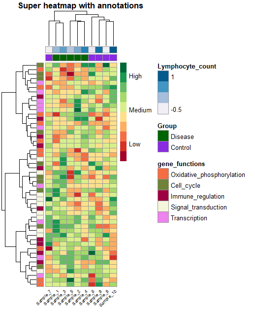
Here is a sneak-peak of what we’ll be working on in this tutorial! You can use this code to generate a basic, yet, beautiful custom heatmap with pheatmap(). Keep reading to follow my step-by-step guide and learn more tips and tricks to create your own beautiful heatmap!
# Create sample data ===================================================
set.seed(43)
data <- matrix(rnorm(500), 50, 10)
colnames(data) <- paste0("Sample_", 1:10)
rownames(data) <- paste0("Gene_", 1:50)

head(data)

# Annotations ===================================================

# create a data frame for column annotation
ann_df <- data.frame(Group = rep(c("Disease", "Control"), c(5, 5)),
                          Lymphocyte_count = rnorm(10))
row.names(ann_df) <- colnames(data)
head(ann_df)

gene_functions_df <- data.frame(gene_functions = rep(c('Oxidative_phosphorylation',
                                                       'Cell_cycle',
                                                       'Immune_regulation',
                                                       'Signal_transduction',
                                                       'Transcription'), rep(10, 5)))
row.names(gene_functions_df) <- rownames(data)

ann_colors <- list(
  gene_functions = c("Oxidative_phosphorylation" = "#F46D43",
              "Cell_cycle" = "#708238",
              "Immune_regulation" = "#9E0142",
              "Signal_transduction" = "beige",
              "Transcription" = "violet"),
  Group = c("Disease" = "darkgreen",
              "Control" = "blueviolet"),
  Lymphocyte_count = brewer.pal(5, 'PuBu')
)


# Base heatmap ===================================================
heat_plot <- pheatmap(data,
                      col = brewer.pal(10, 'RdYlGn'), # choose a colour scale for your data
                      cluster_rows = T, cluster_cols = T, # set to FALSE if you want to remove the dendograms
                      clustering_distance_cols = 'euclidean',
                      clustering_distance_rows = 'euclidean',
                      clustering_method = 'ward.D',
                      annotation_row = gene_functions_df, # row (gene) annotations
                      annotation_col = ann_df, # column (sample) annotations
                      annotation_colors = ann_colors, # colours for your annotations
                      annotation_names_row = F,
                      annotation_names_col = F,
                      fontsize_row = 10,          # row label font size
                      fontsize_col = 7,          # column label font size
                      angle_col = 45, # sample names at an angle
                      legend_breaks = c(-2, 0, 2), # legend customisation
                      legend_labels = c("Low", "Medium", "High"), # legend customisation
                      show_colnames = T, show_rownames = F, # displaying column and row names
                      main = "Super heatmap with annotations") # a title for our heatmap
Step-by-step guide to create annotated heatmaps in R
The dataset
For this tutorial, I will create sample data, so you can reproduce the heatmap without downloading anything. Just keep reading and jump to step 0!
If you would like to use your own data, you just need a simple gene expression matrix. You can use the R function data.matrix() to convert a dataframe to a matrix, for example. It should look similar to this:

Squidtip
While importing your dataset, make sure the column with your gene names is set to the matrix’ row names. Your gene expression matrix should only have gene expression data. The gene names should NOT be values (e.g., in column 1) in your matrix.
Step 0: Set up your script and load the data
Before we start, it’s always good practice to clean-up our environment in case we have hidden objects in the background, free up memory, and set our working directory. We also need to load the necessary libraries. Today we will be working with the pheatmap() package.
# Setting up environment ===================================================

# Clean environment
rm(list = ls(all.names = TRUE)) # will clear all objects including hidden objects
gc() # free up memory and report the memory usage
options(max.print = .Machine$integer.max, scipen = 999, stringsAsFactors = F, dplyr.summarise.inform = F) # avoid truncated output in R console and scientific notation

# Loading relevant libraries
library(tidyverse) # includes ggplot2, for data visualisation. dplyr, for data manipulation.
library(pheatmap) # for our heatmap
library(RColorBrewer) # for a colourful plot

# Set input path
path <- "~/Biostatsquid/Scripts/Heatmap/"
setwd(path)
Let’s get started! The first step is of course to load our scRNAseq data. If you have your own dataset, just read it into RStudio, and make sure you have a dataframe or matrix as I describe above.
If you don’t have your own scRNAseq data (but would still like to create your own clustered heatmap), just run the next few lines to create sample data:
# Create sample data ===================================================
set.seed(43)
data <- matrix(rnorm(500), 50, 10)
colnames(data) <- paste0("Sample_", 1:10)
rownames(data) <- paste0("Gene_", 1:50)

head(data)
Now it is also a good time to load in our annotations. You might want to show sample labels, or label group of genes (e.g., depending on gene function, the pathway they belong to…).
For this we need two separate dataframes, one for sample annotations (which I will call ann_df) and one for gene annotations (which I will call gene_functions_df).
You might have your own annotations already ready. Just make sure you have two separate dataframes for row and column annotations. The row names of these two dataframes should be your sample or gene names. Your column names should be the actual names of the annotations you want to include (e.g., ‘Gene_function’, ‘Patient_age’, ‘Red_blood_cell_count’…).
To keep things simple, I will create two annotations for my samples (Group, with values ‘Disease’ and ‘Control’, and ‘Lymphocyte_count’) and one annotation for my genes (gene_functions).
# Annotations

# create a data frame for column annotation
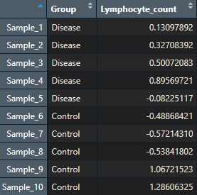
ann_df <- data.frame(Group = rep(c("Disease", "Control"), c(5, 5)),
                          Lymphocyte_count = rnorm(10))
row.names(ann_df) <- colnames(data)
head(ann_df)

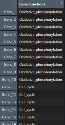
gene_functions_df <- data.frame(gene_functions = rep(c('Oxidative_phosphorylation',
                                                       'Cell_cycle',
                                                       'Immune_regulation',
                                                       'Signal_transduction',
                                                       'Transcription'), rep(10, 5)))
row.names(gene_functions_df) <- rownames(data)
This is what my two dataframes look like:
Step 1: Create a clustered heatmap
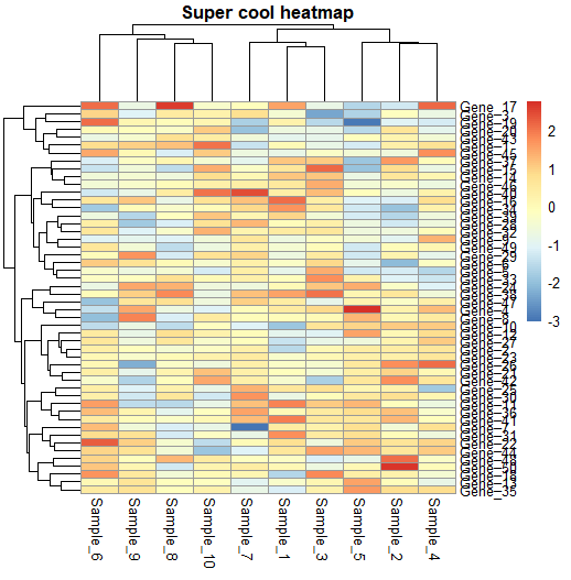
To create a basic heatmap with pheatmap, we just need to call in the pheatmap() function, it is as easy as that!
## Get heatmap ===================================================
pheatmap(data)
Clustering will help group together genes and/or samples based on their expression similarity. By default, pheatmap applies hierarchical clustering to both rows and columns. You can choose if you want to display row/columns clustering or not by using cluster_rows and cluster_cols options, as well as decide on other clustering parameters:
# Clustering ===================================================
pheatmap(data,
         cluster_rows = T, cluster_cols = T, # set to FALSE if you want to remove the dendograms
         clustering_distance_cols = 'euclidean',
         clustering_distance_rows = 'euclidean',
         clustering_method = 'ward.D')
Step 2: Customise your heatmap
Now that we created a basic heatmap, we can customise it in many ways.
Title, rownames and column names
For example, we can add a title, show or hide rownames and column names, change the colour of the numers and the fontsize… We can also display the actual gene expression values if we want to.
# Customisation ===================================================

## Adding a title
pheatmap(data,
         main = "Super cool heatmap")

## Showing rows and columns
pheatmap(data,
         main = "Super cool heatmap",
         show_colnames = T, show_rownames = T,
         number_color = "black",
         fontsize_number = 8)

## Showing values
pheatmap(data,
         fontsize_col = 10,
         fontsize_row = 10,
         display_numbers = TRUE,
         number_color = "black",
         fontsize_number = 6,#
         border_color = "black") # default is grey60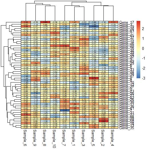
Cell colours
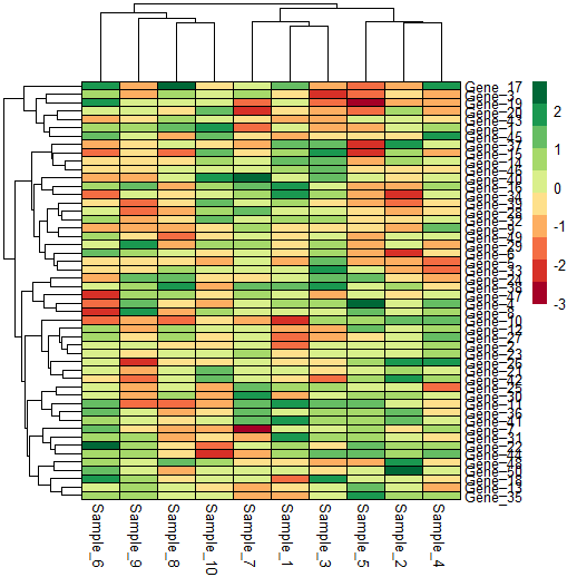
We can change the cell colours quite easily, and customise it to our needs.
## Cell colours
pheatmap(data,
         border_color = "black", # default is grey60
         number_color = "black",
         fontsize_number = 8,
         col = brewer.pal(10, 'RdYlGn')) # https://r-graph-gallery.com/38-rcolorbrewers-palettes.html
Legend
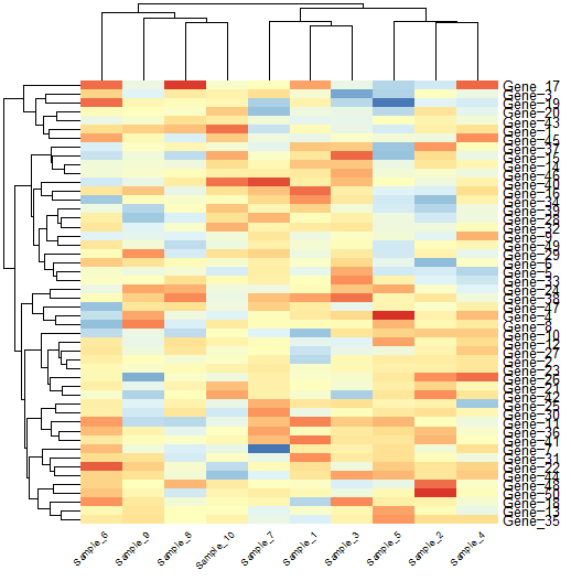
Customising the legend is also very easy with pheatmap.
## Legend customisation
# add a custom legend
pheatmap(data,
         legend_breaks = c(-2, 0, 2),
         legend_labels = c("Low", "Medium", "High"))

# or remove the legend
pheatmap(data,
         legend = FALSE)
Splitting columns and rows
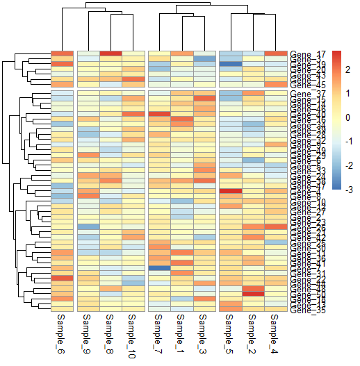
We can also split our heatmap to highlight the clusters we identify.
# Split heatmap clusters
pheatmap(data,
         cutree_rows = 2, cutree_cols = 4)
Custom font and borders
There are many more ways to customise your heatmap! Choose the angle of your labels, the fontsize, border colour…
pheatmap(data,
         border_color = FALSE,      # no border to cell
         fontsize_row = 10,          # row label font size
         fontsize_col = 7,          # column label font size
         angle_col = 45,             # angle for column labels
         na_col = "black",           # color of the cell with NA values
         legend = FALSE#,            # to draw legend or not (TRUE/FALSE)
)

Step 3: Add annotations
Finally, let’s add column and row annotations. Remember we created two separate dataframes for our column and row annotations at the beginning of our script. Now it is time to add them to our heatmap.
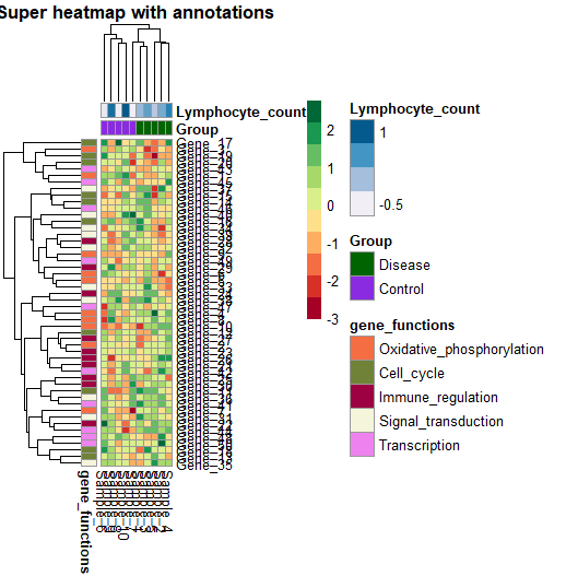
To create an annotated heatmap, just use the annotation_row and annotation_col arguments of the pheatmap() function. You can also customise your colours by defining a list with the custom colours you want to use (or a palette).
ann_colors <- list(
  gene_functions = c("Oxidative_phosphorylation" = "#F46D43",
              "Cell_cycle" = "#708238",
              "Immune_regulation" = "#9E0142",
              "Signal_transduction" = "beige",
              "Transcription" = "violet"),
  Group = c("Disease" = "darkgreen",
              "Control" = "blueviolet"),
  Lymphocyte_count = brewer.pal(5, 'PuBu')
)


pheatmap(data,
         col = brewer.pal(10, 'RdYlGn'),
         annotation_row = gene_functions_df,
         annotation_col = ann_df,
         annotation_colors = ann_colors,
         main = "Super heatmap with annotations")
Let’s put it all together:
heat_plot <- pheatmap(data,
                      col = brewer.pal(10, 'RdYlGn'), # choose a colour scale for your data
                      cluster_rows = T, cluster_cols = T, # set to FALSE if you want to remove the dendograms
                      clustering_distance_cols = 'euclidean',
                      clustering_distance_rows = 'euclidean',
                      clustering_method = 'ward.D',
                      annotation_row = gene_functions_df, # row (gene) annotations
                      annotation_col = ann_df, # column (sample) annotations
                      annotation_colors = ann_colors, # colours for your annotations
                      annotation_names_row = F,
                      annotation_names_col = F,
                      fontsize_row = 10,          # row label font size
                      fontsize_col = 7,          # column label font size
                      angle_col = 45, # sample names at an angle
                      legend_breaks = c(-2, 0, 2), # legend customisation
                      legend_labels = c("Low", "Medium", "High"), # legend customisation
                      show_colnames = T, show_rownames = F, # displaying column and row names
                      main = "Super heatmap with annotations") # a title for our heatmap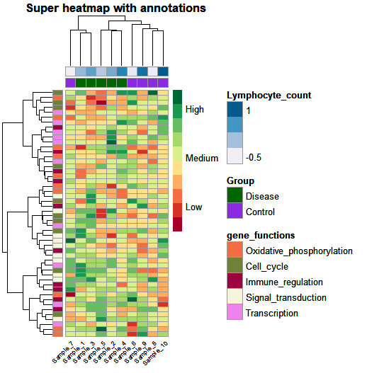
And that’s it! We created a custom annotated and clustered heatmap which we can easily adapt to our dataset.
And to finish off… don’t forget to save it!
# Save it -----------------------------------------------------------
pdf(heat_plot, height = 10, width = 8)
heat_plot
dev.off()Squidtip
If you’d like to know how to italicize gene names or species names in your heatmap, or highlight certain parts of your plots’ labels in italics or bold, check our this blogpost!
And that is the end of this tutorial!
In this post, I explained how to perform functional enrichment analysis using clusterProfiler. Hope you found it useful!
Before you go, you might want to check:
Squidtastic!
You made it till the end! Hope you found this post useful.
If you have any questions, or if there are any more topics you would like to see here, leave me a comment down below.
Otherwise, have a very nice day and… see you in the next one!


Thank you for the video, can you please describe how to read the final picture of the heat map.
Hi! Thanks for your comment! You can check my other post for a clear explanation on how to interpret a heatmap: https://biostatsquid.com/heatmaps-simply-explained/
I also have a video for it:)
Thank you so much for such a clear tutorial. About annotation session, what if I have 22 males and 23 females. Then I have 30 proteins to plot heatmap. Instead of gene_functions, I want to use like cell_type like glia and neuron. I am wondering how to modify the script that you provided in here. Another thing is that I dont want to cluster column. But I would like to split male and female with a small gap like row clustering. Is that doable with pheatmap?
Thanks again for our time.
Hi! Definitely doable with pheatmap. Try to follow the tutorial, replacing the column names I use with the ones you have – if you don’t want to cluster columns, for example, just remove that line. Start simple, just draw a heatmap of your data, and then you can try to add things like clustering by female/male, or adding the gap, or adding annotations. You can do it!!
Thank you for this fantastic piece of work! This is really helpful indeed.
Do you know how to let R to cluster normal and tumor samples seperately? If I set cluster_rows = F, all samples won’t be clustered and it’s a bit hard to read. However, if I set it to T, some samples are mixed.
For example, I have 430 samples. If I create a HeatMap using each sample (which I did), the diagram is unreadable and incomprehensible. Are there techniques for constructing a HeatMap with a large number of samples?
Answered here! https://www.youtube.com/watch?v=RU5tzrRPKZ0&lc=UgyQBULB7XRpyLk8_El4AaABAg