A step-by-step easy R tutorial to create and customise violin plots with ggplot2
In this easy, step-by-step tutorial you will learn how to create your own violin plots in R, including how to customise the colours, layout, create grouped violin plots, and more!
If you are not familiar with violin plots, check my posts on interpreting violin plots and boxplots. They are easy explanations with examples and how to interpret violin plots and boxplots.
Now it’s time to all that theory into practice and create our own violin plots in R. In this tutorial, we will learn how to:
- create a basic violin plot
- customise the layout, colours, axis labels, plot title…
- creating grouped violin plots
- using facet_wrap() to plot many violin plots at once
- creating your own function to produce many violin plots with a single line of code!
We will use the R packages:
- tidyverse
- RColorBrewer
- reshape2
If you are more of a video-based learner, you can check out my Youtube video on how to create your own violin plots in R. Otherwise, just keep reading! And remember you can just copy the code by clicking on the top right corner of the code snippets in this post.
Let’s dive in!
Check out my Youtube video to follow this ggplot2 violin plots in R tutorial with me!
Before you start…
In this tutorial, we will learn how to create our own violin plots. Remember that violin plots are a great way to compare the distribution of a continous variable (such as weight, height, gene counts) across different groups (in other words, a categorical variable, like male vs female, control vs treatment, or nationality).
We will use sample data from the package utils which should be already installed (or will be installed as a dependency when you install ggplot2). Otherwise you can always install it using install.packages(‘utils’).
If you are not that familiar with violin plots or you are not sure whether they are the right plot to visualise your data, check out this other post. I go over the basic concepts and how to interpret the results.
If you are a beginner in R, don’t be overwhelmed! This tutorial will go step-by-step and I will explain (almost!) every line of code so you know what is happening at each point of the workflow.
For this tutorial you will need R, or Rstudio, and you will need to install the following packages.
# the tidyverse includes ggplot2
BiocManager::install("tidyverse")
BiocManager::install("RColorBrewer")
BiocManager::install("reshape2")
Set up your environment
It’s good practice to clear up your environment before you load in any data. This is the general structure I like to keep in all my scripts:
# ---------------------- #
# Violin_plots.R
# ---------------------- #

# Setting up environment ===================================================
# Clean environment
rm(list = ls(all.names = TRUE)) # will clear all objects including hidden objects
gc() # free up memory and report the memory usage
options(max.print = .Machine$integer.max, scipen = 999, stringsAsFactors = F, dplyr.summarise.inform = F) # avoid truncated output in R console and scientific notation

# Set seed
set.seed(42)

# Theme ====================================================================
biostatsquid_theme <- theme(plot.title = element_text(size = rel(2)),
                            panel.grid.major.y = element_line(colour = 'gray'),
                            panel.grid.minor.y = element_line(colour = 'gray'),
                            panel.grid.major.x = element_blank(),
                            panel.grid.minor.x = element_blank(),
                            plot.background = element_rect(fill = NULL, colour = 'white'),
                            panel.background = element_rect(fill = 'white'),
                            # Axis stuff
                            axis.line = element_line(colour = 'black', linewidth = 1),
                            axis.text = element_text(colour = "black", face = 'bold'),
                            axis.text.x = element_text(size = rel(1)),
                            axis.text.y = element_text(size = rel(1)),
                            axis.title = element_text(size = rel(1.2)),
                            axis.ticks = element_line(colour = 'black', linewidth = 1.2),
                            # Legend stuff
                            legend.position = "bottom",
                            legend.margin = margin(6, 6, 6, 6),
                            legend.title = element_text(face = 'bold'),
                            legend.background = element_blank(),
                            legend.box.background = element_rect(colour = "black"))
If you want to know more about the theme() option to customise plots in an easy and quick way, check out this post. We also need to load the necessary libraries.
# Loading relevant libraries
library(tidyverse) # includes ggplot2, for data visualisation. dplyr, for data manipulation.
library(RColorBrewer)
library(reshape2)
Explore the dataset
We’ll start by loading the data, we will load the dataset iris into our environment. We can call ??iris to read more about the dataset and the columns. And to explore it call head() and colnames().
# Importing dataset ===================================================
data(iris)
head(iris)
table(iris$Species)
1. Create a basic violin plot
To plot a violin plot we need:
- a continuous variable: this will be plotted in the y axis
- a categorical variable: this will be plotted in the x axis
We will plot the sepal width (y axis) of 3 different species of iris (x axis).
Before plotting, it’s important to convert your categorical variable to a factor. This tells R that the unique values in that column are categories.
# 0. Convert categorical variable to factor =================================
# This is especially important if it is numerical (e.g., doses of a drug, age... etc)
iris$Species <- as.factor(iris$Species)

# 1. Create violin plots ===================================================

# Basic plot
ggplot(data = iris, aes(x = Species, y = Sepal.Width)) +
  geom_violin(trim = FALSE) +
  coord_flip()
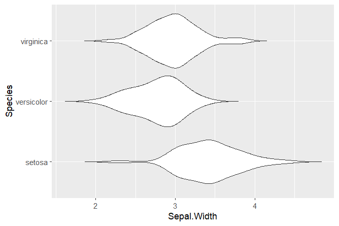
With only 3 lines of code, we created a violin plot! The argument coord_flip() can be used to flip the x and y axis. We set trim = FALSE to not trim the ends of the violin plot.
Squidtip
Converting your categorical variable to a factor is especially important if the variable is numerical (e.g., doses of a drug, age… etc).
Now we can add some stats!
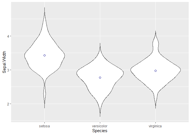
For example, we can add the mean or median as a point.
## Adding stats -----------------------------------------------------------

# Adding the mean or median as a point
# http://www.sthda.com/english/wiki/ggplot2-point-shapes
ggplot(data = iris, aes(x = Species, y = Sepal.Width)) +
  geom_violin(trim = FALSE) +
  stat_summary(fun.y = mean, geom = "point", shape = 21, size = 2, colour = 'darkblue')
The “shape” argument defines the actual shape of the point where the mean lies (21 is a circle). To change it to a cross, a star, a square… check this website. We can edit the size, the colour…
We can also add a boxplot!
If you just want the boxplot, and not the violin plot, delete the violin plot lines.
# Adding a boxplot
ggplot(data = iris, aes(x = Species, y = Sepal.Width)) +
  geom_violin(trim = FALSE) +
  stat_summary(fun.y = mean, geom = "point", shape = 21, size = 2, colour = 'darkblue') +
  geom_boxplot(width = 0.1)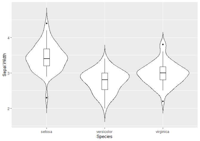
We can show the mean and standard deviation with a crossbar.
# Adding mean and standard deviation
# You can add it as a crossbar
ggplot(data = iris, aes(x = Species, y = Sepal.Width)) +
  geom_violin(trim = FALSE) +
  stat_summary(fun.y = mean, geom = "point", shape = 21, size = 2, colour = 'darkblue') +
  stat_summary(fun.data = "mean_sdl", mult = 1.5,
               geom = "crossbar", width = 0.2 )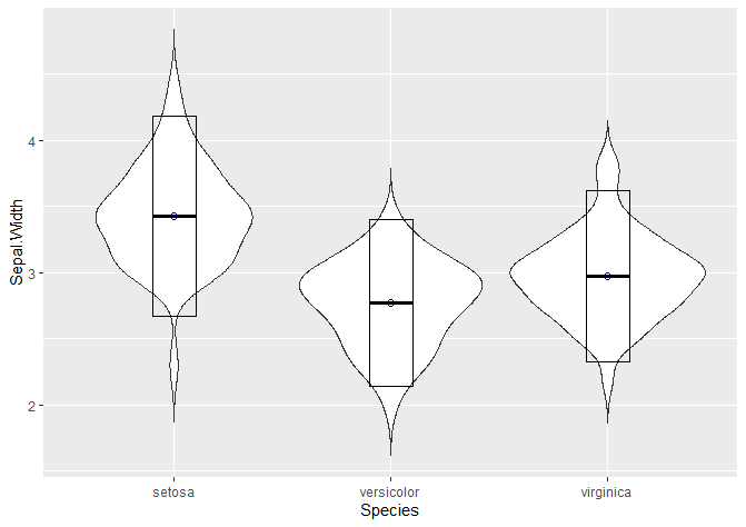
We can add a point range: in this case, the mean is represented by the dot and the line +- 1.5 times the standard deviation.
# Or a poinrange
ggplot(data = iris, aes(x = Species, y = Sepal.Width)) +
  geom_violin(trim = FALSE) +
  stat_summary(fun.y = mean, geom = "point", shape = 21, size = 2, colour = 'darkblue') +
  stat_summary(fun.data = "mean_sdl", mult = 1.5,
               geom = "pointrange", width = 0.2 )
Another common way to visualise violin plots is with jitter, showing the points that actually make up the data. This is particularly useful for boxplots, because they don’t show the density probability function – so it is a way of visualising where do points in our dataset fall.
# Adding jitter
ggplot(data = iris, aes(x = Species, y = Sepal.Width)) +
  geom_violin(trim = FALSE) +
  stat_summary(fun.y = mean, geom = "point", shape = 21, size = 3, colour = 'darkblue', fill = 'darkred') +
  geom_jitter(shape = 16, position = position_jitter(0.2))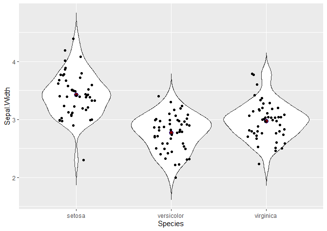
Nice! So these are some common ways of adding stats to our violin plot.
And now… for the fun part! Let’s customise our violin plots and make them prettier.
Squidtip
If you’d like to plot a violin plot, it is as easy as changing geom_violin() for geom_boxplot()!
2. Customise your violin plot
Adding colour
We can change both the colours of the contour and the fill of our violin plots by specifying col and fill.
With the snippet below, you can:
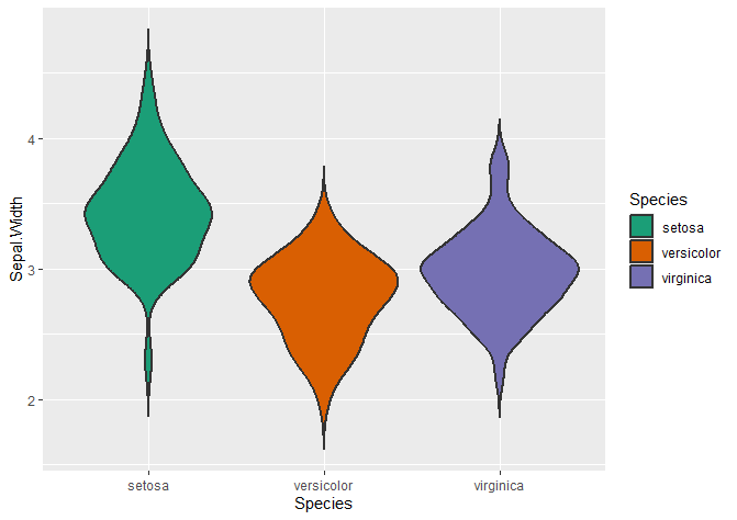
- add fill colour to your plots by specifying with the “fill” variable
- change the fill colours with scale_fill_brewer(). You can find more colour palettes here.
- change the contour colours with scale_colour_brewer(). Don’t forget to also change fill for col inside aes().
- use custom colours for every group.
Changing the contour colour of your violin plots
## Adding colour -----------------------------------------------------------
# Adding colour
ggplot(data = iris, aes(x = Species, y = Sepal.Width, fill = Species)) +
  geom_violin(trim = FALSE, col = 'black', linewidth = 0.8)

# Changing colours
# colour changes the contour of the violin plot
ggplot(data = iris, aes(x = Species, y = Sepal.Width, col = Species)) +
  geom_violin(trim = FALSE, linewidth = 0.8, fill = 'beige') +
  scale_color_brewer(palette = "Dark2")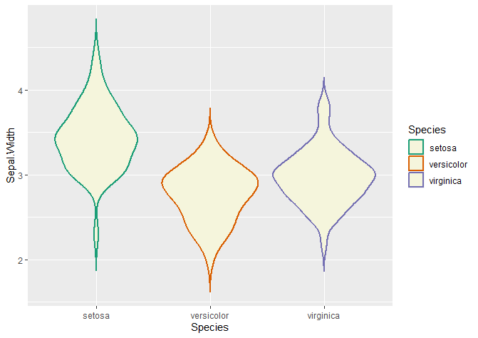
Changing the fill colour of your violin plots
# fill changes the inside of the violin plot
ggplot(data = iris, aes(x = Species, y = Sepal.Width, fill = Species)) +
  geom_violin(trim = FALSE, linewidth = 0.8) +
  scale_fill_brewer(palette = "Dark2")
Using custom colours
To use custom colours, just define them with scale_fill_manual().
# Custom colours
colour_dict <- list('setosa' = 'pink2', 'versicolor' = 'turquoise3', 'virginica' = 'orange3')
ggplot(data = iris, aes(x = Species, y = Sepal.Width, fill = Species)) +
  geom_violin(trim = FALSE, col = 'black', linewidth = 0.8) +
  scale_fill_manual(values = colour_dict)
Easy! As you can see, it’s very simple to change the colour of our violin plots.
Axis titles
This is how you change the titles of your axis and the add a title to your plot:
## Plot options -------------------------------------
# Axis titles
ggplot(data = iris, aes(x = Species, y = Sepal.Width, fill = Species)) +
  geom_violin(trim = FALSE, col = 'black', linewidth = 0.8) +
  scale_fill_manual(values = colour_dict) +
  labs(title = "My amazing violin plot", x = "Species", y = "Sepal Width (cm)")
Axis titles
A very useful way to change the general appearance of your plot is with the theme() function. You can find common ggplot2 themes here. This other page explains how to modify components of a theme.
The theme() of a plot allows you to customise:
- the appearance of the axis labels (size, colour, if you want it in bold or italics…)
- the appearance of the plot (background, grids, width of axis lines…)
- the aspect ratio
- spacing
- legend appearance
- and much more!
If you are interested in more tips and tricks for ggplot2 themes, check out my other post.
## Theme options -------------------------------------
# Everything is customisable!
ggplot(data = iris, aes(x = Species, y = Sepal.Width, fill = Species)) +
  geom_violin(trim = FALSE, col = 'black', linewidth = 0.8) +
  scale_fill_manual(values = colour_dict) +
  labs(title = "My amazing violin plot", x = "Species", y = "Sepal Width (cm)") +
  theme_bw()

# Legend position
ggplot(data = iris, aes(x = Species, y = Sepal.Width, fill = Species)) +
  geom_violin(trim = FALSE, col = 'black', linewidth = 0.8) +
  scale_fill_manual(values = colour_dict) +
  labs(title = "My amazing violin plot", x = "Species", y = "Sepal Width (cm)") +
  theme_bw() +
  theme(legend.position = 'bottom')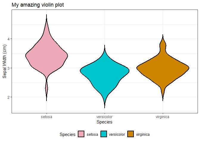
The aspect ratio allows you to make plots narrower or wider (who would have guessed, it lets you change the aspect ratio!).
This is useful if you want to combine plots in a figure, for example.
# Aspect ratio
ggplot(data = iris, aes(x = Species, y = Sepal.Width, fill = Species)) +
  geom_violin(trim = FALSE, col = 'black', linewidth = 0.8) +
  scale_fill_manual(values = colour_dict) +
  labs(title = "My amazing violin plot", x = "Species", y = "Sepal Width (cm)") +
  theme_bw() +
  theme(legend.position = 'bottom',
        aspect.ratio = 0.5)
You can also change the appearance of the axis labels.
Check our my other post if you’d like to find out how to italicise the axis labels or titles of your violin plot
# Axis text
ggplot(data = iris, aes(x = Species, y = Sepal.Width, fill = Species)) +
  geom_violin(trim = FALSE, col = 'black', linewidth = 0.8) +
  scale_fill_manual(values = colour_dict) +
  labs(title = "My amazing violin plot", x = "Species", y = "Sepal Width (cm)") +
  theme_bw() +
  theme(legend.position = 'bottom',
        aspect.ratio = 0.5,
        axis.text = element_text(size = 12, face = 'bold', colour = 'purple4'),
        axis.title = element_text(size = 16, face = 'bold', colour = 'darkblue'),
        plot.title = element_blank())

# Usings customisable themes
ggplot(data = iris, aes(x = Species, y = Sepal.Width, fill = Species)) +
  geom_violin(trim = FALSE, col = 'black', linewidth = 0.8) +
  scale_fill_manual(values = colour_dict) +
  labs(x = "Species", y = "Sepal Width (cm)") +
  biostatsquid_theme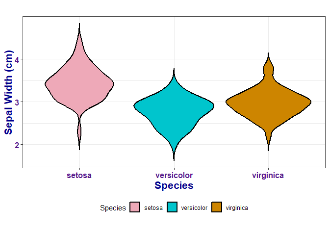
Squidtip
You can also define your own theme() in your script and then just add it to your plots so they all have a consistent appearance – find out how here!
3. Grouped violin plots with multiple groups
Sometimes, we want to compare one or more conditions across different groups or categories. For example, control and treatment groups across different cell lines. Or the expression of 5 genes across 10 different mice.
For example, below I’m creating a dummy column called “Treatment”, which has alternating values: “treated” and “untreated”. Now, I’d like to plot the condition “Treatment” across the 3 different species of iris.
To create grouped violin plots with ggplot2, we just have to specify the condition with the fill variable, and the groups with the x variable in the aes() function, like this:
## Multiple groups -----------------------------------------------------------
iris$Treatment <- rep(c('treated', 'untreated'), nrow(iris)/2)
head(iris)

colour_dict <- list('treated' = 'pink2', 'untreated' = 'turquoise3')
ggplot(data = iris, aes(x = Species, y = Sepal.Width, fill = Treatment)) +
  geom_violin(trim = FALSE, col = 'black', linewidth = 0.8) +
  scale_fill_manual(values = colour_dict) +
biostatsquid_theme 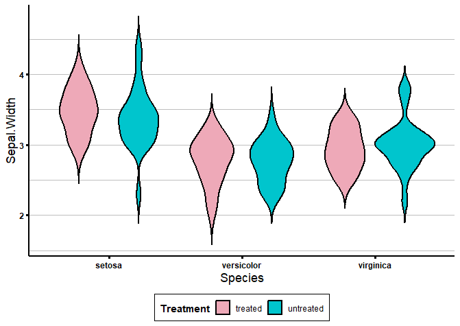
4. Violin plots for many variables: facet_wrap()
Sometimes, it’s useful to plot many variables at once. For example, Sepal.Width, Sepal.Length, Petal.Width and Petal.Length. We could just copy & paste the code snippet that plots a violin plot and change the “y = ” every time. But there are cleaner ways of plotting many variables (and more code- and time-efficient!).
One option to plot many variables at once is to use facet_wrap().
But first, we need to reformat our dataframe to “long” format, by restructuring it so that variables we want to plot are in a column instead of being their own columns.
Confused? Let me show you how:
# 2. Creating many violin plots at once: melt ===================================================
df_long <- melt(iris, id.vars = c('Species', 'Treatment'))
head(df_long)
If we check in our curve, the survival at time 5 is exactly what we showed above.
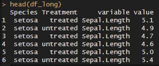
As you can see, the “variable” column now has all the variables we want to plot. The “value” column has… you guessed it! The values.
Now, we can use facet_wrap() to plot many violin plots for all our variables:
# Use facet_wrap
colour_dict <- list('pink2', 'turquoise3', 'orange3')
ggplot(df_long, aes(x = Species, y = value, fill = Species)) +
  geom_violin(trim = FALSE, col = 'black', linewidth = 0.8) +
  scale_fill_manual(values = colour_dict) +
  labs(title = "Violin Plots for All Variables", x = "", y = "") +
  facet_wrap(~variable) +
  biostatsquid_theme +
  theme(axis.text.x = element_text(angle = 45, hjust = 1),
        strip.text = element_text(size = 12, face = "bold", colour = "green4"),
strip.background = element_rect(fill = "white", colour = "black", size = 1)) 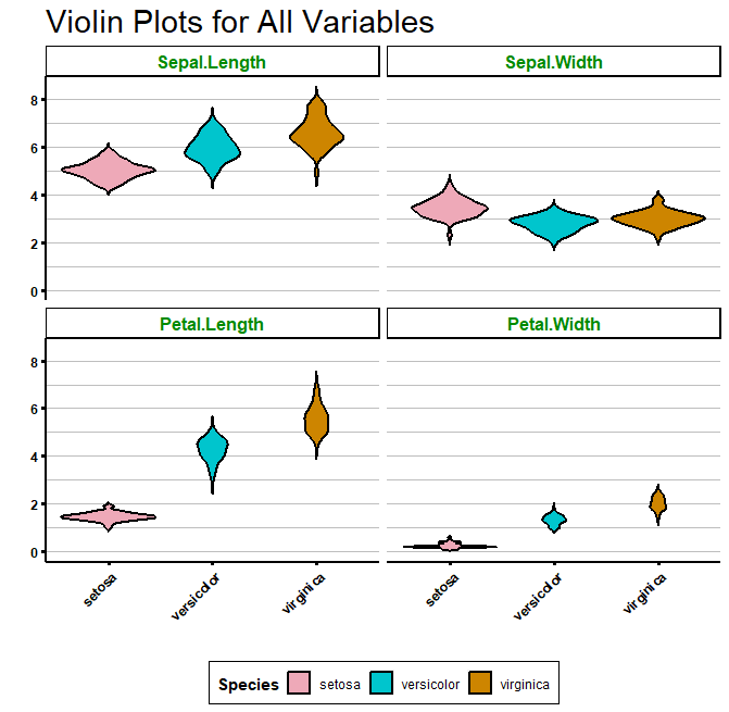
Of course, you can also create grouped violin plots by specifying the “fill” argument:
# Adding group by treatment
ggplot(df_long, aes(x = Species, y = value, fill = Treatment)) +
  geom_violin(trim = FALSE, col = 'black', linewidth = 0.8) +
  scale_fill_manual(values = colour_dict) +
  labs(title = "Violin Plots for All Variables", x = "", y = "") +
  facet_wrap(~variable) +
  biostatsquid_theme +
  theme(axis.text.x = element_text(angle = 45, hjust = 1),
        strip.text = element_text(size = 12, face = "bold", colour = "green4"),
strip.background = element_rect(fill = "white", colour = "black", size = 1)) 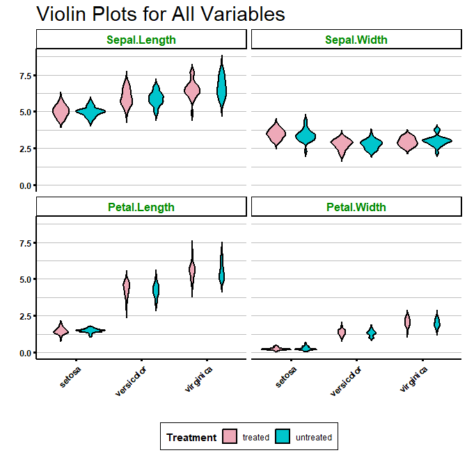
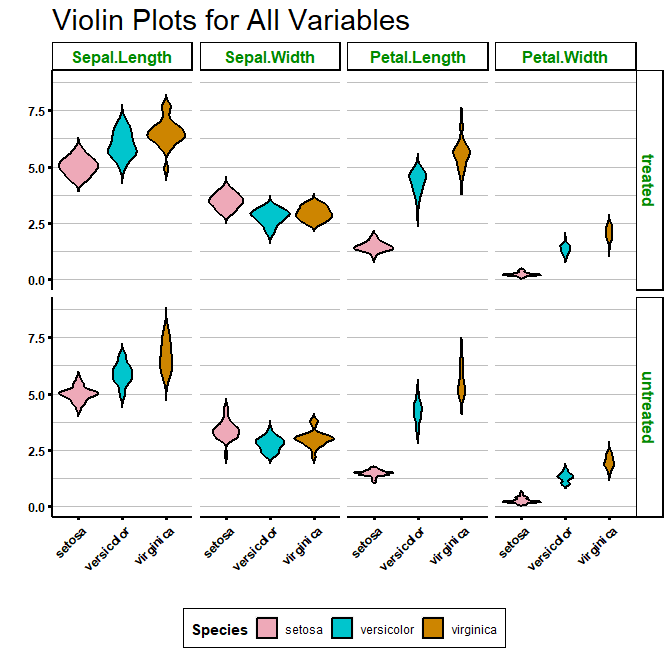
If you prefer it, you can also plot a grid, with one variable against another, by using facet_grid():
Using a function to create many violin plots
Sometimes, it is useful to create a custom function to do very repetitive tasks for you.
For example, to create many violin plots for different variables. Imagine we want to plot a violin plot for sepal width, sepal length, petal width, petal length… and more.
A function can be useful when you want to plot many different variables as a violin plot. This way, instead of having to copy & paste the same chunk of code for each of the variables you want to plot, you can just use your function to plot a violin plot with just one line of code!
Check out my video if you want a step-by-step explanation!
# Adding arguments to your function
get_violin_plots <- function(data, x_variable, y_variable, col_variable, title_x = NULL, title_y = NULL, custom_cols = brewer.pal(10, 'Set3')){

  p1 <- ggplot(data = data, aes(x = !!sym(x_variable), y = !!sym(y_variable), fill = !!sym(col_variable))) +
    geom_violin(trim = FALSE, linewidth = 0.8, colour = 'darkgrey') +
    scale_fill_manual(values = custom_cols) +
    labs(x = title_x, y = title_y) +
    biostatsquid_theme

  return(p1)
}
Now, to use our function, we just need to call it:
get_violin_plots(data = iris, x_variable = 'Species', y_variable = 'Sepal.Width', col_variable = 'Species',
                    title_x = 'Species', title_y = 'Sepal.Width',
                    custom_cols = list('pink', 'gold', 'brown'))
You can also specify your colour dictionary separately:
colour_dict <- list('pink2', 'turquoise3', 'orange3')
get_violin_plots_v2(data = iris, x_variable = 'Species', y_variable = 'Sepal.Width', col_variable = 'Species',
                    title_x = 'Species', title_y = 'Sepal.Width',
custom_cols = colour_dict) 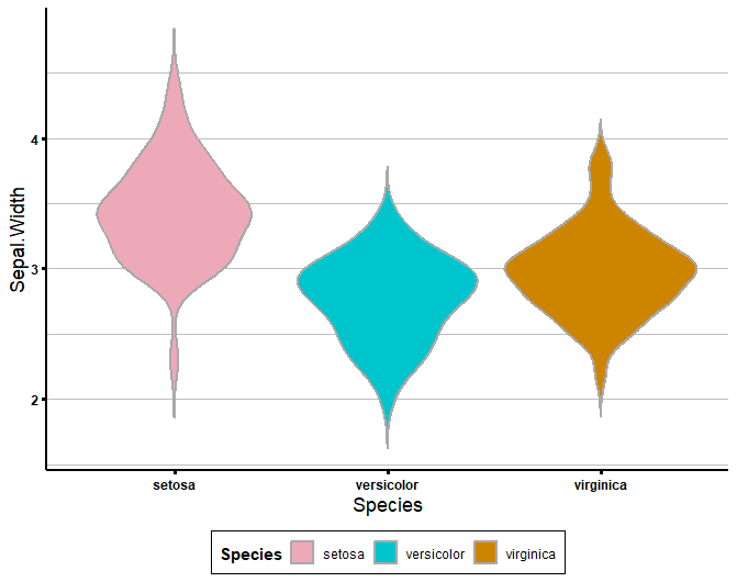
And you can use it with different columns, and even different datasets!
Let’s try using our function to plot violin plots using a different dataset, called “diamonds”.
get_violin_plots(data = iris, x_variable = 'Species', y_variable = 'Petal.Length', col_variable = 'Species',
                    title_x = 'Species', title_y = 'Petal Length (cm)',
                    custom_cols = colour_dict)

# It works with any dataset!
data("diamonds")
head(diamonds)
# This won't work because you did not provide enough colours
get_violin_plots(data = diamonds, x_variable = 'cut', y_variable = 'price', col_variable = 'color',
                    title_x = 'Diamond cut', title_y = 'Price (eur)', custom_cols = colour_dict)

# This won't work because you did not provide enough colours
get_violin_plots(data = diamonds, x_variable = 'cut', y_variable = 'price', col_variable = 'color',
                    title_x = 'Diamond cut', title_y = 'Price (eur)')
And remember, you can always customise your violin plot more. Your function should create a basic violin plot and then you can add customisations for different plots.
# You can always customise it more!
get_violin_plots_v2(data = diamonds, x_variable = 'cut', y_variable = 'price', col_variable = 'color',
                    title_x = 'Diamond cut', title_y = 'Price (eur)')  +
  coord_flip() +
  scale_fill_manual('Colour of diamonds', values = brewer.pal(7, name = 'Set1')) +
  theme(axis.ticks = element_line(colour = 'orange'))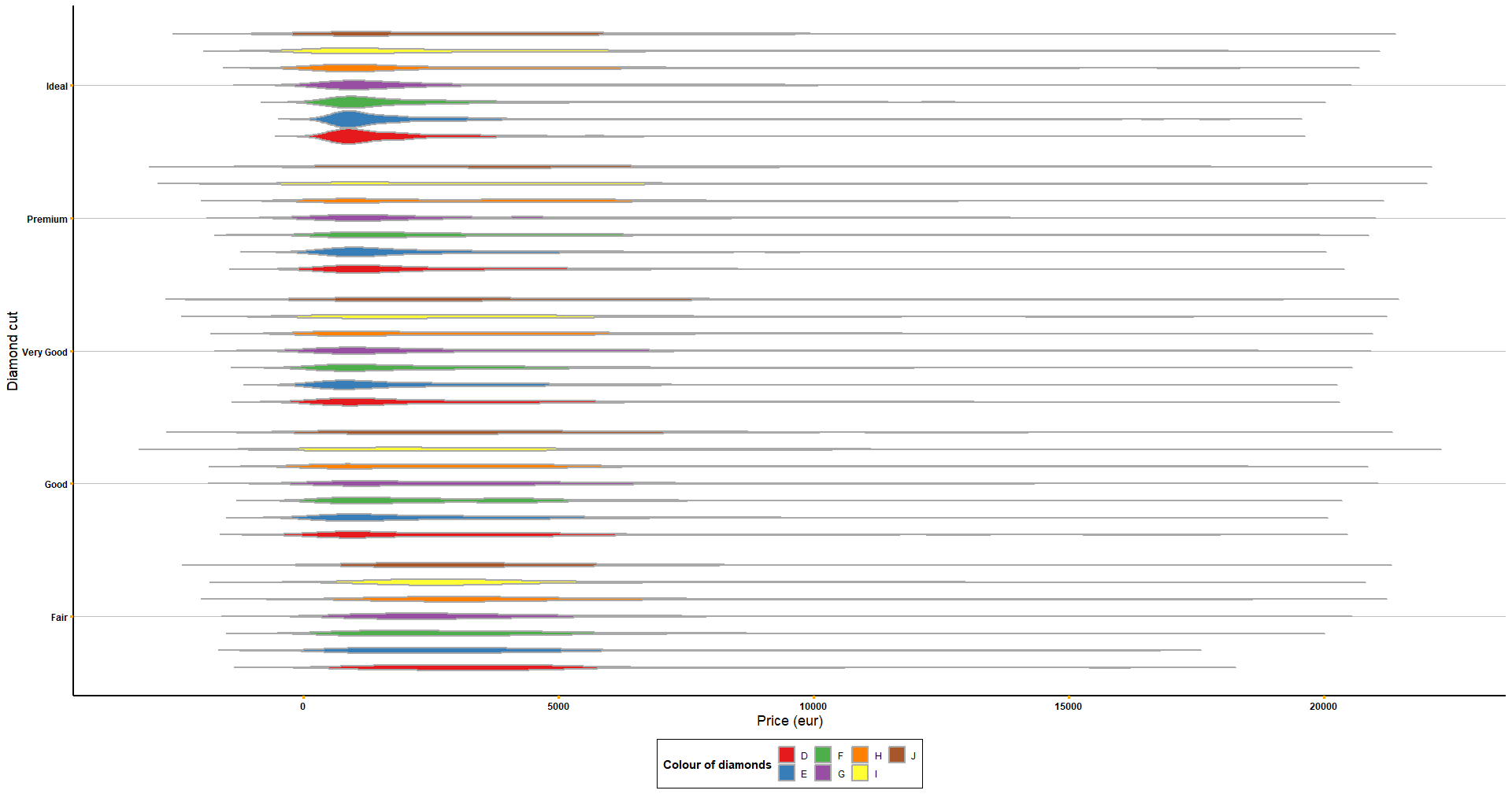
sessionInfo()
Check my sessionInfo() here in case you have trouble reproducting my steps:
> sessionInfo()
R version 4.2.3 (2023-03-15 ucrt)
Platform: x86_64-w64-mingw32/x64 (64-bit)
Running under: Windows 10 x64 (build 22631)

Matrix products: default

locale:
[1] LC_COLLATE=English_Ireland.utf8  LC_CTYPE=English_Ireland.utf8    LC_MONETARY=English_Ireland.utf8 LC_NUMERIC=C
[5] LC_TIME=English_Ireland.utf8

attached base packages:
[1] stats     graphics  grDevices datasets  utils     methods   base

other attached packages:
 [1] reshape2_1.4.4     RColorBrewer_1.1-3 lubridate_1.9.3    forcats_1.0.0      stringr_1.5.0      dplyr_1.1.3        purrr_1.0.2
 [8] readr_2.1.4        tidyr_1.3.0        tibble_3.2.1       ggplot2_3.4.3      tidyverse_2.0.0

loaded via a namespace (and not attached):
 [1] Rcpp_1.0.11       pillar_1.9.0      compiler_4.2.3    plyr_1.8.9        tools_4.2.3       lifecycle_1.0.3   gtable_0.3.4
 [8] timechange_0.2.0  pkgconfig_2.0.3   rlang_1.1.1       cli_3.6.1         rstudioapi_0.15.0 withr_2.5.1       generics_0.1.3
[15] vctrs_0.6.3       hms_1.1.3         grid_4.2.3        tidyselect_1.2.0  glue_1.6.2        R6_2.5.1          fansi_1.0.4
[22] tzdb_0.4.0        magrittr_2.0.3    scales_1.2.1      colorspace_2.1-0  renv_1.0.3        utf8_1.2.3        stringi_1.7.12
[29] munsell_0.5.0
And that is the end of this tutorial!
In this post, I explained how to create your own violin plots in R using ggplot2. We also covered creating many violin plots using facet_wrap(), facet_grid() and a custom function! Hope you found it useful!
Before you go, you might want to check:
Squidtastic!
You made it till the end! Hope you found this post useful.
If you have any questions, or if there are any more topics you would like to see here, leave me a comment down below.
Otherwise, have a very nice day and… see you in the next one!
Squids don't care much for coffee,
but Laura loves a hot cup in the morning!
If you like my content, you might consider buying me a coffee.
You can also leave a comment or a 'like' in my posts or Youtube channel, knowing that they're helpful really motivates me to keep going:)
Cheers and have a 'squidtastic' day!


0 Comments