What is a volcano plot?
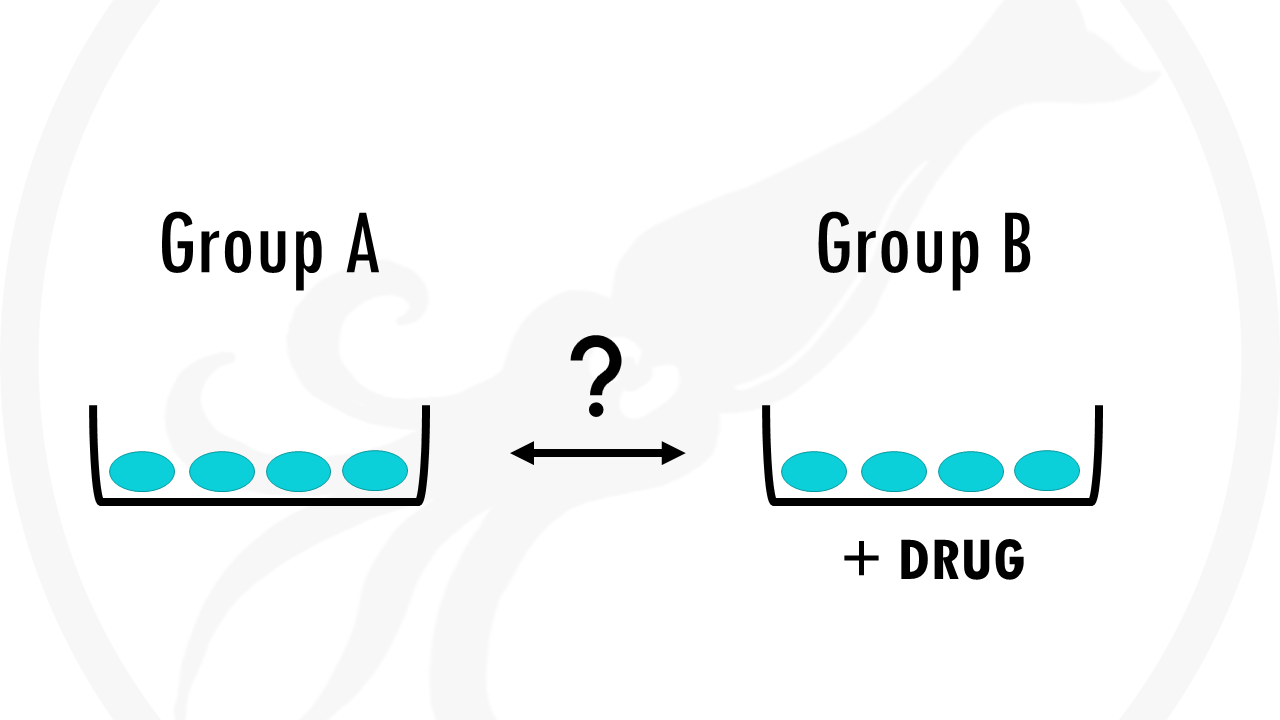
Imagine you are carrying out an RNAseq experiment. You have a group of cells A and a group of cells B. Group B was treated with a drug.
Now you want to see what effect the drug has in gene expression. Does the drug cause some genes to be upregulated? Does it downregulate the expression of other genes? By how much?
A great way to visualise this is using a volcano plot.
A volcano plot is a type of scatterplot that shows statistical significance (p-value) versus magnitude of change (fold change).
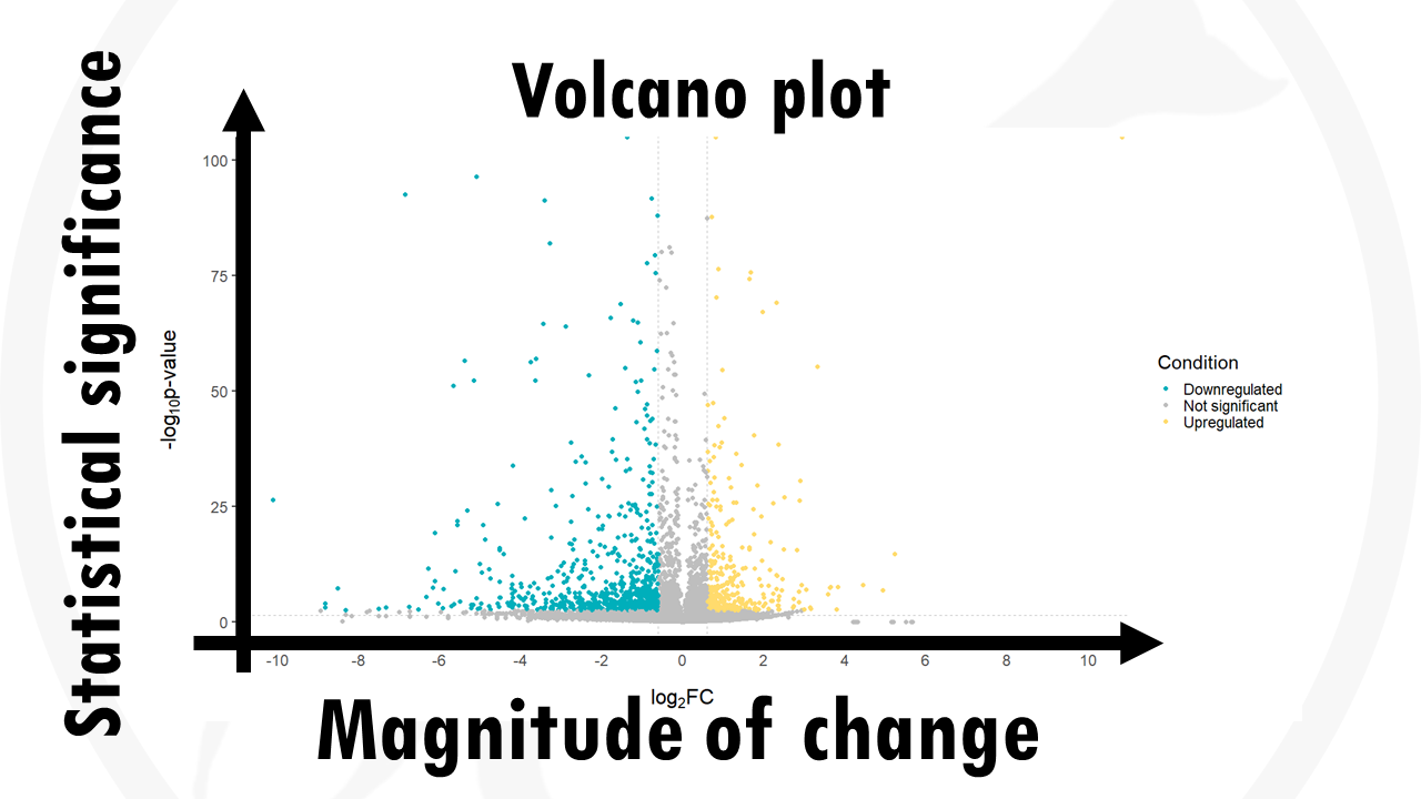
In this case, each dot represents a gene.
This way, we can quickly identify genes with large fold changes that are also statistically significant.
In summary, a volcano plot allows us to quickly visualise and identify the most biologically significant genes.
How do we interpret a volcano plot?
Interpreting and reading a volcano plot is very easy.
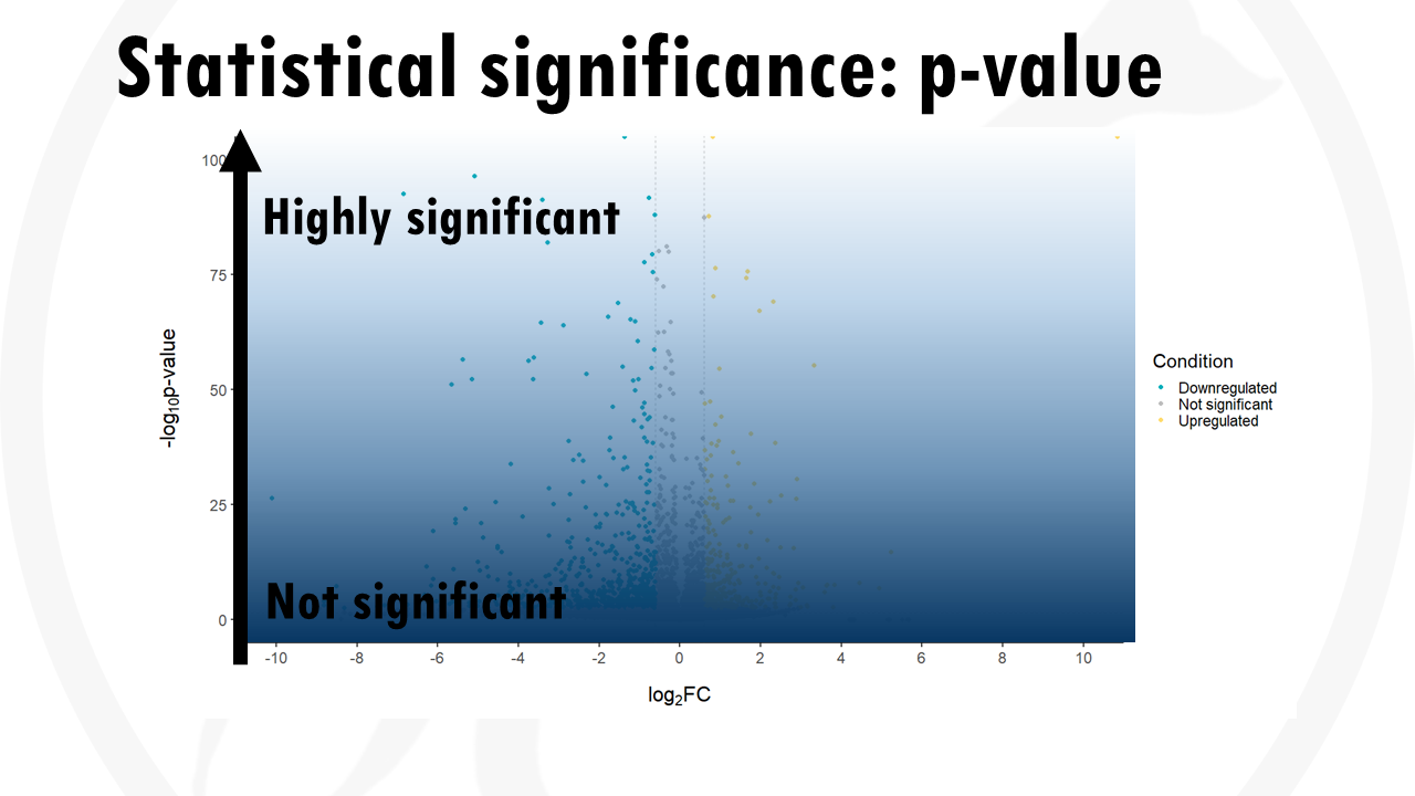
The y axis shows the level of statistical significance. It is usually represented by the p value.
The most statistically significant genes are towards the top, as they have the lowest p-values.
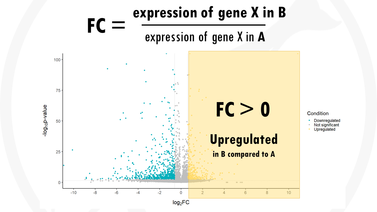
The x axis shows the fold change (FC). The fold change of a gene is the ratio between the gene expression of the two groups. For example, the FC for gene X would be calculated as the gene expression in group B (drug) divided by the gene expression in group A (no drug).
If the expression of a certain gene in higher in group B compared to group A the fold change will be positive. This means that the most upregulated genes will be towards the right, they have a positive fold change.
If the expression of a certain gene in higher in group A compared to group B the fold change will be negative. The most downregulated genes are towards the left, they have a negative fold change. This means they have a lower expression in group B compared to group A.
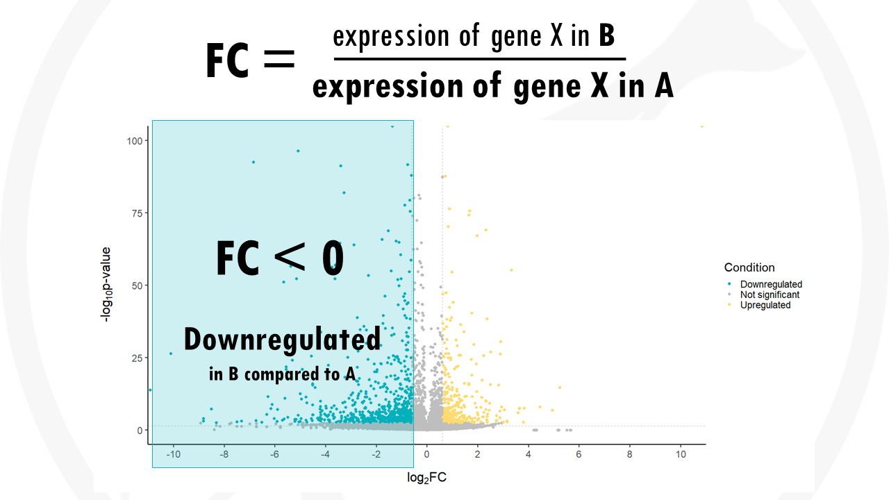
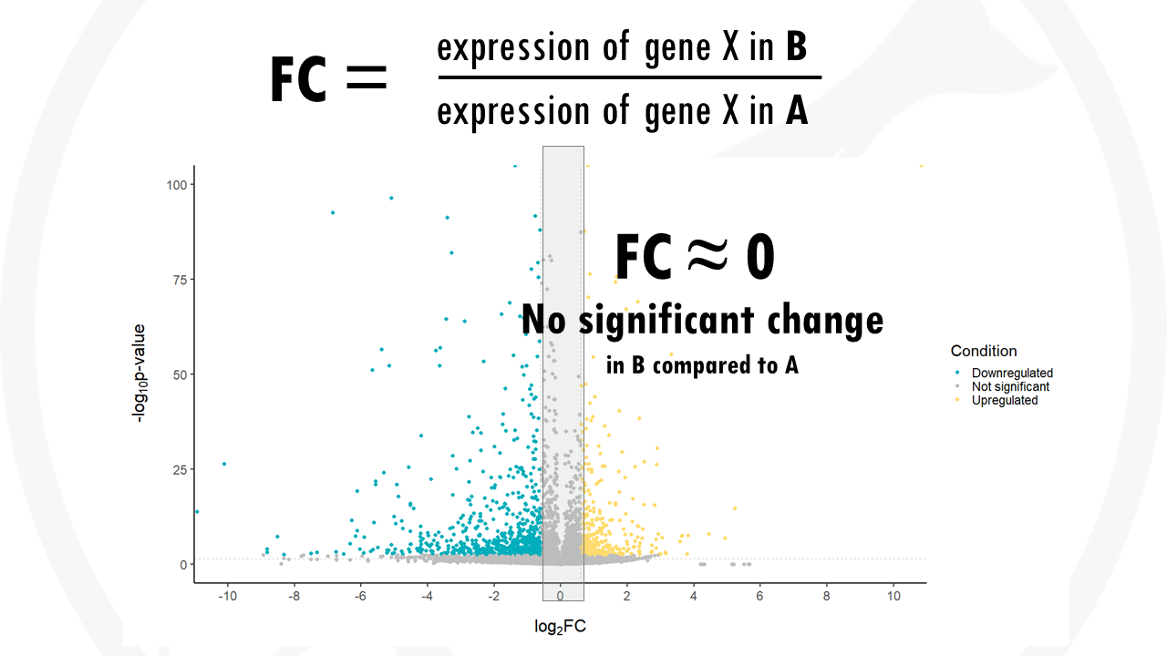
If the fold change is 0, the expression does not change between one group and another.
To interpret a volcano plot:
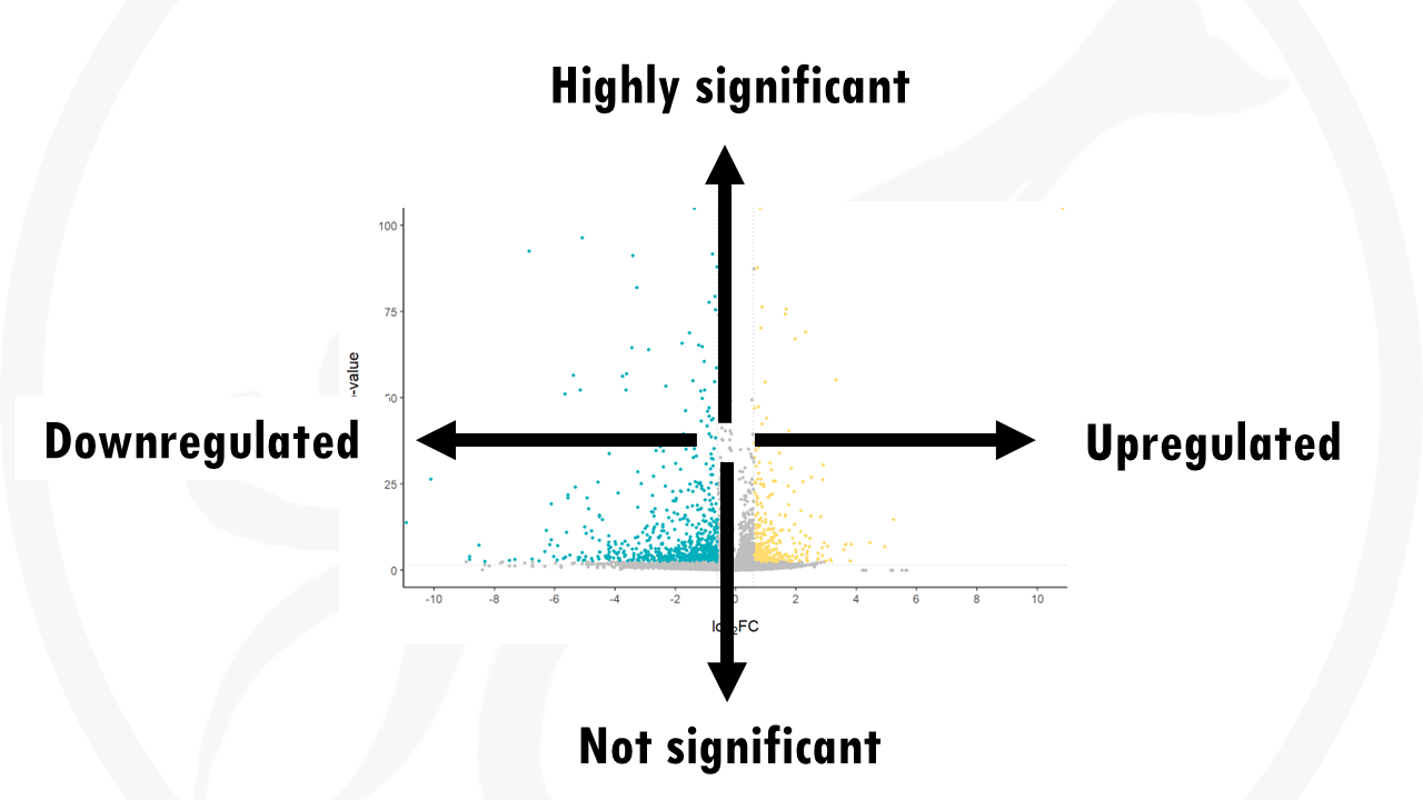
The y axis shows how statistically significant the gene expression differences are: more statistically significant genes will be towards the top (lower p-values).
The x axis shows the how big the difference in gene expression is (fold change):
- A positive fold change means the gene is upregulated in group B compared to group A.
- A negative fold change means the gene is downregulated in group B compared to A.
- A fold change near 0 means there are no big differences in gene expression.

Remember!
- A volcano plot is used to easily visualise which are the most significant differences and how big is that difference between two groups.
- The y axis shows if that change is significant or not. It is usually in the form of -log10 (p-value).
- The x axis shows the fold change, how many times are genes expressed more or less compared to the other group.
- If you want to check highly significant genes, they will have the higher -log10 p values. If you want downregulated genes, you usually look to the left, to negative fold changes. Upregulated genes will then be to the right, with positive fold changes.
And that is the end of this tutorial!
In this post, I explained the differences between log2FC and p-value, and why in differential gene expression analysis we don't always get both high log2FC and low p-value. Hope you found it useful!
Before you go, you might want to check:
Squidtastic!
You made it till the end! Hope you found this post useful.
If you have any questions, or if there are any more topics you would like to see here, leave me a comment down below.
Otherwise, have a very nice day and... see you in the next one!


I think I found two typos where “in” probably should be “is”.
“If the expression of a certain gene in higher in group B compared to group”
I think you mean “If the expression of a certain gene is higher in group B…”
Hi, yep you are right, good catch! Hopefully the main message is still understandable:)
Thank you for this clear explanation making it so much easy for me to understand.
Thanks for your feedback! Glad it was useful:)
Thanks for the detailed explanation. If possible, could you please explain how to determine or set threshold to volcano plots?
Hi! Thanks for your comment, it’s a great point. Thresholds are dependent on the data and the person analysing the data I would say! It depends on how confident you want to be that your results are statistically significant. But most people go with p-adj 0.05 or 0.01.
And how do you decide the threshold for Log2FC?
A negative fold change implies ‘downregulation’. That is easy to understand. In many publications however, such as 10.1126/sciimmunol.ade3525 (fig 1E), I see that the negative fold change actually indicates ‘upregulation’ in a distinct sample set. I find that confusing. How do you interpret a volcano plot in which two sample groups are compared?
Hi! This is a great observation. Log2FC is used to compare one group versus another. For example, “treated” versus “control”. In that case, positive fold changes would indicate upregulation in the first group (treated) versus the second group (control). Negative fold changes would indicate downregulation in the first group (treated) versus the second group (control). However, notice that something that is DOWNregulated in TREATED versus control, is the same as saying something is UPregulated in CONTROL versus treated.
So in that publication you send, they show just that, they just rephrased it: in red, we see genes UPregulated in CD8+ cells compared to CD8- cells. In red, we see genes that are DOWNregulated in CD8+ cells compared to CD8- cells, which is the same as saying UPregulated in CD8- cells compared to CD8+ cells.
Hope this made sense! Thanks for your comment:)
Thanks! Your explanations makes the chart so easy to understand.
I really feel like I can understand these papers better now – not just their data, but also their study design.
I disagree that the points in grey with FC~0 are not significant. I think the correct way to say it would be that they are statistically significant but less biologically relevant due to so little fold change.
You are definitely correct. Genes with FC ~ 0 can still be statistically significantly different (if e.g., p val < 0.05) but as you say they are not "significant" meaning "interesting" as there's not a big difference between groups. Thanks for your comment!
Great tutorial! Thanks!