Find out some of the best tricks and tips for visualisation in R!
Having cool results is one thing, but being able to show those results is another. Choosing the right plot and making it attractive is just as important to get your message across clearly. In this post, you’ll find some of the best tips and tricks I use to create pretty and publication-ready plots with ggplot2 and more! You will find out what are the top visualisation tricks you should know in R.
As with all my coding posts, you can copy all the code snippets and adapt them to your own datasets to easily apply them to your case!
So if you are ready… let’s dive in!
Follow this tutorial on Youtube to create pretty plots in R with me!
Table of contents
Before you start
Tip #1: Plot themes
Tip #2: Combine plots
Tip #3: Saving plots
This tutorial will give you general tips and tricks for your plotting in R. But if you are looking for more specific types of visualisation, you might want to check my other tutorials to create heatmaps or volcano plots in R!
Visualisation in R tutorial
Let’s start by setting our environment, importing the relevant libraries and the dataset we will use for this tutorial.
# Setting up environment ===================================================
# Clean environment
rm(list = ls(all.names = TRUE)) # will clear all objects including hidden objects
gc() # free up memory and report the memory usage
options(max.print = .Machine$integer.max, scipen = 999, stringsAsFactors = F, dplyr.summarise.inform = F) # avoid truncated output in R console and scientific notation

# Loading relevant libraries
library(tidyverse) # includes ggplot2, for data visualisation. dplyr, for data manipulation.
library(RColorBrewer) # for a colourful plot

# Importing dataset ===================================================
data(iris)
For the purpose of this tutorial, we will create some sample plots with the iris dataset.
#1: Plot themes
If you have been using ggplot2 to create your plots in R, you probably have already heard of ggplot themes.
Let’s first create an easy scatterplot with ggplot:
# 1. Creating and using a custom theme ===================================================
ggplot(data = iris, aes(x = Sepal.Length, y = Sepal.Width, col = Species)) +
  geom_point()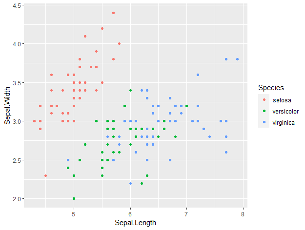
This is how ggplot plots look by default. With just an additional line of code, we can make our plot look so much nicer by setting a theme. For example, you can set a dark theme with ‘ + theme_dark() ‘
ggplot(data = iris, aes(x = Sepal.Length, y = Sepal.Width, col = Species)) +
  geom_point() +
  theme_dark()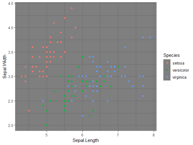
By just adding that line of code, we changed the entire theme of the plot, which now has a black background.
Perhaps that’s not the theme you are looking for. You can find more ggplot themes here.
Some of my favourites are theme_classic() and theme_bw().
But you can go one step further and create your own theme, with theme(). You can customise the size, font type, colour of all text (axis labels, titles…) separately or together, line elements like the grid and the axis lines, the legend position, if you want a background or a box around it… virtually anything.
For example, I created a ‘biostatsquid_theme’ like this:
biostatsquid_theme <- theme(plot.title = element_text(size = rel(2)),
                            panel.grid.major.y = element_line(colour = 'gray'),
                            panel.grid.minor.y = element_line(colour = 'gray'),
                            panel.grid.major.x = element_blank(),
                            panel.grid.minor.x = element_blank(),
                            plot.background = element_rect(fill = NULL, colour = 'white'),
                            panel.background = element_rect(fill = 'white'),
                            # Axis stuff
                            axis.line = element_line(colour = 'black', linewidth = 1),
                            axis.text = element_text(colour = "black", face = 'bold'),
                            axis.text.x = element_text(size = rel(1)),
                            axis.text.y = element_text(size = rel(1)),
                            axis.title = element_text(size = rel(1.2)),
                            axis.ticks = element_line(colour = 'black', linewidth = 1.2),
                            # Legend stuff
                            legend.position = "bottom",
                            legend.margin = margin(6, 6, 6, 6),
                            legend.title = element_text(face = 'bold'),
                            legend.background = element_blank(),
                            legend.box.background = element_rect(colour = "black"))

ggplot(data = iris, aes(x = Sepal.Length, y = Sepal.Width, col = Species)) +
  geom_point() +
  biostatsquid_theme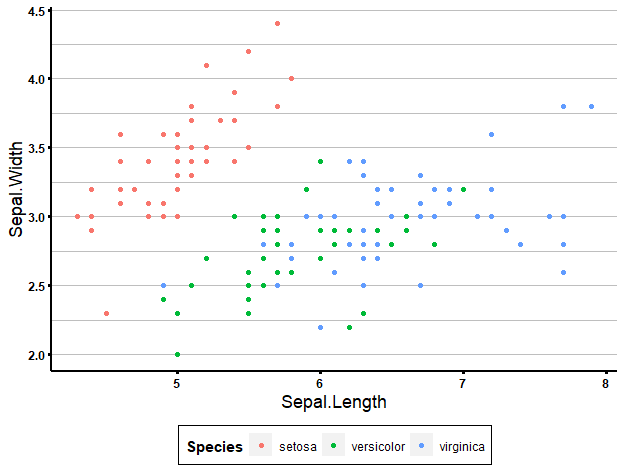
Creating your own theme from scratch might be a bit overkill. It depends on what kind of visualisation style you are looking for, perhaps the preset themes are good enough for you. If there is one particular thing you don’t like or want to change about a theme, you can always set it as a base theme and add theme() to modify it.
For example, here I use the theme_classic() as base, and then change the appearance of the text in the x-axis, remove the y-axis, and move the legend to the left (a bit bizarre, I know):
ggplot(data = iris, aes(x = Sepal.Length, y = Sepal.Width, col = Species)) +
  geom_point() +
  theme_classic() +
  theme(axis.text.x = element_text(colour = 'blue', size = 15),
        axis.line.y = element_blank(),
        legend.position = 'left')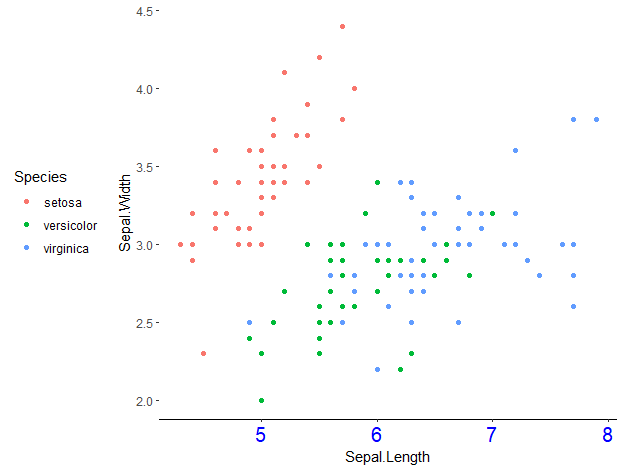
Once you are happy with your theme, you might want to apply it to ALL your plots. Of course, you can just add + theme() to each of your ggplot objects, but a great visualisation trick is to use theme_set(). If you run it at the beginning of your script, it will apply whichever theme you choose to all your plots. And again, if for one particular plot you want something different (e.g., no legend), you can always add + theme() and modify it.
theme_set(biostatsquid_theme)
ggplot(data = iris, aes(x = Sepal.Length, y = Sepal.Width, col = Species)) +
  geom_point()
Squidtip
- ggplot themes allow you to change the appearance of your plots to make them look more professional and ‘cleaner’
- You can use pre-set themes or customise your own – or both!
- Use theme_set() to apply your theme of choice to all your plots.
Keep reading for more visualisation tips in R!
#2 Combine plots
Sometimes, you want to combine plots into one, for example, for a publication figure.
In R, there are many ways of doing this. Some of the libraries I like to use are cowplot, patchwork and ggpubr.
Let’s first create some plots:
p1 <- ggplot(data = iris, aes(x = Sepal.Length, y = Sepal.Width, col = Species)) +
  geom_point()
p2 <- ggplot(data = iris, aes(x = Sepal.Length, y = Sepal.Width, fill = Species)) +
  geom_col()
Combining plots with cowplot
Now, let’s combine p1 and p2 plots together with plot_grid() from the package cowplot. We can specify the number of columns, rows, the relative heights and widths…
For more information on the cowplot package and it’s options, click here. The github page has more links to get a quick introduction to the main features of this package, and additional documentation.
library(cowplot)
cowplot::plot_grid(p1, p2, ncol = 1, nrow = 2,
                   rel_heights = c(2, 3))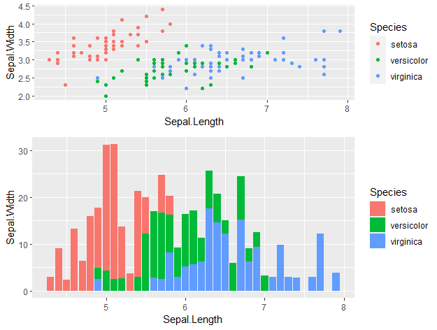
cowplot::plot_grid(p1, p2, ncol = 2, nrow = 1,
                   rel_widths = c(2, 3))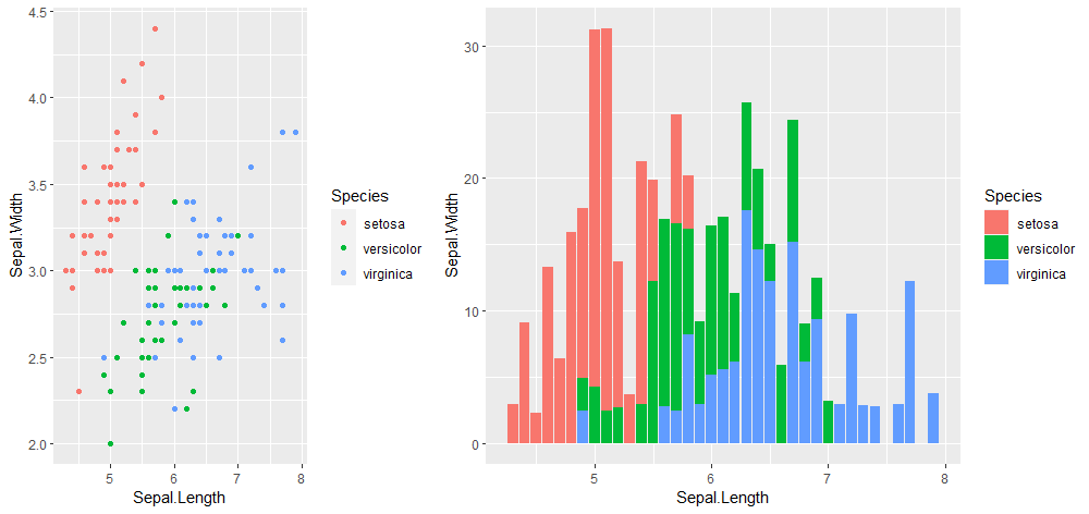
You can also add labels, which is very useful if you want to combine plots for a figure in a publication.
Squidtip
If you get an error similar to this one, it’s because your theme did not include label settings – you can fix it by defining the label_fontfamily and label_colour.
Error in `geom_text()`:
! Problem while setting up geom aesthetics.
ℹ Error occurred in the 2nd layer.
Caused by error in `check_aesthetics()`:
! Aesthetics must be either length 1 or the same as the data (1)
✖ Fix the following mappings: `family`
Run `rlang::last_trace()` to see where the error occurred.
cowplot::plot_grid(p1, p2, ncol = 2, nrow = 1,
rel_widths = c(5, 3), labels = c('A.', 'B.'),
label_fontfamily = "Times", label_colour = "black")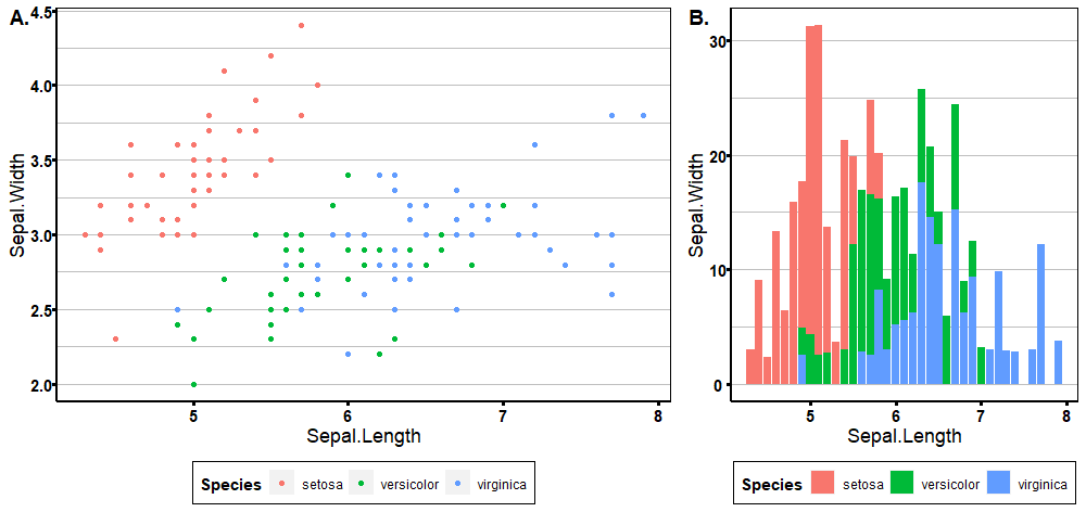
Combining plots with pathchwork
library(patchwork)
plot_layout(p1 + p2 + gridExtra::tableGrob(iris[1:10, 1:2]), widths = c(2, 4, 2))
Another useful library to know is patchwork. I like to use it to include tables in my figures:
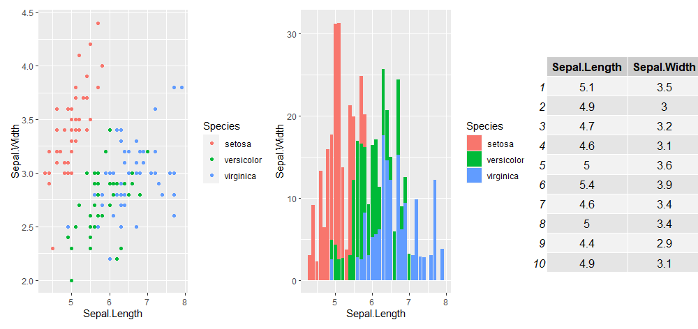
But there is a lot more you can do with patchwork, check our their quick tutorial and examples here.
Combining plots with ggpubr
ggpubr is also an amazing library to combine plots and create publication-ready visualisations. You can check more about the ggpubr package here.
It’s really easy to use with ggplot objects, and there are lots of settings and customisations available, like using a common legend for all your plots.
ggarrange(p1, p2, ncol = 2, common.legend = TRUE, legend = 'bottom')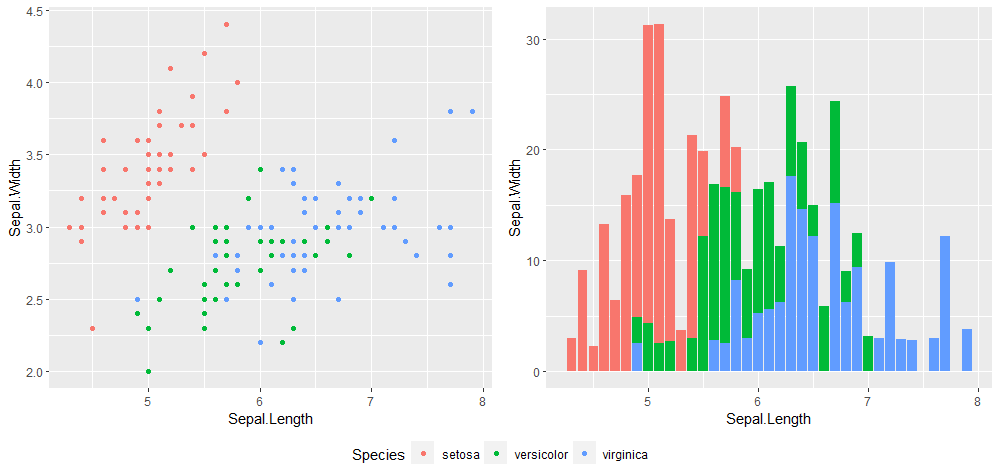
Squidtip
My top tip to combine plots and create publication-ready visualisations in R is to use the libraries cowplot, patchwork or ggpubr.
#3: Saving plots
If you are using the ‘Export’ button in the Plots pane of RStudio, this is the top tip for you!
Saving plots using code is really easy and it will save you a lot of time, especially when you have to re-export the figure many times. Like before, there are many ways of doing this.
To save a plot, you need to ‘tell’ R:
- the plot(s) you want to save
- the filename. If you just specify a name for the plot, like ‘super_plot.png’, it will save it to your current working directory. If you want a different folder, you must specify the full path (e.g., C:/Users/Biostatsquid/Plots/Cool_plots/super_plot.png)
Optionally, you can also specify:
- number of rows/columns you want your plots arranged in
- the height and width of the image
- …
This is the basic structure to save a plot in R. You first open a png ‘device’ (you can change the format to pdf, jpeg… whatever you want, really.
Then, you print the plot(s).
Finally, don’t forget to close your device with dev.off!
png(filename = 'super_plot.png')
print(p1)
dev.off()
We can easily add a few more ‘upgrades’ to make plot saving more automatic.
For example, I like setting the filename by specifying my output directory (the folder where the image will be exported to). This way, if I want to change the name of the image, I can easily do it. Or, if I want to change the output folder, I can also change out_dir and when I run the code I know all my images will be saved to the new folder.
I also like setting the height and width of the image as a function of my rows and columns. This is useful when I have a list of plots and I am playing around with the data, sometimes exporting 10 plots, sometimes 3, sometimes I want them in 2 columns and sometimes I want 6 columns. By making the height and width of the image depend on the number of rows and columns, I can get the plots to have the same ratio and not become ‘deformed’. But you can just specify a number if you want.
# Set the output directory where the plots will be saved to.
out_dir <-  "C:/Users/laura/Documents/Biostatsquid/Plots/"
dir.create(out_dir, showWarnings = FALSE)
# Let's be fancy and make the height and width depend on the number of columns and rows
# we want our plots distributed in
number_cols <- 2
number_rows <- 1
png(filename = paste0(out_dir, 'super_plot.png'), height = 750 * number_rows, width = 750 * number_cols)
print(p1 + p2)
dev.off()
If you have already combined the plots with one of the libraries we mentioned in the previous section, then you don’t need to specify p1 + p2. You can also just save it as a new object and save the combined plot as a single plot:
number_cols <- 1
number_rows <- 1
combined_plot <- ggarrange(p1, p2, ncol = number_cols, nrow = number_rows, common.legend = TRUE, legend = 'bottom')
png(filename = paste0(out_dir, 'super_plot.png'), height = 750 * number_rows, width = 750 * number_cols)
print(combined_plot)
dev.off()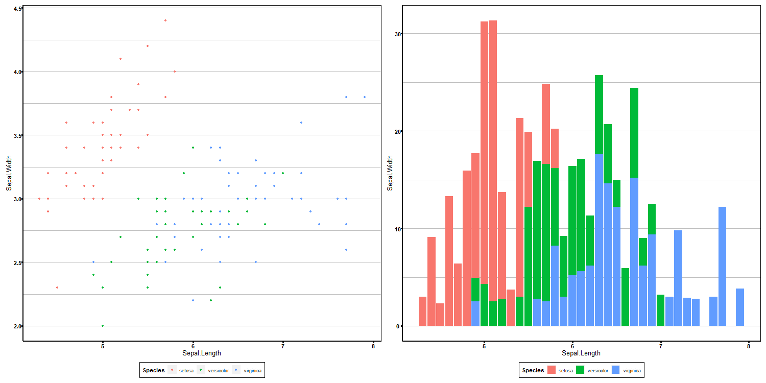
If you are not that convinced by the png() and dev.off() method, you can also use ggsave! Read more about ggsave here.
ggsave(combined_plot, paste0(out_dir, 'super_plot.png'))Ending notes
Wohoo! You made it ’til the end!
In this post, I shared some of my top tricks and tips on how to visualise your results in R. I hope you found it useful!
Are there any more tricks and tips you’d like to see? Let me know in the comments below! Also don’t hesitate to leave a comment if there is anything unclear, that you would like explained differently/ further, or if you’re looking for more resources on bioinformatics! Your feedback is really appreciated and it helps me create more useful content:)
Before you go, you might want to check:
Squidtastic!
You made it till the end! Hope you found this post useful.
If you have any questions, or if there are any more topics you would like to see here, leave me a comment down below.
Otherwise, have a very nice day and… see you in the next one!
Squids don't care much for coffee,
but Laura loves a hot cup in the morning!

If you like my content, you might consider buying me a coffee.
You can also leave a comment or a 'like' in my posts or Youtube channel, knowing that they're helpful really motivates me to keep going:)
Cheers and have a 'squidtastic' day!
And that is the end of this tutorial!
In this post, I explained the differences between log2FC and p-value, and why in differential gene expression analysis we don't always get both high log2FC and low p-value. Hope you found it useful!
Before you go, you might want to check:
Squidtastic!
You made it till the end! Hope you found this post useful.
If you have any questions, or if there are any more topics you would like to see here, leave me a comment down below.
Otherwise, have a very nice day and... see you in the next one!


Hi Biostatsquid!
I have a request, any chance you could make a short tutorial on the basics of a violin plot ?
R newbie