R TUTORIAL:
Pre-process your scRNAseq data with this easy, step-by-step pipeline
Table of contents
Before you start
scRNAseq pre-processing pipeline: complete script
Step-by-step guide to analyse your data with Seurat
Step 1: Set up your script
Step 2: Create the Seurat object
Step 3: QC & basic filtering
Step 4: Normalisation
Step 5: Identification of highly variable features
Step 6: Scaling
Step 7: PCA
Step 8: Clustering
Step 9: UMAP
Step 10: Save it!
Before you start…
In this tutorial we will go over the basics steps of preprocessing for single cell RNA seq data in R using the Seurat package.
Pre-processing is an essential step in scRNAseq data analysis. It transforms your raw count matrix into a pre-processed dataset ready for downstream analysis.
If you want to know more about scRNAseq data analysis pipelines, you can check out The hitchhiker’s guide to single-cell transcriptomics and data analysis pipelines.
Data pre-processing in R is definitely not the most exciting part of data analysis, but it will have an enormous impact in your results. The steps are very easy to follow and there are many workflows available to get the best results from your dataset.
In this step-by-step guide you will learn the standard pipeline using the Seurat package, which is very common in transcriptomics analysis. We will go through the basic steps of quality control and filtering, normalisation, identification of highly variable features (genes), clustering and different dimensionality reduction methods (PCA, UMAP…).
If you are a beginner in R, don’t be overwhelmed! Each line of code will be explained so you know what is happening at each point of the workflow. Deciding on which parameters and thresholds to use is always the most difficult part, but I will give you general guidelines to make it easier.
You might also want to check out my Youtube tutorial on how to analyse your scRNAseq data. Or if you prefer a written step-by-step guide, then please continue reading.
In this Youtube video, I explain how to pre-process your scRNAseq data in R using the Seurat package step by step!
Here is a sneak-peak of what we’ll be working on in this tutorial! You can use this code to follow the standard pre-processing pipeline, or keep reading to follow my step-by-step guide.
# 1. Import data ===================================================
nsclc_sm <- Read10X_h5(filename = "40k_NSCLC_DTC_3p_HT_nextgem_Multiplex_count_raw_feature_bc_matrix.h5")
str(nsclc_sm) # Check the multiple modalities (list of matrixes) - we're interested in Gene expression
cts <- nsclc_sm$`Gene Expression`


# 2. Create your Seurat object (raw counts) ===========================================
nsclc_seu <- CreateSeuratObject(counts = cts, project = 'NSCLC', min.cells = 3, min.features = 200)
str(nsclc_seu)


# 3. QC ===================================================
## perc_mt -----------------------
nsclc_seu[['percent_mt']] <- PercentageFeatureSet(nsclc_seu, pattern = '^MT-')
View(nsclc_seu@meta.data)
VlnPlot(nsclc_seu, features = c("nCount_RNA", "nFeature_RNA", "percent_mt"), ncol = 3)
FeatureScatter(nsclc_seu, feature1 = "nCount_RNA", feature2 = "nFeature_RNA") +
  geom_smooth(method = 'lm')


## Filtering -----------------------
nsclc_seu <- subset(nsclc_seu, subset = nFeature_RNA > 200 & nFeature_RNA < 2500 & percent_mt < 5)

## Normalisation -----------------------
#nsclc_seu <- NormalizeData(nsclc_seu, normalization.method = 'LogNormalize', scale.factor = 10000)
nsclc_seu <- NormalizeData(nsclc_seu)
str(nsclc_seu)


## Identify highly-variable features ===========================================
nsclc_seu <- FindVariableFeatures(nsclc_seu, selection.method =  'vst', nfeatures = 2000)
# Identify the top 10 HVGs
top10 <- head(VariableFeatures(nsclc_seu), 10)
top10_plot <- VariableFeaturePlot(nsclc_seu)
LabelPoints(plot = top10_plot, points = top10, repel = TRUE)


# Scaling ==================================================
all_genes <- rownames(nsclc_seu)
nsclc_seu <- ScaleData(nsclc_seu, features = all_genes)
View(nsclc_seu@assays$RNA)


# PCA ===================================================
nsclc_seu <- RunPCA(nsclc_seu, features = VariableFeatures(nsclc_seu))
print(nsclc_seu[['pca']], dims = 1:5, nfeatures = 5)
DimHeatmap(nsclc_seu, dims = 1, cells = 500, balanced = TRUE)
DimPlot(nsclc_seu, reduction = "pca") + NoLegend()

# determine dimensionality of the data
ElbowPlot(nsclc_seu)


# Clustering ===================================================
nsclc_seu <- FindNeighbors(nsclc_seu, dims = 1:15)
nsclc_seu <- FindClusters(nsclc_seu, resolution = c(0.1, 0.3, 0.5, 0.7, 1))
View(nsclc_seu@meta.data)

DimPlot(nsclc_seu, group.by = 'RNA_snn_res.1', label = TRUE)

Idents(nsclc_seu) <- 'RNA_snn_res.0.1' # set identity of clusters


# UMAP ===================================================
nsclc_seu <- RunUMAP(nsclc_seu, dims = 1:15)
DimPlot(nsclc_seu, reduction = 'umap')


# Save it! ===================================================
saveRDS(nsclc_seu, file = 'nsclc_seu.RDS')
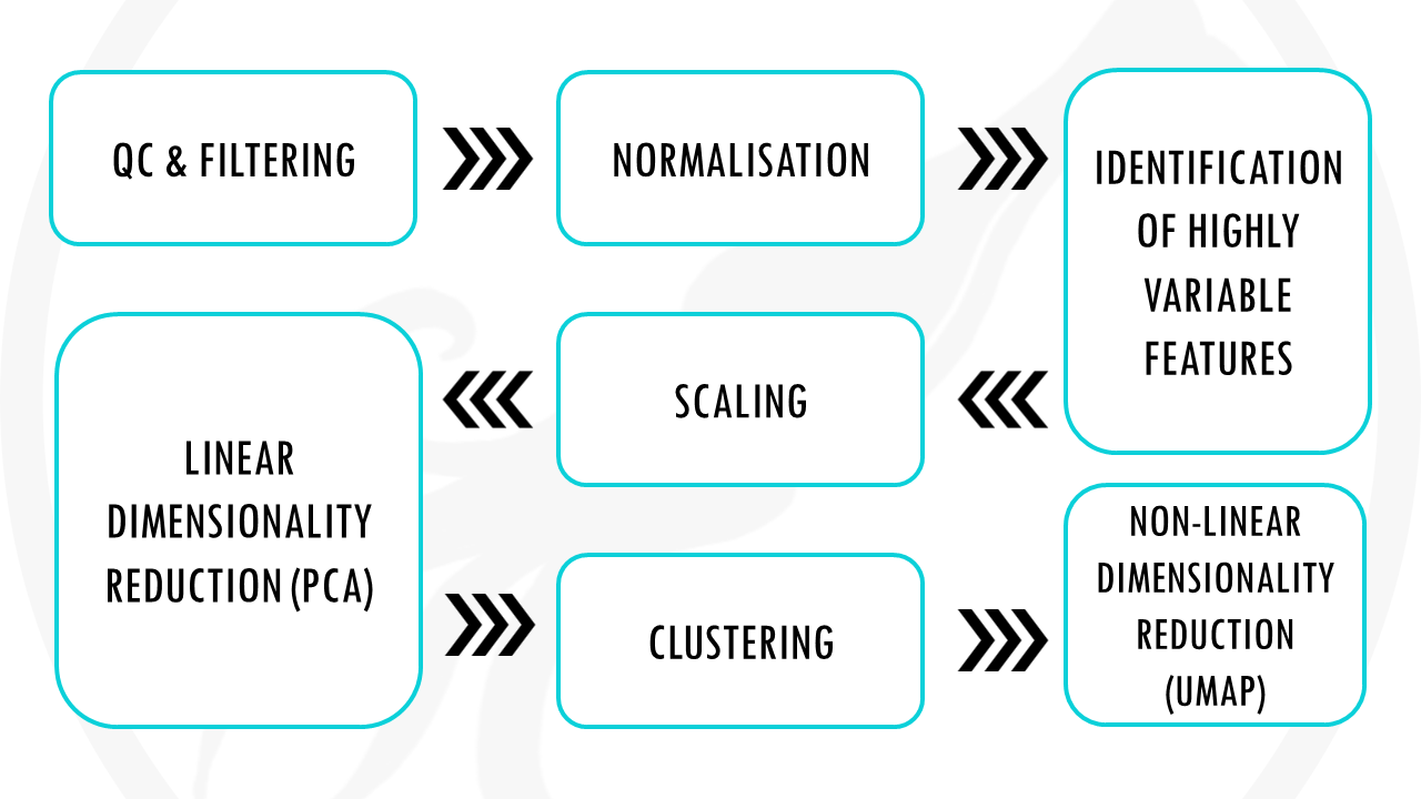
Standard scRNAseq pre-processing workflow in 10 steps
The dataset
For this tutorial, I will use the non-small cell lung cancer (NSCLC) dissociated tumor cells from 7 donors dataset from 10X genomics. You can read more about the dataset and download it freely here. Make sure you download the Gene Expression – Feature / cell matrix HDF5 (raw).
Or, alternatively, you can just download the dataset by clicking on this button:
Step 1: Set up your script and load the data
Before we start, it’s always good practice to clean-up our environment in case we have hidden objects in the background, free up memory, and set our working directory. We also need to load the necessary libraries. Today we will be working with the Seurat package.
# Setting up environment ===================================================

# Clean environment
rm(list = ls(all.names = TRUE)) # will clear all objects including hidden objects
gc() # free up memory and report the memory usage
options(max.print = .Machine$integer.max, scipen = 999, stringsAsFactors = F, dplyr.summarise.inform = F) # avoid truncated output in R console and scientific notation

# Loading relevant libraries
library(tidyverse) # includes ggplot2, for data visualisation. dplyr, for data manipulation.
library(Seurat)

# Set input path
path <- "~/Biostatsquid/Scripts/scRNAseq/"
setwd(path)

list.files(path)
set.seed(42)
Let’s get started! The first step when is of course to load our raw count data matrix. You can use the function Read10X_h5() from the Seurat package. I will read it into an object called nsclc_sm (non-small cell lung cancer sparse matrix). When it loads, you will see in the console a message saying:
Genome matrix has multiple modalities, returning a list of matrices for this genome.
We can check what the multiple modalities mean by checking the structure of our data object nsclc_sm with str(). This shows that the object is in fact a list of matrices containing different types of data: the gene expression matrix, antibody capture, and multiplexing capture. We are interested in the gene expression matrix, which we assign to the object ‘counts’ (cts).
# Import data ===================================================
nsclc_sm <- Read10X_h5(filename = "40k_NSCLC_DTC_3p_HT_nextgem_Multiplex_count_raw_feature_bc_matrix.h5")
str(nsclc_sm) # Check the multiple modalities (list of matrixes) - we're interested in Gene expression
cts <- nsclc_sm$`Gene Expression`
As you can see, the cts object is of type ‘Large dgCMatrix’. It is a sparse matrix.
Basically, a sparse matrix represent 0s (so no molecules detected) as dots. This saves memory and it also makes processes faster since most values in an scRNA-seq matrix are 0.
Step 2: Create your Seurat object
Great! So now we can convert our count matrix to a Seurat object, using the function CreateSeuratObject(). We need to specify the counts, we can give our project a name, and we can also select the min cells and min features to consider. In this case, we will only include cells with at least 3 features (genes), and features (or genes) that are expressed in at least 200 cells.
# Initialise Seurat object (raw, non-normalised data)
nsclc_seu <- CreateSeuratObject(counts = cts, project = 'NSCLC', min.cells = 3, min.features = 200)
str(nsclc_seu)
Step 3: Quality control
And now we have our Seurat object, nice! Now we can start our preprocessing steps.
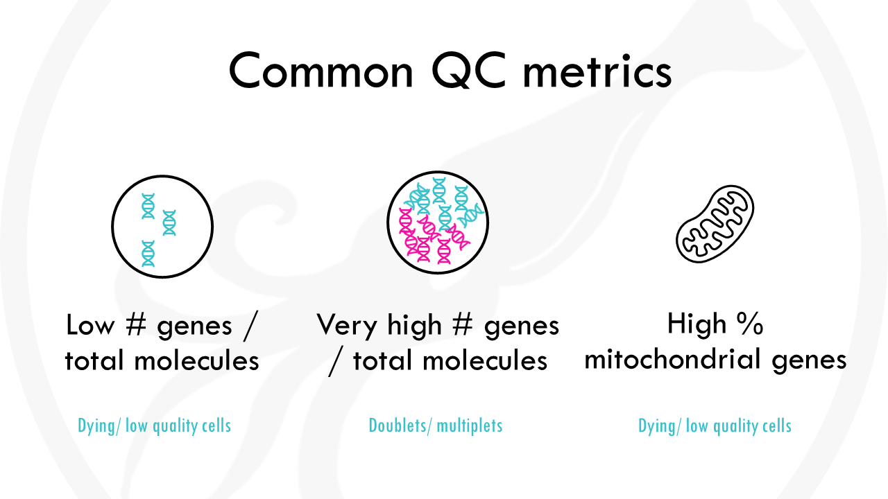
The first step is general quality control. What does this mean? Essentially, we want to remove:
- cells with a very low number of unique genes detected, as they probably are low-quality droplets or empty cells.
- cells with a very high gene count, as it probably means they are doublets. Sometimes cells stick together and then you are getting gene expression data not from 1 cell, but 2 (or more!).
- cells with a high percentage of mitochondrial genes. Mitochondrial genes are usually transcribed in the mitochondria, not the cytoplasm. A high number of mitochondrial genes usually points to a low quality cell or a dying cell.
We can start by calculating the percentage of mitochondrial genes for each cell. We can do it really easy with the function PercentageFeatureSet() from the Seurat package, which allows us to calculate the percentage of features with a certain condition. In this case, we want to count mitochondrial genes, so genes starting with ‘MT’. The results will be stored in the meta.data section of the Seurat object.
Squidtip
When calculating the % of mitochondrial genes, you need to take into account the species your working with! In humans, mitochondrial genes start with ‘MT’, but it might change from species to species. For example, in mouse (Mus musculus) mitochondrial genes start with ‘mt’.
You can examine the metadata by calling @meta.data. You will also see two columns containing:
- nFeature_RNA: the number of unique genes detected in each cell.
- nCount_RNA: the total number of molecules detected within a cell.
Low nFeature_RNA for a cell indicates that it may be dead/dying or an empty droplet. High nCount_RNA and/or nFeature_RNA indicates that the “cell” may in fact be a doublet (or multiplet)
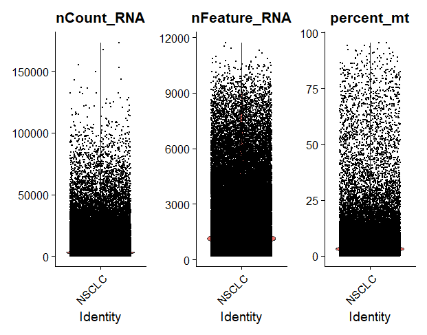
To visualise different metadata metrics, we can use the VlnPlot() function and specify the metrics we want to display.
It’s nice to visualise it because then we can see how good or bad our data is, and use this to decide which thresholds to use to filter the data. For example, here we see there are quite a few cells with a high % of mitochondrial contamination, so we will need to filter those out.
FeatureScatter() can be used to plot one metric against another and draw a regression line to see if they have a linear relationship. For example, we can represent the number of genes against the number of molecules, and draw a line.
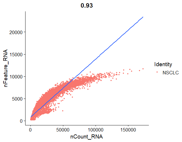
In our regression plot, we are representing the number of molecules detected in each cell, against the number of unique genes detected in that cell. Each orange point represents a cell. Most cells should follow a linear pattern, but we see that they plateau a bit towards the end. What we do not want to see is:
- cells in the lower right corner. That would mean that they have a high molecule count but low number of unique features, so we are basically capturing a very low number of genes and we are just sequencing those genes over and over again, giving a high number of transcript counts.
- cells in the top left corner of the plot, since that would mean that we capture a high number of genes, but they are not deeply sequenced enough.
It is important to check for these low-quality cells and remove them from the dataset, as they will just interfere with the results of your downstream analysis.
For this standard quality control step, we will filter out low quality cells using the subset function to:
- filter cells that have unique feature counts over 2,500 or less than 200
- filter cells that have >5% mitochondrial counts
But feel free to adapt this to your own project!
# QC ===================================================
## perc_mt -----------------------
nsclc_seu[['percent_mt']] <- PercentageFeatureSet(nsclc_seu, pattern = '^MT-')
View(nsclc_seu@meta.data)
#colnames(nsclc_seu@meta.data)
VlnPlot(nsclc_seu, features = c("nCount_RNA", "nFeature_RNA", "percent_mt"), ncol = 3)
FeatureScatter(nsclc_seu, feature1 = "nCount_RNA", feature2 = "nFeature_RNA") +
  geom_smooth(method = 'lm')

## Filtering -----------------------
nsclc_seu <- subset(nsclc_seu, subset = nFeature_RNA > 200 & nFeature_RNA < 2500 & percent_mt < 5)
Step 4: Normalisation
After removing unwanted cells from the dataset, the next step is to normalize the data. By default, we employ a global-scaling normalization method “LogNormalize” that normalizes the feature expression measurements for each cell by the total expression, multiplies this by a scale factor (10,000 by default), and log-transforms the result. Normalized values are stored in pbmc[[“RNA”]]@data.
## Normalisation -----------------------
#nsclc_seu <- NormalizeData(nsclc_seu, normalization.method = 'LogNormalize', scale.factor = 10000)
nsclc_seu <- NormalizeData(nsclc_seu)
str(nsclc_seu)
Step 5: Identification of highly-variable genes
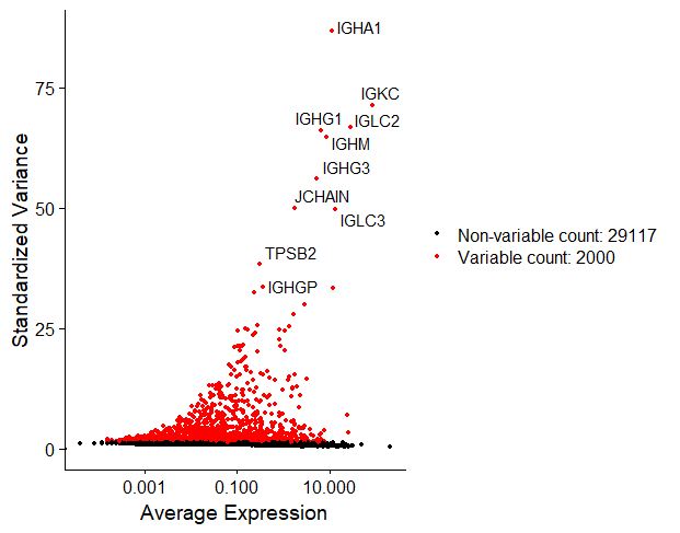
The next step is to calculate which genes have high cell-to-cell variation in the dataset. These will be important genes, since we will be able to use them to distinguish cell types. Genes with very low cell-to-cell variation on the other hand (such as housekeeping genes) are not very informative since most cells will express them: they cannot be used to identify cell subsets.
We can do this easily with Seurat’s function FindVariableFeatures(). By default, it returns 2,000 features per dataset. We can also visualise the top 10 highly variable genes.
## Identify highly-variable features ---------------------------
nsclc_seu <- FindVariableFeatures(nsclc_seu, selection.method =  'vst', nfeatures = 2000)

# Identify the top 10 HVGs
top10 <- head(VariableFeatures(nsclc_seu), 10)
top10_plot <- VariableFeaturePlot(nsclc_seu)
LabelPoints(plot = top10_plot, points = top10, repel = TRUE)
Step 6: Scaling
Once we found the variable features in our dataset, the next step is to scale the data.
This step is used to remove unwanted sources of variation, for example, technical variation introduced during the experiment such as batch effects, or biological variation such as variation due to the cell cycle stage, or mitochondrial contamination…
Scaling ensures that when we cluster the cells later on by similarity of gene expression, they will cluster due to the actual differences in gene expression and not these other unwanted sources of variation.
# Scaling ----------------------------------
all_genes <- rownames(nsclc_seu)
nsclc_seu <- ScaleData(nsclc_seu, features = all_genes)
View(nsclc_seu@assays$RNA)Squidtip
If you want something a bit more complex you can also check Seurat’s new normalisation workflow, SCTransform(). In this tutorial we will stick with the standard parameters and just use the ScaleData() function.
Step 7: PCA
Now we can move onto dimensionality reduction. Dimensionality reduction methods allow us to visualise our multidimensional dataset. A common method is PCA which we can compute using RunPCA().
If you are not very familiar with PCA you can check this other post.
In a nutshell, PCA allows you to summarise all the gene expression data across many genes into principal components (PCs). This way, instead of having gene expression data of 31117 genes, we will just consider a few principal components, allowing us to visualise our cells in a plot. Cells with similar expression profiles will cluster together.
## PCA ---------------------
nsclc_seu <- RunPCA(nsclc_seu, features = VariableFeatures(nsclc_seu))
print(nsclc_seu[['pca']], dims = 1:5, nfeatures = 5)
DimHeatmap(nsclc_seu, dims = 1, cells = 500, balanced = TRUE)
DimPlot(nsclc_seu, reduction = "pca") + NoLegend()

# determine dimensionality of the data
ElbowPlot(nsclc_seu)
If we just take into account the first 2 principal components, we can visualise our dataset in a 2D plot:
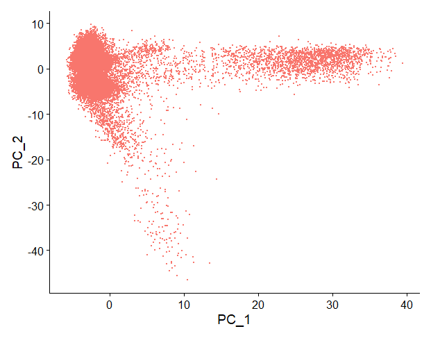
Each point is a cell. PC1 and PC2 take into account the gene expression data across many genes, allowing us to summarise that information and group cells with similar gene expression profiles together.
But, are two PCs enough to capture most of the information from our dataset?
One way to determine the number of PCs you should keep is a graphical representation known as a scree plot. You can read more about scree plots here.
But in summary, most scree plots look broadly similar in shape, starting high on the left, quickly falling, and then flattening out at some point.
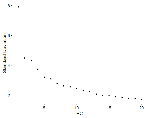
This is because the first principal component usually explains most of the variability in the dataset (i.e, gene expression variability), the next few components explain a moderate amount, and the latter components only explain a small fraction of the overall variability.
The purpose of a scree plot is to visualise the “elbow” in the curve and select all components just before the line flattens out.
In R, you can compute it really easily with ElbowPlot().
In this scree plot, I would choose the first 12-15 PCs, just before the curve flattens out.
Step 8: Clustering
Nice! After computing PCA, we can move onto clustering.
Clustering is one of the most common exploratory data analysis technique used to get a ‘feeling’ about the structure of the data.
It basically consists on identifying subgroups in the data so that the points (cells) belonging to the same subgroup (cluster) are very similar and points (cells) in different clusters are very different.
## Clustering ---------------------
nsclc_seu <- FindNeighbors(nsclc_seu, dims = 1:15)
nsclc_seu <- FindClusters(nsclc_seu, resolution = c(0.1, 0.3, 0.5, 0.7, 1))
View(nsclc_seu@meta.data)

DimPlot(nsclc_seu, group.by = 'RNA_snn_res.1', label = TRUE)

Idents(nsclc_seu) <- 'RNA_snn_res.1' # set identity of clusters
Let’s take the code snippet step by step.
First, we compute K-nearest neighbours of each cell using the function FindNeighbors(). The algorithm will compute this using the first 15 PCs.
Next, we can perform graph clustering using FindClusters(). This function will assign each cell a number, depending on the cluster they belong to.
For example, cells belonging to cluster ‘1’ will have value ‘1’.
But, how many clusters will it group our cells in?
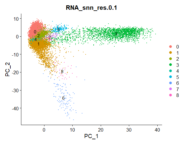
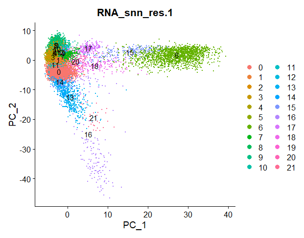
This is defined by the resolution parameter r. In the function FindClusters() I selected different resolution parameters.
For each resolution parameter, the algorithm will perform graph clustering. The higher the resolution, the more clusters our cells will be grouped in.
Check out the differences between clustering for resolution parameter 0.1 and 1:
Squidtip
In Seurat, the function FindClusters will do a graph-based clustering using “Louvain” algorithim by default (algorithm = 1). To use the Leiden algorithm, you need to set it to algorithm = 4. See ?FindClusters for additional options.
Step 9: UMAP
Finally, we can use non-linear dimensionality reduction methods such as UMAP or tSNE to visualise our datasets.
If you want to compare different dimensionality reduction methods, I recommend this article from towardsdatascience.com.
In this tutorial, we will perform UMAP.
## UMAP ---------------------
nsclc_seu <- RunUMAP(nsclc_seu, dims = 1:15)
DimPlot(nsclc_seu, reduction = 'umap')
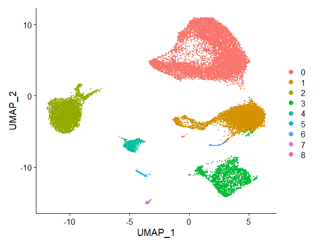
We can visualise clusters (with resolution parameter 0.1, since I set the cell identities to this resolution parameter before with the function Idents()) projected onto the UMAP:
Step 10: Export and save your Seurat object
Wohoo! We finish our basic data analysis and pre-processing.
That wasn’t too bad, was it?
Don’t forget to save your Seurat object for future use. This way, you can import it for downstream analysis without having to compute all the steps from the beginning every time you want to work on it!
# Save it!
saveRDS(nsclc_seu, file = 'nsclc_seu.RDS')
And that is the end of this tutorial!
In this post, I explained the differences between log2FC and p-value, and why in differential gene expression analysis we don't always get both high log2FC and low p-value. Hope you found it useful!
Before you go, you might want to check:
Squidtastic!
You made it till the end! Hope you found this post useful.
If you have any questions, or if there are any more topics you would like to see here, leave me a comment down below.
Otherwise, have a very nice day and... see you in the next one!


I do enjoy your youtube videos on statistics. Here, you are expanding into processing of single cell transcriptomics data using Seurat. The 10x dataset has data from seven subjects. I think, the presence of data from different subjects requires data integration i.e., batch effect correction, something that Seurat offers as a method. Were these data already batch effect corrected?
With best wishes,
Jurgen
Hi Jurgen, thank you very much for your comment. You make a great point. The data was not already batch effect corrected, it is raw data. Of course, we should correct for batch effects. This is tackled in the ‘Scaling’ steps. Of course, depending on your data, you might need a more sophisticated batch-effect correction. What I did not do in this tutorial, is check the differences between scaled and non-scaled data which would be a great way to see if it worked. For example, we could build a PCA with the non-scaled normalised data, and a PCA with the scaled normalised data. Then we could colour both PCAs by the donor, and see if cells cluster donor wise or not. If we see that there are discrete clusters depending on the donor, we would need further batch correction, so that cells cluster by cell type. Hope this helps!
hey thank youu so much for this!! also I have few doubts such as :
1)How to analyze QC plots (violin plots and scatter plots before and after filtering)
2)How to determine the filtering criteria?
3)How to set the resolution in Clustering?
4)What does RNA_snn_res.1 this refers to?
5)How to interpret all the plots including the heatmaps to draw some conclusions?
I am new to scRNA seq, would be grateful if you answer these questions.
They are all great questions! Let me see… I’ll give you a quick answer but planning on making a few videos explaining this in a bit more detail:)
1 – In general you’d be looking for no dead cells (i.e., often cells with many counts but few features) or doublets (waaay too many counts and not that many new features). This is at a very QC level – depends what you are looking for! And if your sample has cell types with particular characteristics (e.g., cancer cells tend to have a lot of counts), you have to be careful not to remove too many! There’s no perfect way – some people are less stringent and then label clusters as “dead cells”, for example. I personally prefer to be a bit “cleaner” from the start without removing too many useful cells… it can be tricky but the more you do it the easier it gets:)
2 – Again, depends. I personally like to start with very lenient thresholds, do clustering and see what kind of clusters I end up with. If there is a lot of rubbish, I repeat with more restrictive thresholds. The more you know your dataset the better, might take a few attempts until you find something that works for you. There’s not a set of thresholds that are valid for all datasets, but a good place to start is to find publications with as similar datasets as yours and see what worked for them:)
3 – Same! At the beggining I run 6 or 7 resolutions. It all depends on the cell types you are expecting in your dataset, how easy it is to differentiate them (you can always re-cluster a specific cluster you are interested in). So choose the resolution that will roughly give you the number of clusters you are expecting. Again, check the literature to see what your tissue / sample is expected to have.
4 – I believe I used a resolution of 0.1, it’s just the name of a column – you can call it whatever you want (I think when you use Seurat that’s the default naming system)
5 – That’s a big question! What kind of conclusions are you looking for? Different plots can be used to make different points. E.g., show that a cell type exists in your dataset, show that a particular cell type expressed a particular (set of) gene(s), show differences in gene expression between cell types, compare characteristics like proliferation markers, show differences in cell type composition between samples…
Hi!
Thank you so much for your work. It’s beneficial, and I would love to support you.
Please, I have some beginner questions.
I have two groups with two replicates. Can you tell me at what moment in this analysis I should integrate the data? Is it after filtering individually by mtpercent?
See my answer in your next comment!
Another question!
Should the normalization step be performed before or after merging the filtered data?
Great question, the order of integration/normalisation etc can be a bit confusing. I’m following the advice of the Seurat team.
1. Filtering, per sample (removing low quality cells, doublets, cells with high mit content etc)
2. Normalisation, per sample. Log norm or sctransform usually.
3. Perform integration (using either sct corrected counts, or lognorm counts for example). You can use different methods like CCAIntegration, HarmonyIntegration…
Between steps 1 and 2 I usually do unintegrated analysis with raw/lognorm counts, to compare my UMAPs and see how much better the integrated counts look:)
These links may help you:
https://github.com/satijalab/seurat/issues/3665
https://github.com/satijalab/seurat/issues/7542
https://github.com/satijalab/seurat/issues/7672
https://github.com/satijalab/seurat/issues/7585