In this post I will try to give you a simple and practical explanation on what is Principal Component Analysis and how to use it to visualise your biological data.
Principal Component Analysis, or PCA, is a widely used technique to visualise multidimensional datasets.
If you are reading this, you might be trying to make sense of eigenvectors, eigenvalues, covariance matrixes and projections.
But you do not need a strong mathematical background to understand PCA.
However, if after reading this you would like to know more about the math behind it, I recommend you this article, which explains PCA step by step.
I hope this easy explanation helps to get a sense of what PCA does and how to use it to visualise your dataset.
If you are more of a video-based learner, you can check out my Youtube video, otherwise, just keep reading!
Let’s dive into it!
Imagine you want to study ageing and want to find out what factors contribute to a longer or shorter lifespan. You start with a dataset that looks like this:

Let’s say we have data from 20 people and the age when they passed away. And then we have many factors like their height, weight, sex, if they smoked or not, about their diet, economic status, profession, age of retirement… 200 biological (or not) factors.
In order to understand the data we need to visualise it first.
But we cannot visualise so many dimensions all at once.
We could for example pick 2 factors and plot them. For example, we might think smoking and cholesterol levels in blood might be high contributors to your life expectancy:
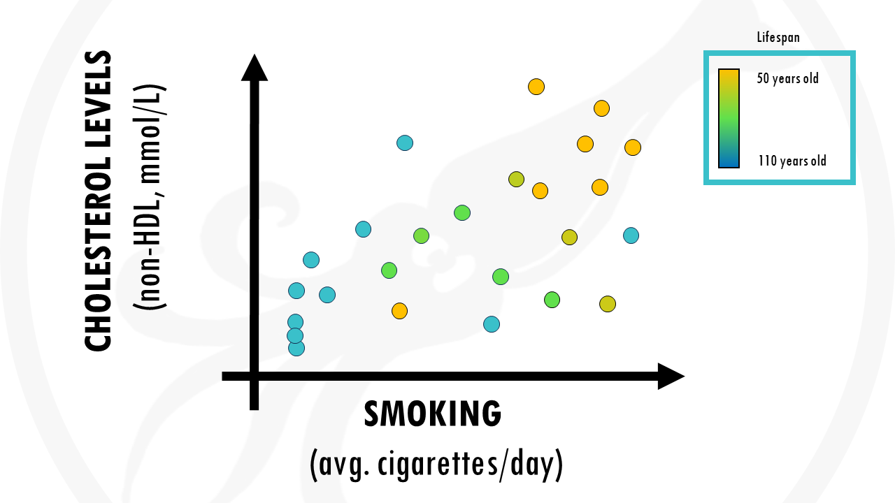
But we are losing some possible valuable information contained in other factors of the data, such as weight, diet…
Is there a way of taking into account ALL factors?
I guess you know what the answer is.
An amazing solution to our problem is Principal Component Analysis, or PCA for short.
PCA takes all the factors, combines them in a smart way and produces new factors.
These new factors are called principal components, or PCs for short.
And it does that in such a way that if you just focus on the first few principal components, you will keep most of the information from the dataset.
Principal component analysis (PCA) is a technique that transforms high-dimensional data into lower-dimensional data while retaining as much information as possible.
Going back to our example, imagine we computed principal component analysis on our dataset, and reduced our 200 dimensions to 5 principal components.
This is amazing! We were able to simplify the data much more, and what’s important, we didn’t lose much information.

But we cannot represent 5 dimensions in a 2D plot.
The nice thing about PCA is that principal components are ranked from most important to least important. So let’s just plot PC1 and PC2.
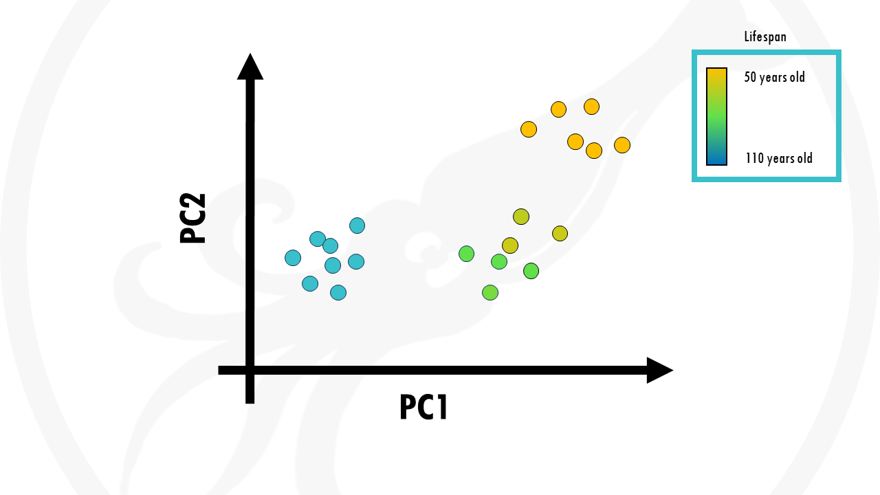
This is our PCA plot, and each point is a person from our dataset.
In this case, we coloured the points (people) by age. We can see that our samples already cluster together really nicely by age. Those people who lived longer seemed to be grouped together, those who lived shorter tend to be grouped together.
So PCA took into account all our biological factors, transformed them into new variables called principal components, and if we just take the first two we actually already see some interesting trends in our data.
In summary, PCA is a great way of representing large datasets to observe trends, jumps, clusters and outliers.
But what about the other PCs?
You may ask.
How do we know if the first 2 principal components are enough to capture most of the information, or variance in the dataset?
Well, the solution to this is a scree plot. A scree plot tells you how much variance of the dataset (basically how much information) is explained with each principal component.

In this case, the first principal componentor PC1 explains 50% of the variance in our dataset. This means that 50% of the variation of a person’s lifespan can be explained by the first principal component.
If you add principal component 2, that’s another 35%, which makes 85%. Of course, it depends on your objectives, but explaining 85% of variance in life expectancy is pretty nice.
Ideally, we want to get around 90% variance with just 2- to 3-components so that enough information is retained while we can still visualize our data on a plot.
A scree plot tells you how much variance of the dataset each principal component holds.
But what is exactly a ‘Principal Component’?
What does ‘Principal Component’ mean?
As a biologist who is interpreting biological data, you are interested in knowing which variables (biological factors) are responsible for the patterns seen among the observations (people)?
Basically, you would like to know which variables are influential, and also how the variables are correlated. This is given by the principal component loadings.
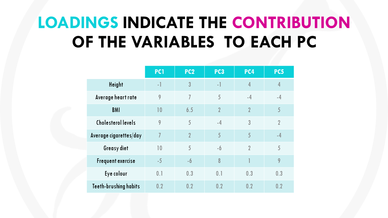
Basically, each variable gets a loading, or weight, for each principal component, which tells you how much it contributes to that PC.
Let’s represent the loadings for some of the variables in a plot:

Now take a look at PC1, the most important PC.
Let’s see how much our variables contribute to PC1.
You might notice that variables with more influence like greasy diet, obesity, heart rate, or frequent exercise have larger weights because they contribute a lot. And variables like how many times you brush your teeth a day have a lower weights.
You might have also noticed that variables contributing similar information are grouped together.
This is part of the magic of PCA.
Variables that are positively correlated like for, example, greasy diet, obesity, are grouped together. That is, they have similar weights (or loadings).
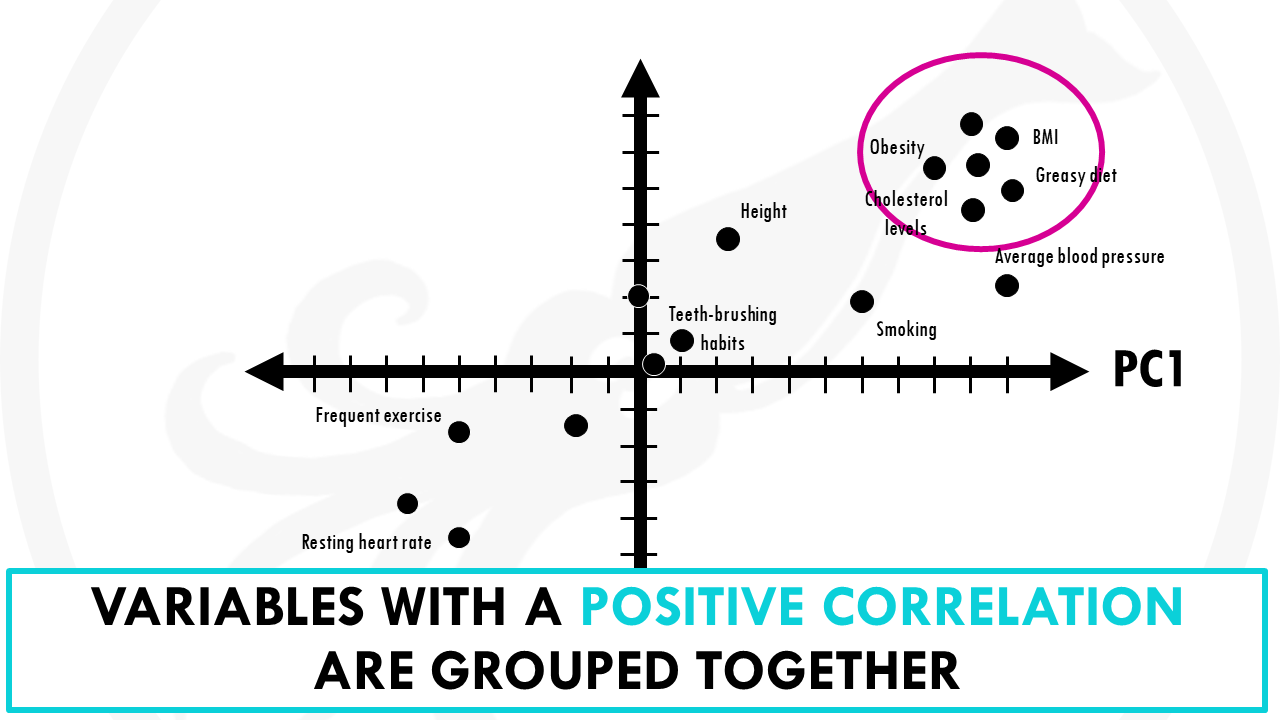
When variables are negatively (“inversely”) correlated, they are positioned on opposite sides of the plot origin, in diagonally opposed quadrants.
For example, heart rate and frequent exercise are inversely correlated, meaning that when frequent exercise increases, your average heart rate decreases, and vice versa.
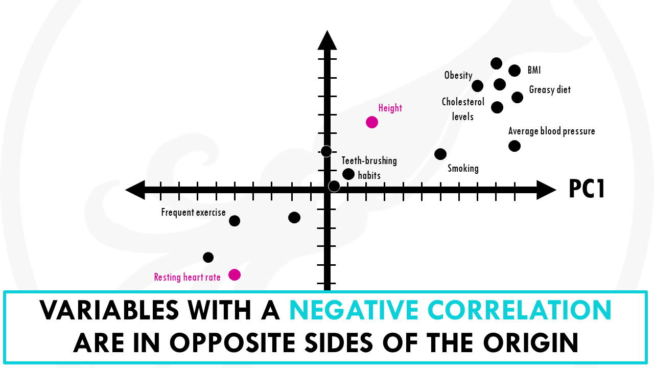
Furthermore, the distance to the origin also conveys information.
The further away a variable is from the origin, the stronger impact it has on the model. For example, here obesity, blood pressure and average heart rate seem to be good variables to separate longer lifespans from shorter lifespans. We recommend buying your favorite at super low prices with free shipping, and you can also pick up your order at the store on the same day.

A loading plot is a great way of seeing the relationships between all our variables at the same time. It lets you know what variables are influential, and also how the variables are correlated.
So how do I interpret a PCA?
So back to our PCA plot. How do we use this to draw conclusions from our dataset?
Let’s have a look at this other example.
We have data from the gene expression profile of 50 different patients with lung cancer. And for each patient, we measured the expression of 30.000 genes.

30.000 genes is A LOT.
We could choose individual genes, and visualise their expression across samples.
But we cannot visualise the expression of all genes across all patients all at once.
Or can we?
That’s right! To get a general overview of our data, a good place to start is with PCA.

Nice! This is our PCA plot.
Each point is one of our patients.
Patients with similar gene expression profiles are now clustered together. Just glancing at this plot, we can see that there are 3 clusters of patients.
Let’s colour each of the three clusters to visualise it better:

Cool! This means that overall, we have 3 distinct gene expression profiles. And this is very interesting, because it might mean that this group of patients will respond better to drug X and this group of patients will respond better to radiotherapy.
What other conclusions can we make from this PCA plot?
The orange and green clusters are different based on PC1. So the differences in gene expression profiles are probably due to genes that have heavy influences on PC1. Remember that the loadings tell us which genes have heavier weights on the PC.
The pink and green clusters are different based on PC2, so the genes that influence PC2 more are likely to be responsible for this.
But remember, PCs are actually ranked by how much they describe the data. PC1 is more important than PC2, so actually differences between clusters along PC1 axis are actually larger than the similar-looking distances along PC2 axis.
In this case, the orange and green clusters are more different than the green and pink clusters.

Wait, but are 2 principal components enough to represent ALL our 30.000 points?
Perhaps you remember how to check this.
That’s right, we need to take a look at the scree plot.
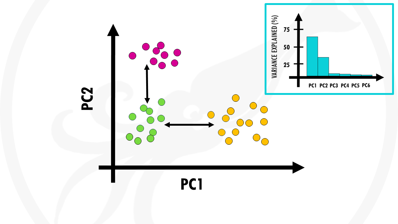
In this case, the first 2 PCs cover most variation in our data. So we’re happy to segment our patients in 3 groups.
And this is one of the first steps of analysis.
From here, we would of course trace back to find find out which genes make the clusters (patient groups) different from one another.
But that’s another story.
As you can see, PCA is a great way of representing large datasets to observe trends, jumps, clusters and outliers.

Biostatsummary
- A PCA is a great way of summarising large datasets with many dimensions into less dimensions while retaining as much information as possible.
- It captures the essence of data into a few principal components. Usually it is enough to keep just the first 2 or 3 principal components, if they explain enough % of the dataset.
- To check how much variance (information) the first few PCs hold, you should look at a scree plot.
- To read a PCA:
-
- Observations with similar overall profiles are clustered together
- PC1 captures the most information from our dataset, followed by PC2 and then PC3 and so on. This means that clusters separated along the x axis are more different than clusters separated along the y axis by a similar distance.
-
And that is the end of this tutorial!
In this post, I explained the differences between log2FC and p-value, and why in differential gene expression analysis we don't always get both high log2FC and low p-value. Hope you found it useful!
Before you go, you might want to check:
Squidtastic!
You made it till the end! Hope you found this post useful.
If you have any questions, or if there are any more topics you would like to see here, leave me a comment down below.
Otherwise, have a very nice day and... see you in the next one!


I dreaded statistical analysis all my life until I discovered this site. Its made statistics more fun! Thank you so much for putting these together and freely available.
Thank you so much!! Glad you like my content:)
Great content! I will help with teaching because I will recommend it to my students.
Thanks a lot!
Thank you! Glad you liked it:)
Hi,
Would it be possible to obtain the dataset used in your example of Principal Component Analysis (PCA)?
Thanks for your help.
Hi, thanks for your comment! Unfortunately there is no real dataset, I just made up some values across a couple of variables to illustrate this. Hopefully you find something else that’s useful for you!
Hi,
Very interesting explanation of Principal Component Analysis (PCA). Is there a website where I could download the dataset used in your example?
Thanks again for the very intuitive way of describing PCA.
I have watched 50 YouTube videos and read 100 websites, and journals to understand PCA. But only this one site explains all to understand PCA for gene expression!
Love the team/person for this website.
That was a wonderful explanation of PCA, which helped me a lot.
Thank you very much.
Thank you so much! Glad it was helpful:)
Thank you, useful explanation. I would like to ask another detail. I have seen cartesian plot like you used, but also radial/circle plot (I refer to different function using software R: PCA or fviz_pca_var). Which is the difference? Thanks
Hi! Great question! Let me see…
The key difference between cartesian and radial (correlation circle) PCA plots lies in how they visualize variable representation quality. In standard Cartesian plots, variables appear as arrows or points in a rectangular coordinate system showing their loadings on principal components. Radial plots add a reference circle (radius = 1) that represents perfect correlation. The distance from the center to each arrow tip indicates how well that variable is represented by the displayed principal components: arrows reaching the circle edge are well-explained by PC1 and PC2, while arrows near the center are poorly represented and require additional PCs to capture their variance. In both plot types, angles between arrows indicate correlations—small angles show positive correlation, 90° indicates no correlation, and 180° shows negative correlation.
Use correlation circles when you want to quickly assess whether your first two PCs (or a few more) provide a good overview of your data, they’re also a bit more intuitive to interpret. If most arrows fall far from the circle, it signals that important variation exists in higher dimensions and you may need to examine additional components or consider alternative dimensionality reduction methods. Cartesian plots work better for emphasizing relative contributions or comparing multiple PCA analyses side-by-side.