Hey! You’re looking at an old post. Newer version here: clusterProfiler tutorial in R
R TUTORIAL:
Perform pathway enrichment analysis with clusterProfiler() in R
Table of contents
Before you start
Step-by-step clusterProfiler tutorial
Step 0: Set up your script and load the data
Step 1: Prepare inputs for clusterProfiler
Step 2: Run clusterProfiler
Step 3: Visualise your pathway enrichment analysis results
SessionInfo()
Before you start…
Welcome to Biostatsquid’s easy and step-by-step tutorial on ClusterProfiler! In this guide, we will explore an essential tool for functional enrichment analysis and interpretation of gene sets or clusters of genes.
So what does clusterProfiler do? Functional enrichment analysis plays a crucial role in understanding the biological processes, molecular functions, and cellular components associated with a set of genes. CluserProfiler will allow us to identify and visualize enriched functional terms, such as Gene Ontology (GO) terms and biological pathways, within our gene sets.
Throughout this tutorial, we will walk you through the key features and steps involved in using ClusterProfiler. You will learn how to annotate genes, perform enrichment analysis, apply multiple testing correction, and interpret the results. In part 2, we will explore the various visualization techniques available in ClusterProfiler, helping you gain a comprehensive understanding of the enriched functional annotations.
For this tutorial you will need R, or Rstudio, and you will need to install the following packages:
# For data management
install.packages('tidyverse')
BiocManager::install("clusterProfiler")
BiocManager::install("org.Hs.eg.db")
# For visualisation
install.packages('pheatmap')
install.packages("DOSE")
install.packages("enrichplot")
install.packages("ggupset")
If you are a beginner in R, don’t be overwhelmed! This tutorial will go step-by-step and I will explain (almost!) every line of code so you know what is happening at each point of the workflow.
You might also want to check out my Youtube tutorial on how to do pathway enrichment analysis using clusterProfiler. Or if you prefer a written step-by-step guide, then continue reading and don’t forget you can just copy the code by clicking on the top right corner of the code snippets in this post.
But enough introduction! Ready to enter the world of functional enrichment analysis with ClusterProfiler? Let’s dive in!
Squidtip
Want to know more about functional enrichment analysis? Check out my blogposts on Pathway Enrichment Analysis and Gene Set Enrichment Analysis – simply explained!
In this Youtube video, I explain how to do Pathway Enrichment Analysis with the R package clusterProfiler()!
Step-by-step clusterProfiler tutorial
The dataset
For this tutorial, I will use the differential gene expression results we used in my volcano plots tutorial. It is the human COVID T cell single-cell RNA-seq dataset from Bacher et al. (2020). You can read more about the dataset and obtain it for free here.
I already pre-processed the data and carried out the differential gene expression analysis between severe and healthy samples for Tfh-like cells. To follow this tutorial, you can just download the DGE results here. Right click, then ‘Save link as’.
If you would like to use your own data, you just need a simple gene expression dataframe with the following columns:
- gene_symbol: the gene symbols (or IDs, i.e., ENSEMBLE IDs)
- pval: p-values from your differential gene expression analysis.
- padj: p-adjusted values from your differential gene expression analysis (p-value is enough)
- log2fc: your log2 fold change values, showing the direction of the change (upregulation or downregulation).
Step 0: Set up your script and load the data
Before we start, it’s always good practice to clean-up our environment in case we have hidden objects in the background, free up memory, and set our working directory. We also need to load the necessary libraries. Today we will be working with clusterProfiler() package, and several other R libraries for data visualisation and management. You might need to install them first using install.packages() or BiocManager::install().
# Setting up environment ===================================================

# Clean environment
rm(list = ls(all.names = TRUE)) # will clear all objects including hidden objects
gc() # free up memory and report the memory usage
options(max.print = .Machine$integer.max, scipen = 999, stringsAsFactors = F, dplyr.summarise.inform = F) # avoid truncated output in R console and scientific notation


# Loading relevant libraries
library(tidyverse) # includes ggplot2, for data visualisation. dplyr, for data manipulation.
library(RColorBrewer) # for a colourful plot
library(pheatmap)
library(clusterProfiler) # for PEA analysis
library('org.Hs.eg.db')
library(DOSE)
library(enrichplot) # for visualisations
library(ggupset) # for visualisations

# Set input path
in_path <- "Datasets/" # input path, where your data is located
out_path <- "PEA/Results/" # output path, where you want your results exported to
bg_path <- "PEA/Background_genes/" # folder with your background genes used for PEA
Additionally, we will define a function, matrix_to_list(), which takes an adjacency matrix as input and converts it into a list representation, which will be the format we will manage through our analysis.
# Functions ------------------------------------------------
## Function: Adjacency matrix to list ####
matrix_to_list <- function(pws){
  pws.l <- list()
  for (pw in colnames(pws)) {
    pws.l[[pw]] <- rownames(pws)[as.logical(pws[, pw])]
  }
  return(pws.l)
}
Let’s get started! The first step is of course to load our differential gene expression results. If you have your own dataset, just read it into RStudio, and make sure you have a dataframe as I describe above. We can also add a new column, diffexpressed, which indicates whether a gene is UPregulated, DOWNregulated or NOt differentially expressed. I used a log2fc = 0 and p-adjusted value of 0.05 to define the thresholds, but you might want to tweak it depending on how permissive you want to be (or how many differentially expressed genes you have!).
# Read in data ===================================================
list.files(in_path)
df <- read.csv(paste0(in_path, 'severevshealthy_degresults.csv'), row.names = 1)

# Annotate according to differential expression
df <- df %>% mutate(diffexpressed = case_when(
  log2fc > 0 & padj < 0.05 ~ 'UP',
  log2fc < 0 & padj < 0.05 ~ 'DOWN',
  padj > 0.05 ~ 'NO'
))Squidtip
Did you notice? Instead of writing the full path of my data file (e.g., ‘/home/Biostatsquid/Scripts/rnaseq/PEA/Datasets/severevshealthy_degresults.csv’), I just pasted together in_path (which I previously defined as ‘Datasets/’), and the name of the file, ‘severevshealthy_degresults.csv’ with the paste0 function.
Ok! So before we can start our analysis we need to check what clusterProfiler needs. If you would like to read more about the method, I recommend reading the publication. The reference manual lists all the functions of the package.
For the sake of making this tutorial as generalisable as possible, I will explain how to use the enricher() function which allows you to use any set of background genes.
- This means we will need a bit more code to provide the background gene list. But don’t worry, we will go through all of the steps, it’s easier than you think! This is a more customisable way of doing things, but a bit more complicated (not too much though!)
- However, clusterProfiler already provides functions for some pathway databases like enrichKEGG() and enrichGO(). So take a look at the clusterProfiler package, it has a lot to offer!
Step 1: Prepare inputs for clusterProfiler
Prepare background genes
1. Get your gene set .gmt files. For example, you can download them from:
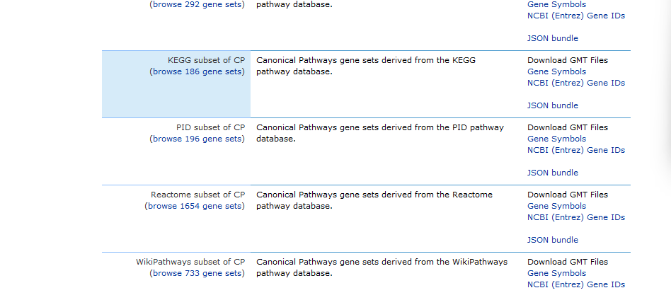
2. Filter the .gmt file and convert it to a format accepted by clusterProfiler. As I explain in my previous post, we need to use a set of background genes that contain only the genes present in our dataframe, to avoid bias. This will be done automatically by clusterProfiler, so you can comment out the line that filters those genes. You can use the following code:
# Get the genes that are present in your dataframe
genes_in_data <- df$gene_symbol

# Read in the .gmt file
file <- "PEA/Background_genes/c2.cp.kegg.v7.5.1.symbols.gmt"
pwl2 <- read.gmt(file)
# Subset to the genes that are present in our dataset
#pwl2 <- pwl2[pwl2$gene %in% genes_in_data,]
# Save the filtered background gene set
filename <- 'kegg.RDS'
saveRDS(pwl2, filename)


# SQUIDTIP! If you want to parse several .gmt files at once, you can use a loop:
gmt_files <- list.files(path = bg_path, pattern = '.gmt', full.names = TRUE)
for (file in gmt_files){
	file <- gmt_files[1]
        pwl2 <- read.gmt(file)
	#pwl2 <- pwl2[pwl2$gene %in% genes_in_data,]
        filename <- paste(gsub('c.\\.', '', gsub('.v7.5.*$', '', file)), '.RDS', sep = '')
	saveRDS(pwl2, filename)
}
Squidtip
You don’t need to download the gene sets if you don’t want to. There’s an easier way of doing this by using the msigdbr package to handle the gene sets for you. Read more here: https://biostatsquid.com/easy-msigdbr-in-r/
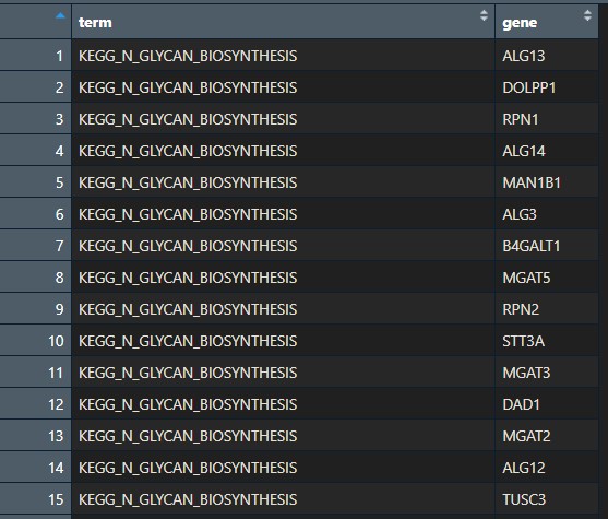
You should now have an .RDS file with the background genes in your folder.
Basically, it should look like this:
Prepare differential gene expression results
We will:
- Remove non-significant genes: since we only want the enriched pathways of the significantly differentially expressed genes.
- Substitute names so they are annotated nicely in the heatmap later
- Split the data into a list of 2 sub-dataframes: upregulated, downregulated genes.
## Prepare deg results -----------------------------------------------

# If you forgot to do that before, annotate according to differential expression
df <- df %>% mutate(diffexpressed = case_when(
  log2fc > 0 & padj < 0.05 ~ 'UP',
  log2fc < 0 & padj < 0.05 ~ 'DOWN',
  padj > 0.05 ~ 'NO'

))

# Remove non-significant genes
df <- df[df$diffexpressed != 'NO', ]

# Substitute names so they are annotated nicely in the heatmap later
df$diffexpressed <- gsub('DOWN', 'Healthy', gsub('UP', 'Severe', df$diffexpressed))
unique(df$diffexpressed)

# Split the dataframe into a list of sub-dataframes: upregulated, downregulated genes
deg_results_list <- split(df, df$diffexpressed)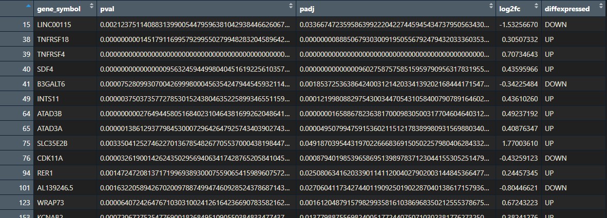
Step 2: Run clusterProfiler
Wohoo! After all these steps… we are finally ready to run clusterProfiler! Are you excited?
First, let’s set some variables. This is not essential but it will make your life easier in case you need to change them later on.
## Run ClusterProfiler -----------------------------------------------

# Settings
name_of_comparison <- 'severevshealthy' # for our filename
background_genes <- 'reactome' # for our filename
bg_genes <- readRDS(paste0(bg_path, 'reactome.RDS')) # read in the background genes
padj_cutoff <- 0.05 # p-adjusted threshold, used to filter out pathways
genecount_cutoff <- 5 # minimum number of genes in the pathway, used to filter out pathways
filename <- paste0(out_path, 'clusterProfiler/', name_of_comparison, '_', background_genes) # filename of our PEA resultsSquidtip
You don’t need to set all these variables to run clusterProfiler.
But! If you have a lot of differential gene expression results and/or background gene sets… you will have to copy paste your code maaany times and just change a few names… This is very tedious, time-consuming and error-prone! A bit of code can save you a lot of time. If you haven’t thought about it yet- I’m talking about building your own function!
These variables set-up is a good place to start. If you are interested in a blogpost explaining how to create a function that runs clusterProfiler and outputs your results and plots by just giving it a few variables – leave me a comment down below!
# SQUIDTIP! An option to read in your background genes by only defining your 'background_genes' variable
if(background_genes == 'KEGG'){
  bg_genes <- readRDS(paste0(bg_path, 'kegg.RDS'))
} else if(background_genes == 'reactome'){
  bg_genes <- readRDS(paste0(bg_path, 'reactome.RDS'))
} else if(background_genes == 'go.bp'){
  bg_genes <- readRDS(paste0(bg_path, 'go.bp.RDS'))
} else {
  stop('Invalid background genes. Select one of the following: KEGG, Reactome, GO, or add new pwl to function')
}
Now that we have our background genes and our differential expressed genes ready… let’s call the enricher() function from clusterProfiler.
We use lapply as we are applying the function to our list (remember we split the data into a list of 2 subsets).
Squidtip
If you only have 1 dataset, you can run the enricher function directly:
x <- enricher(my_dge_results, TERM2GENE = bg_genes)# Run clusterProfiler on each sub-dataframe
res <- lapply(names(deg_results_list),
function(x) enricher(gene = deg_results_list[[x]]$gene_symbol,
TERM2GENE = bg_genes))
names(res) <- names(deg_results_list)
#Convert the list of enrichResults for each sample_pattern to a dataframe with the pathways
res_df <- lapply(names(res), function(x) rbind(res[[x]]@result))
names(res_df) <- names(res)
res_df <- do.call(rbind, res_df)
head(res_df)
Squidtip
What does the enricher() function do?
It basically does a hypergeometric test for pathway enrichment analysis, accepting a user-defined annotation. So it is very useful if you want to analyse your data with unsupported organisms or other ontologies/pathways, or customised annotations.
Its inputs are the dge results, and two additional parameters TERM2GENE and TERM2NAME.
TERM2GENEis a data.frame with first column of term ID and second column of corresponding mapped gene. It is used to match the pathway with the genes.TERM2NAMEis optional, used to rename pathways. It is adata.framewith first column of term ID and second column of corresponding term name.
More information here: https://github.com/YuLab-SMU/clusterProfiler
Great! We now have a list with our pathway enrichment analysis results. Let’s make it more readable and convert it to a dataframe with the following lines of code:
#Convert the enrichResults to a dataframe with the pathways
res_df <- lapply(names(res), function(x) rbind(res[[x]]@result))
names(res_df) <- names(res)
res_df <- do.call(rbind, res_df)
head(res_df)
And maybe add a few more columns to our dataframe (I use the gsub() function to make the pathways names shorter):
res_df <- res_df %>% mutate(minuslog10padj = -log10(p.adjust),
                            pathway_name = gsub('\\.GOBP.*$|\\.KEGG.*$|\\.REACTOME.*$', '', rownames(res_df)))
Now, we can subset our results. Filter the significant pathways according to p-adjusted threshold and gene count.
# Subset to those pathways that have p adj < cutoff and gene count > cutoff (you can also do this in the enricher function)
target_pws <- unique(res_df$ID[res_df$p.adjust < padj_cutoff & res_df$Count > genecount_cutoff]) # select only target pathways have p adjusted < 0.05 and at least 6 genes
res_df <- res_df[res_df$ID %in% target_pws, ]
Squidtip
Feel free to adjust these thresholds to your own results! You might need to play around with the numbers until you find what best suits your dataset and your goal.
Finally, don’t forget to save your results!
print('Saving clusterprofiler results')
write.csv(res_df, paste0(filename, '_resclusterp.csv'), row.names = FALSE)
Step 3: Visualise your pathway enrichment analysis results
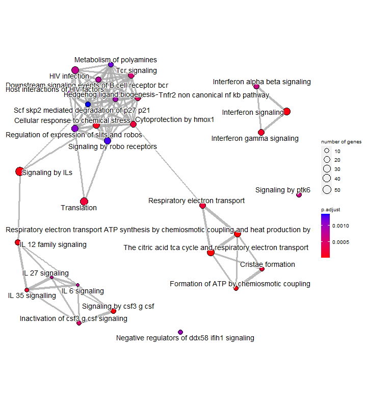
Now it’s time for the fun part! Let’s explore our results by plotting them in different ways.
Check how to visualise your clusterProfiler results and create pretty plots here: Visualisation of pathway enrichment results.
sessionInfo()
Check my sessionInfo() here in case you have trouble reproducting my steps:
> sessionInfo()
R version 4.2.3 (2023-03-15 ucrt)
Platform: x86_64-w64-mingw32/x64 (64-bit)
Running under: Windows 10 x64 (build 22621)

Matrix products: default

locale:
[1] LC_COLLATE=English_Ireland.utf8  LC_CTYPE=English_Ireland.utf8    LC_MONETARY=English_Ireland.utf8 LC_NUMERIC=C
[5] LC_TIME=English_Ireland.utf8

attached base packages:
[1] stats4    stats     graphics  grDevices utils     datasets  methods   base

other attached packages:
 [1] ggupset_0.3.0         enrichplot_1.18.4     DOSE_3.24.2           org.Hs.eg.db_3.16.0   AnnotationDbi_1.60.2  IRanges_2.32.0
 [7] S4Vectors_0.36.2      Biobase_2.58.0        BiocGenerics_0.44.0   clusterProfiler_4.6.2 fgsea_1.24.0          mgsa_1.46.0
[13] gplots_3.1.3          pheatmap_1.0.12       RColorBrewer_1.1-3    lubridate_1.9.2       forcats_1.0.0         stringr_1.5.0.9000
[19] dplyr_1.0.10          purrr_1.0.1           readr_2.1.4           tidyr_1.2.1           tibble_3.1.8          ggplot2_3.4.2
[25] tidyverse_2.0.0

loaded via a namespace (and not attached):
 [1] colorspace_2.1-0       ggtree_3.6.2           gson_0.1.0             ellipsis_0.3.2         qvalue_2.30.0
 [6] XVector_0.38.0         aplot_0.1.10           rstudioapi_0.14        farver_2.1.1           graphlayouts_1.0.0
[11] ggrepel_0.9.3          bit64_4.0.5            scatterpie_0.2.1       fansi_1.0.3            codetools_0.2-19
[16] splines_4.2.3          cachem_1.0.8           GOSemSim_2.24.0        polyclip_1.10-4        jsonlite_1.8.7
[21] GO.db_3.16.0           png_0.1-8              ggforce_0.4.1          compiler_4.2.3         httr_1.4.6
[26] Matrix_1.5-3           fastmap_1.1.1          lazyeval_0.2.2         cli_3.6.0              tweenr_2.0.2
[31] tools_4.2.3            igraph_1.5.0           gtable_0.3.3           glue_1.6.2             GenomeInfoDbData_1.2.9
[36] reshape2_1.4.4         fastmatch_1.1-3        Rcpp_1.0.11            vctrs_0.5.1            Biostrings_2.66.0
[41] ape_5.7-1              nlme_3.1-162           ggraph_2.1.0           timechange_0.2.0       lifecycle_1.0.3
[46] gtools_3.9.4           zlibbioc_1.44.0        MASS_7.3-58.2          scales_1.2.1           tidygraph_1.2.3
[51] hms_1.1.3              parallel_4.2.3         memoise_2.0.1          gridExtra_2.3          downloader_0.4
[56] ggfun_0.1.1            HDO.db_0.99.1          yulab.utils_0.0.6      stringi_1.7.12         RSQLite_2.3.1
[61] tidytree_0.4.2         caTools_1.18.2         BiocParallel_1.32.6    GenomeInfoDb_1.34.9    rlang_1.1.1
[66] pkgconfig_2.0.3        bitops_1.0-7           lattice_0.20-45        treeio_1.22.0          patchwork_1.1.2
[71] shadowtext_0.1.2       cowplot_1.1.1          bit_4.0.5              tidyselect_1.2.0       plyr_1.8.8
[76] magrittr_2.0.3         R6_2.5.1               generics_0.1.3         DBI_1.1.3              pillar_1.9.0
[81] withr_2.5.0            KEGGREST_1.38.0        RCurl_1.98-1.12        crayon_1.5.2           KernSmooth_2.23-20
[86] utf8_1.2.2             tzdb_0.4.0             viridis_0.6.3          grid_4.2.3             data.table_1.14.8
[91] blob_1.2.4             digest_0.6.33          gridGraphics_0.5-1     munsell_0.5.0          viridisLite_0.4.2
[96] ggplotify_0.1.1
And that is the end of this tutorial!
In this post, I explained how to perform functional enrichment analysis using clusterProfiler. Hope you found it useful!
Before you go, you might want to check:
Squidtastic!
You made it till the end! Hope you found this post useful.
If you have any questions, or if there are any more topics you would like to see here, leave me a comment down below.
Otherwise, have a very nice day and… see you in the next one!


0 Comments