A step-by-step R tutorial on visualising pathway enrichment analysis results with clusterProfiler
Table of contents
Before you start
Step-by-step tutorial
Creating an enrichResult object
Barplots
Dotplots
Cnetplot
Heatplot
Treeplot
Enrichment map
Upsetplot
sessionInfo()
Before you start…
Welcome to Biostatsquid’s easy and step-by-step tutorial where you will learn how to visualize your pathway enrichment results. In this guide, we will explore different ways of plotting the gene sets and their genes after performing functional enrichment analysis with clusterProfiler.
If you haven’t yet, check out my blogpost on performing pathway enrichment analysis with clusterProfiler. This tutorial picks up where we left off, so it will ensure you have your results in the correct format. You can also check out the step-by-step tutorial in R for pathway enrichment analysis on Youtube.
If you performed pathway enrichment analysis with a different tool or package, don’t worry! This tutorial will still be useful. Just check that your results are an R data.frame with the following columns:
- ID
- Description
- GeneRatio
- BgRatio
- pvalue
- p.adjust
- qvalue
- geneID
- Count
- minuslog10padj
- diffexpressed


Throughout this tutorial, I will show you some nice ways to visualise your pathway enrichment analysis results. This will make them easier to interpret. You will learn how to create a heatmap, dotplot, cnetplot, treeplot and many more cool plots!
For this tutorial you will need R, or Rstudio, and you will need to install the following packages:
# For data management
install.packages('tidyverse')
BiocManager::install("clusterProfiler")
# For visualisation
install.packages('pheatmap')
install.packages("enrichplot")
install.packages("ggupset")
If you are a beginner in R, don’t be overwhelmed! This tutorial will go step-by-step and I will explain (almost!) every line of code so you know what is happening at each point of the workflow.
You might also want to check out my Youtube tutorial on how to visualise your pathway enrichment analysis results. Or if you prefer a written step-by-step guide, then continue reading and don’t forget you can just copy the code by clicking on the top right corner of the code snippets in this post.
But enough introduction! Ready to enter the world of functional enrichment analysis with ClusterProfiler? Let’s dive in!
Squidtip
Want to know more about functional enrichment analysis? Check out my blogposts on Pathway Enrichment Analysis and Gene Set Enrichment Analysis – simply explained!
In this Youtube video, I explain how to visualise your Pathway Enrichment Analysis with the R package enrichplot()!
Step-by-step tutorial
Load your data
In this example, we will analyse pathways that were enriched for upregulated genes. In other words, we will select the genes that were differentially upregulated in severe patients compared to healthy patients. Then, we will check which pathways are overrepresented in that list of genes, more than what would be expected by chance.
For our following plots, we will use the package enrichplot().
Enrichplot needs the results in a specific format. If you have run clusterProfiler, then easy! You can just use the results from the enricher() function.
# If you ran clusterProfiler before, just read in the results
res <- qs::qread(file.path(out_path, paste0(filename_prefix, '_resclusterp_enrichres.qs')))

# Visualisations -----------------------------------------------
# Visualize ORA results for UPregulated genes
results <- res$UP
Otherwise, we first need to transform our ORA results to an enrichResult() object. Check out my previous blogpost to understand where the data is coming from.
# Read in your data

# Your ORA results, in a dataframe
res_df_sig <- read.csv(file.path(out_path, paste0(filename_prefix, '_resclusterp.csv'))

# Your background genes
data <- scRNAseq::BacherTCellData(filtered = TRUE, ensembl = FALSE, location = TRUE)
background_genes <- row.names(data)
background_genes[1:5]
rm(data) # to clear some space

# Your pathways:
## 1. Prepare pathways or gene sets -----------------------------------------------
# msigdbr R package provides Molecular Signatures Database (MSigDB) gene sets
# Read more here: https://igordot.github.io/msigdbr/articles/msigdbr-intro.html
# View available collections
# msigdbr_collections()
# Set gene set collection
name_of_gene_set <- 'H' # for hallmark gene sets
# Other options:
# 'C1' - positional gene sets
# 'C2' - curated gene sets (includes KEGG, Reactome, BioCarta, etc.)
# 'C3' - regulatory target gene sets
# 'C4' - computational gene sets
# 'C5' - ontology gene sets (GO terms)
# 'C6' - oncogenic signature gene sets
# 'C7' - immunologic signature gene sets
# 'C8' - cell type signature gene sets
gene_sets_df <- msigdbr(species = 'Homo sapiens', category = name_of_gene_set)
#gene_sets_df <- msigdbr(species = 'Homo sapiens', category = 'C5', subcollection = 'GO:BP')
head(gene_sets_df)

print("Sample of gene sets:")
print(head(gene_sets_df))

# Convert to named list format required by clusterprofiler: the first column should have pathway names
# the second column should have gene symbols
gene_sets <- gene_sets_df %>%
  dplyr::select(gs_name, gene_symbol)
And finally, let’s use the new() function from the enrichplot package to create our enrichResult object!
Just a few things to consider:
result: our results data frame containing the results of our pathway enrichment analysis results outputted by clusterProfiler().pvalueCutoff: The p-value cutoff used for selecting significant enrichment results.pAdjustMethod: The method used for adjusting p-values, usually"BH"for Benjamini-Hochberg correction.qvalueCutoff: The q-value cutoff used for selecting significant enrichment results (similar to p-value but adjusted for multiple testing).gene: A vector containing gene symbols or IDs associated with the analysis (so the names of our DEGs)universe: A vector containing all possible genes that could be considered in the analysis. Important! This includes also genes that were not significantly differentially expressed between groups.gene2Symbol: A character vector, used to map gene IDs to gene symbols. Since we are providing gene symbols already, we don’t need this!geneSets: a named list, where the names are enriched GO terms (or KEGG, or whichever functional gene set terms you used) and the elements are DE genes annotated with that GO term.
results <- new("enrichResult",
                 readable = FALSE,
                 result = res_df_sig,
                 pvalueCutoff = 0.05,
                 pAdjustMethod = "BH",
                 qvalueCutoff = 0.2,
                 organism = "human",
                 ontology = "UNKNOWN",
                 gene = gene_sets_df$gene_symbol,
                 keytype = "UNKNOWN",
                 universe = background_genes,
                 gene2Symbol = character(0),
                 geneSets = gene_sets_df)
class(enrichres)Squidtip
Important! The pathways that come up after selecting for ‘UP’ are not necessarily upregulated pathways. We are just selecting pathways that were enriched in our list of UPregulated genes. It could be that in our list there are a lot of genes that code for repressors or inhibitors of that pathway. In which case, the pathway would probably be downregulated compared to healthy patients.
If you would like to clear things up a bit more, try reading my other blogpost on pathway enrichment analysis – simply explained!
Now that we have an enrichresult object, time to start plotting!
Barplot
A barplot is a great way to visualize your enriched pathways. It basically shows the enrichment scores (e.g. p-values) and the gene count or ratio as bar height and color.
# Barplot
# Most common method to visualize enriched terms. Shows enrichment scores (e.g. p values) and gene count or ratio as bar height and color
p1 <- barplot(results, showCategory = 10,
              title = paste("MSigDB", name_of_gene_set, "Enrichment - upregulated genes"))
p1
p2 <- mutate(results, qscore = -log(p.adjust, base = 10)) %>%
  barplot(x = "qscore")
p2
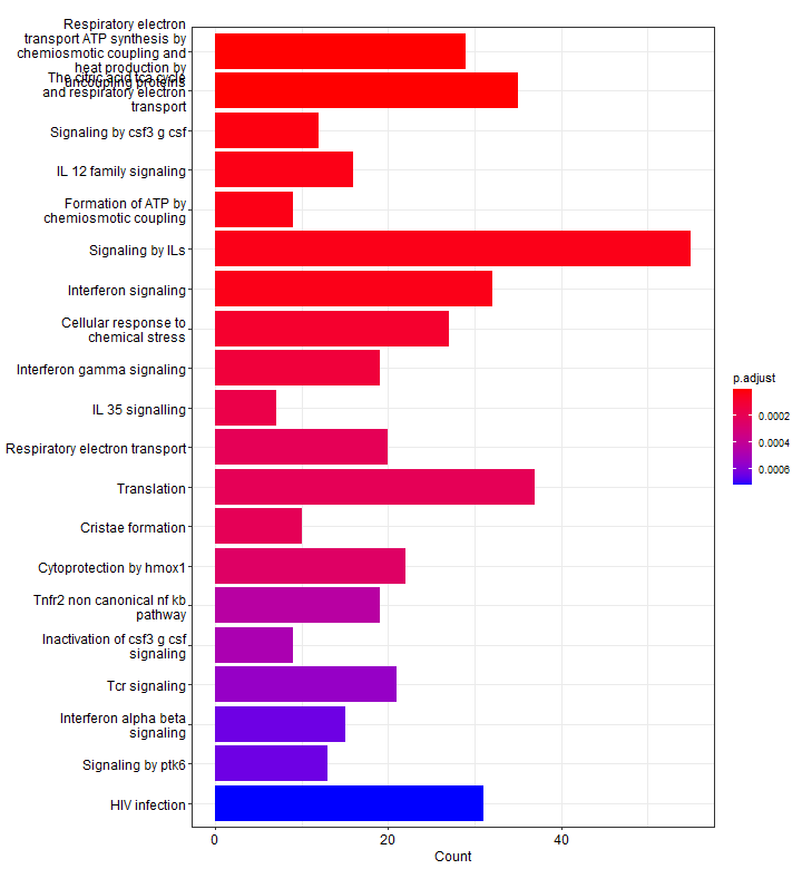
Below, we see 20 top significantly enriched pathways (based on p-values) from our upregulated gene list. Red pathways are more significantly enriched than blue pathways. The number of genes that were present in our list of upregulated genes for that pathway are shown on the x-axis. In other words, more genes associated to that pathway = longer bars.
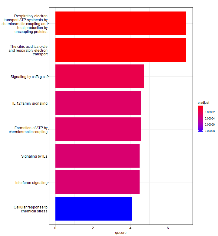
We can use mutate to show a different enrichment score, for example, displaying the -log10(p-adj). Since we did not specify, here only 8 pathways are shown.
Dotplot
A dotplot is very similar to a barplot, except that the number of genes is not shown by the bar length, but by the dot size.
# Dotplot
# Dot plot is similar to bar plot with the capability to encode another score as dot size.
p3 <- dotplot(results, showCategory = 15)
p3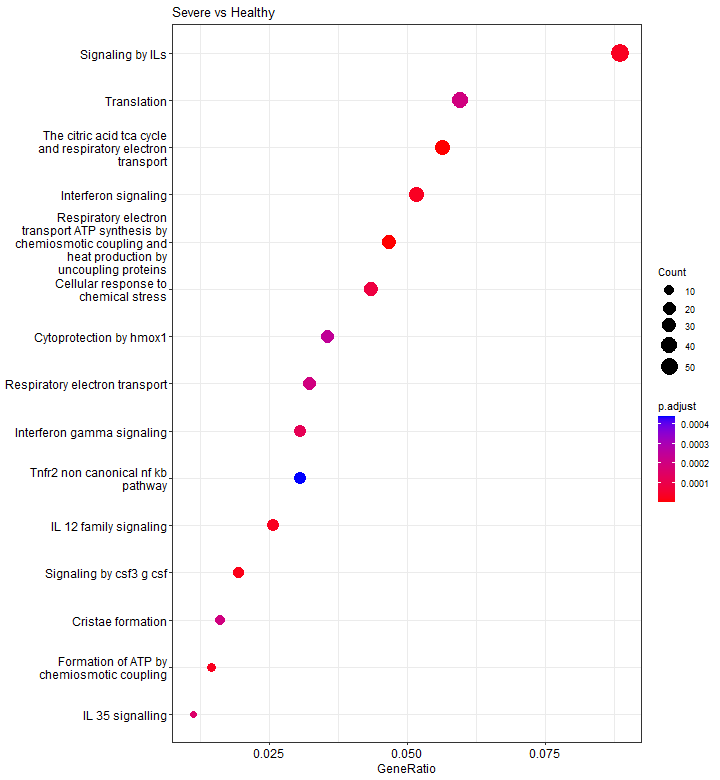
Cnetplot
We’re getting into some serious plotting now! A cnetplot shows the linkages between genes and pathways as a network.
The light yellow big nodes are pathways (the names are too long for this to be pretty!). Ant from each of them we have lines ‘coming out’ of them which are the genes associated to that pathway.
This way, we can easily identify clusters of genes that may share common biological functions or participate in the same molecular pathways. For example, in the lower cluster, we see STAT1, STAT3 and JAK2 (upregulated genes in severe patients) which participate in both ‘IL-12 family signaling’ and ‘Signaling by CSF3 G-CSF’ pathways.
# cnetplot
# Shows the linkages of genes and biological concepts (e.g. GO terms or KEGG pathways) as a network.
p4 <- cnetplot(results, categorySize = "pvalue")
print(p4)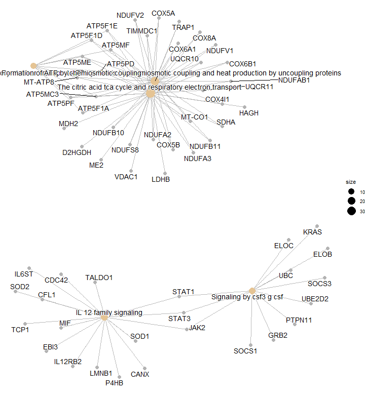
Heatplot
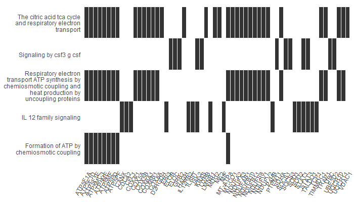
A heatplot is similar to cnetplot. In this case, the x axis shows the list of genes we have (in this case, our upregulated genes). In the y axis, we have our pathways. The bars show which genes participated in which pathways. It is useful when there is a large number of significant pathways, as it makes it easier to visualize.
For example, our first gene, ATP5F1A, participates in ‘Formation of ATP by chemiosmotic coupling’, ‘Respiratory electron transport and ATP synthesis…’ and ‘The citric acid TCA cycle…’.
# Heatplot
# The heatplot is similar to cnetplot, while displaying the relationships as a heatmap.
# useful when there is a large number of significant terms
p5 <- heatplot(results, showCategory = 12)
p5
Treeplot
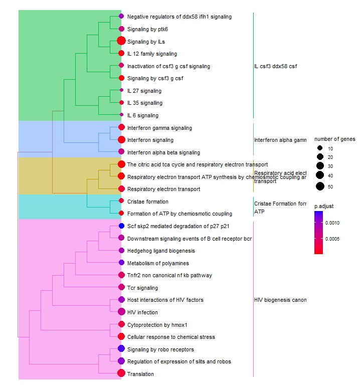
The treeplot() function performs hierarchical clustering of enriched pathways.
Many enrichment analyses use hierarchical ontologies to organize functional terms or gene sets into a hierarchical structure. For example, the Gene Ontology consists of thre main branches: Biological Process, Cellular Component, and Molecular Function. Each branch contains more specific terms organized in a hierarchical manner.
The treeplot() function from the enrichplot package takes the enrichment results and the hierarchical ontology as inputs. It creates a tree-like plot where each pathway is represented by a node, and the parent-child relationships between terms are shown by connecting lines.
The nodes in the treeplot can be customized to convey additional information. For example, in this case, the node colour represents the significance of enrichment. The node size number of genes associated with each term. This allows us to quickly visualise important or highly enriched terms.
# Treeplot
# The treeplot() function performs hierarchical clustering of enriched terms. I
enrichres2 <- pairwise_termsim(results) # calculate pairwise similarities of the enriched terms using Jaccard’s similarity index
p6 <- treeplot(enrichres2)
Enrichment map
An enrichment map organizes enriched pathways into a network with edges connecting overlapping gene sets or pathways. In this way, mutually overlapping gene sets are tend to cluster together, making it easy to identify functional module.
Just like in the treeplot, the node colour represents the significance of enrichment. The node size number of genes associated with each term. This allows us to quickly visualise important or highly enriched terms.
# Enrichment map
# organizes enriched pathways into a network with edges connecting overlapping gene sets.
# In this way, mutually overlapping gene sets are tend to cluster together, making it easy to identify functional module.
p7 <- emapplot(enrichres2)
p7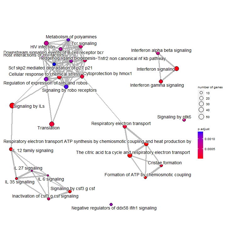
Upsetplot
An upsetplot is an alternative to cnetplot. It emphasizes the gene overlapping among different gene sets.
In an upsetplot, each gene set or pathway is represented by a column, and the height of the column indicates the number of genes associated with that set or term. The intersections between the gene sets or terms are shown as connected lines or bars.
# Upsetplot
# alternative to cnetplot. emphasizes the gene overlapping among different gene sets.
p8 <- upsetplot(results)
p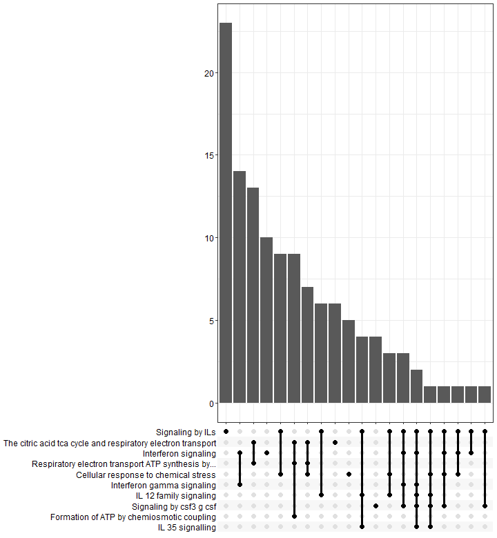
sessionInfo()
Check my sessionInfo() here in case you have trouble reproducting my steps:
> sessionInfo()
R version 4.4.2 (2024-10-31 ucrt)
Platform: x86_64-w64-mingw32/x64
Running under: Windows 11 x64 (build 26100)

Matrix products: default


locale:
[1] LC_COLLATE=English_Ireland.utf8  LC_CTYPE=English_Ireland.utf8    LC_MONETARY=English_Ireland.utf8 LC_NUMERIC=C
[5] LC_TIME=English_Ireland.utf8

time zone: Europe/Dublin
tzcode source: internal

attached base packages:
[1] stats     graphics  grDevices utils     datasets  methods   base

other attached packages:
 [1] enrichplot_1.26.6      DOSE_4.0.1             clusterProfiler_4.14.6 msigdbr_24.1.0         ggupset_0.4.1
 [6] RColorBrewer_1.1-3     lubridate_1.9.4        forcats_1.0.0          stringr_1.5.1          dplyr_1.1.4
[11] purrr_1.0.4            readr_2.1.5            tidyr_1.3.1            tibble_3.2.1           ggplot2_3.5.1
[16] tidyverse_2.0.0

loaded via a namespace (and not attached):
  [1] ProtGenerics_1.38.0         bitops_1.0-9                fs_1.6.5                    matrixStats_1.5.0
  [5] spatstat.sparse_3.1-0       httr_1.4.7                  alabaster.base_1.6.1        tools_4.4.2
  [9] sctransform_0.4.1           utf8_1.2.4                  R6_2.6.1                    HDF5Array_1.34.0
 [13] lazyeval_0.2.2              uwot_0.2.3                  rhdf5filters_1.18.1         withr_3.0.2
 [17] sp_2.2-0                    gridExtra_2.3               progressr_0.15.1            cli_3.6.4
 [21] Biobase_2.66.0              spatstat.explore_3.4-2      fastDummies_1.7.5           alabaster.se_1.6.0
 [25] labeling_0.4.3              Seurat_5.2.1                spatstat.data_3.1-6         ggridges_0.5.6
 [29] pbapply_1.7-2               Rsamtools_2.22.0            yulab.utils_0.2.0           gson_0.1.0
 [33] R.utils_2.13.0              parallelly_1.42.0           limma_3.62.2                rstudioapi_0.17.1
 [37] RSQLite_2.4.1               BiocIO_1.16.0               generics_0.1.3              gridGraphics_0.5-1
 [41] RApiSerialize_0.1.4         ica_1.0-3                   spatstat.random_3.3-3       GO.db_3.20.0
 [45] Matrix_1.7-1                S4Vectors_0.44.0            abind_1.4-8                 R.methodsS3_1.8.2
 [49] lifecycle_1.0.4             yaml_2.3.10                 edgeR_4.4.2                 SummarizedExperiment_1.36.0
 [53] rhdf5_2.50.2                qvalue_2.38.0               SparseArray_1.6.2           BiocFileCache_2.14.0
 [57] Rtsne_0.17                  grid_4.4.2                  blob_1.2.4                  promises_1.3.2
 [61] ExperimentHub_2.14.0        crayon_1.5.3                miniUI_0.1.1.1              speckle_1.6.0
 [65] ggtangle_0.0.7              lattice_0.22-6              cowplot_1.1.3               GenomicFeatures_1.58.0
 [69] KEGGREST_1.46.0             pillar_1.10.1               fgsea_1.32.4                GenomicRanges_1.58.0
 [73] rjson_0.2.23                future.apply_1.11.3         codetools_0.2-20            fastmatch_1.1-6
 [77] glue_1.8.0                  ggfun_0.2.0                 spatstat.univar_3.1-2       data.table_1.17.0
 [81] gypsum_1.2.0                vctrs_0.6.5                 png_0.1-8                   treeio_1.30.0
 [85] spam_2.11-1                 gtable_0.3.6                assertthat_0.2.1            cachem_1.1.0
 [89] S4Arrays_1.6.0              mime_0.12                   survival_3.7-0              SingleCellExperiment_1.28.1
 [93] statmod_1.5.0               fitdistrplus_1.2-2          ROCR_1.0-11                 nlme_3.1-166
 [97] ggtree_3.14.0               bit64_4.6.0-1               alabaster.ranges_1.6.0      filelock_1.0.3
[101] RcppAnnoy_0.0.22            GenomeInfoDb_1.42.3         irlba_2.3.5.1               KernSmooth_2.23-24
[105] colorspace_2.1-1            BiocGenerics_0.52.0         DBI_1.2.3                   tidyselect_1.2.1
[109] bit_4.6.0                   compiler_4.4.2              curl_6.2.1                  httr2_1.1.0
[113] scRNAseq_2.20.0             DelayedArray_0.32.0         plotly_4.10.4               rtracklayer_1.66.0
[117] stringfish_0.16.0           scales_1.3.0                lmtest_0.9-40               rappdirs_0.3.3
[121] digest_0.6.37               goftest_1.2-3               spatstat.utils_3.1-3        alabaster.matrix_1.6.1
[125] XVector_0.46.0              htmltools_0.5.8.1           pkgconfig_2.0.3             MatrixGenerics_1.18.1
[129] ensembldb_2.30.0            dbplyr_2.5.0                fastmap_1.2.0               rlang_1.1.5
[133] htmlwidgets_1.6.4           UCSC.utils_1.2.0            shiny_1.10.0                farver_2.1.2
[137] zoo_1.8-13                  jsonlite_1.9.0              BiocParallel_1.40.2         GOSemSim_2.32.0
[141] R.oo_1.27.1                 RCurl_1.98-1.17             magrittr_2.0.3              GenomeInfoDbData_1.2.13
[145] ggplotify_0.1.2             dotCall64_1.2               patchwork_1.3.0             Rhdf5lib_1.28.0
[149] munsell_0.5.1               Rcpp_1.0.14                 ape_5.8-1                   babelgene_22.9
[153] ggnewscale_0.5.2            reticulate_1.41.0.1         alabaster.schemas_1.6.0     stringi_1.8.4
[157] zlibbioc_1.52.0             MASS_7.3-61                 AnnotationHub_3.14.0        plyr_1.8.9
[161] parallel_4.4.2              listenv_0.9.1               ggrepel_0.9.6               deldir_2.0-4
[165] Biostrings_2.74.1           splines_4.4.2               tensor_1.5                  hms_1.1.3
[169] locfit_1.5-9.12             igraph_2.1.4                spatstat.geom_3.3-6         RcppHNSW_0.6.0
[173] reshape2_1.4.4              stats4_4.4.2                XML_3.99-0.18               BiocVersion_3.20.0
[177] SeuratObject_5.0.2          RcppParallel_5.1.10         renv_1.0.9                  BiocManager_1.30.25
[181] tzdb_0.5.0                  httpuv_1.6.15               RANN_2.6.2                  polyclip_1.10-7
[185] alabaster.sce_1.6.0         qs_0.27.3                   future_1.34.0               scattermore_1.2
[189] xtable_1.8-4                AnnotationFilter_1.30.0     restfulr_0.0.16             RSpectra_0.16-2
[193] tidytree_0.4.6              gitcreds_0.1.2              later_1.4.1                 viridisLite_0.4.2
[197] aplot_0.2.8                 GenomicAlignments_1.42.0    memoise_2.0.1               AnnotationDbi_1.68.0
[201] IRanges_2.40.1              cluster_2.1.6               timechange_0.3.0            globals_0.16.3
And that is the end of this tutorial!
In this post, I explained how to visualise your functional enrichment analysis results using enrichplot(). Hope you found it useful!
Before you go, you might want to check:
Squidtastic!
You made it till the end! Hope you found this post useful.
If you have any questions, or if there are any more topics you would like to see here, leave me a comment down below.
Otherwise, have a very nice day and… see you in the next one!


Hi, thank you very much for this helpful workflow! I am having issues being able to plot, I am unsure if it is a package/installation issue.
Ex:
barplot(enrichres.down, showCategory = 20)
Error in labels(…) :
lazy-load database ‘/Library/Frameworks/R.framework/Versions/4.3-x86_64/Resources/library/yulab.utils/R/yulab.utils.rdb’ is corrupt
In addition: Warning messages:
1: In labels(…) : restarting interrupted promise evaluation
2: In labels(…) : internal error -3 in R_decompress1
Do you happen to know potentially what this issue may be a result from?
Also, when making the enrich object and it asks what organism to put, is that a mandatory parameter to fill out? I am looking at soils so don’t think that it will be on the list.
Thank you!
Hi again, I actually just found a simple fix was to restart my R studios and reload all the packages 🙂
Hi Lily, glad you found a solution! Sometimes restarting does the trick, yes;) Good luck and thanks for the feedback!:)
Such a great tutorial. I’ve been struggling with the GO analysis and your tutorials have been helping a lot. I was trying to use this workflow for my compareCluster result, however the heatplot doesn’t work 🙁
Another question, do you have try improve the network using the clusterProfile output as an input in clueGO? That would be a great tutorial 🙂
Hi Valeria, thanks for your feedback! I’m glad to hear my tutorials have been helping you:) What kind of error are you getting?
I’ve never used clueGO but I checked it out and looks like an interesting thing to look into! Thanks so much for your suggestion!
hello i want ask can we analysis use EnrichGO n EnrichKEGG only Gene Symbol ? cause i don’t know where i get the statistical value (ID, Description, GeneRatio, BgRatio, pvalue, p.adjust, qvalue, geneID, Count, minuslog10padj, diffexpressed
) can you give me inform where i get the statistical value this?
Hi Arsy, sorry for the late reply – could you rephrase? Not sure I understand your question. You get all those columns after you run the tool. For that you need the inputs I describe in the tutorial – just make sure you have the dataframes in the right format. Let me know if you still have a question about this.
Fantastic tutorial! thanks so much for making biostats so accessible.
I wonder if you have any code or intention of doing a multiple group comparison for visualisation to showcase cluster profiler and others, as often what we want to show as biologist is the difference between up and down regulated or across conditions or both?
Hi! Thanks so much for your suggestion, it’s a great idea! Are you thinking of any visualisation in particular? A heatmap would probably cover multisample/multi-condition comparisons, and then you could annotate the genes/pathways based on if they are downregulated or upregulated – is this what you were thinking of?
Amazing tutorial thanks so much!
I was just wondering how to combine the visualisations esp dotplot to compare the down and up regulated genes. I see clusterprfiler has that ability but not sure how to incorporate the code.
Hi! Thanks for your comment! That’s a great question. I’m not sure you can do it with the clusterProfiler function -> if you want to merge your PEA results from upregulated and downregulated genes you have two different dataframes. You have several options though:
– build two different dotplots and merge them (e.g., with cowplot, patchwork or ggarrange – I have a tutorial and video on how to do this if you need help)
– merge the two clusterProfiler results while adding a new column ‘original_dataframe’ that marks the results from upregulated and downregulated genes. Then use the dotplot function and use the argument split=’original_dataframe’. This splits it into two windows, see the last plot of this discussion@ https://support.bioconductor.org/p/9146375/ Might be a bit tricky though since some pathways might be repeated, not sure how well this will work. So if you want this I would go with option 1.
– Otherwise subset the pathways you want to show from each analysis into a new dataframe and just build a dotplot yourself using ggplot. You can find some tips here http://www.sthda.com/english/wiki/ggplot2-dot-plot-quick-start-guide-r-software-and-data-visualization
Hope this helps!
Hi,
Thank you so much for this workflow – I was just wondering if there was a way to customise the colours on the emapplot, ideally I would like to colour scale the nodes by p.adjust but I have tried a number of codes and am not able to do this.
Hi! Thanks for your comment, great question. I haven’t tried it myself but it seems like it’s a standard ggplot object so you can just use + scale_colour_manual() or similar.
Maybe this will help: https://github.com/YuLab-SMU/enrichplot/issues/66
Cheers!
Hi ,
thank you so much for this great tutorial 🙂
I have a problem with plotting , when I used this code , I got this error:
Error in ans[ypos] <- rep(yes, length.out = len)[ypos] :
replacement has length zero
In addition: Warning message:
In rep(yes, length.out = len) : 'x' is NULL so the result will be NULL
Do you have any idea what is the problem?
Hi, not sure but I think if you are using rep() to repeat the character value ‘yes’ , you need to add the quotation marks – rep(‘yes’, 5)
this was a super helpful tutorial, thank you!
I want to use the CompareCluster function from the clusterprofiler package to create a double dot plot with two groups and each group has the plot split in downregulated and upregulated pathways. can i do this using the enrichresult objects created from your tutorial? I’m having difficulty doing so.
thanks
Hi thanks! I don’t have any experience with comparecluster but try following this tutorial from the developer: https://yulab-smu.top/biomedical-knowledge-mining-book/clusterprofiler-comparecluster.html
hello.thank you very much for your great tutorial
when i want to get cnet plot i got this error?
Error in graph_from_data_frame(d = d, directed = directed, vertices = vertices) :
the data frame should contain at least two columns
could you please help me?
Thanks for your comment! I don’t think I can help you without seeing your inputs, but looks like your dataframe (d?) is missing columns!
Hi!
I’m getting the same error. Were you able to resolve the issue?
Many Thanks!
This tutorial was really helpful, Thank you.
But when running it i have a problem at start , I have installed the libraries using install.packages(“enrichplot”, dependencies=TRUE) but when i try to load them using library command it is showing that no such package exist in the system and yes i have tried uninstalling and installing it many times.
Can you suggest some way to solve this problem
Hi, enrichplot is a Bioconductor package, try this:
BiocManager::install(“enrichplot”)
https://www.bioconductor.org/packages/release/bioc/html/enrichplot.html
Hi there! Amazing tutorial, and amazing blog! Thank you so much for all this information.
I would like to use some of these plots, but with the results obtained from a GSEA analysis over the Reactome database (performed using fgsea, following the protocol you provide in another entry https://biostatsquid.com/fgsea-tutorial-gsea/). Firstly, is this possible? I don’t understand at all how to fit the data frame I got from the fgsea to this analysis, and I’m getting lots of errors.
Thank you very much for your time! 🙂
Hi! Thanks for your comment and so sorry for the late reply! I completely missed your message, my bad!
You can definitely generate those plots with fgsea results – you just need to extract the relevant columns from your fgsea results object. Let me know if you still need this!
Hi, thank you………Its so helpful for me
You’re very welcome! Glad it was helpful:)
Hi, Thank you very much for your awsome tutorial!
I got a problem when following this process. I got 6 down and 3 up reactome ID, and trying to visualize with emapplot(enrichres2) seperately. However, the output is completely blank, didn’t show any gene netweork.
I’m very new for GSEA analysis, do you know what’s wrong the problem?
Thank you!
Thanks a lot for the tutorials – I have followed both this and the preceding one about “Pathway Enrichment Analysis with clusterProfiler”. Unfortunately, there is one of the variables where I get a different result in that previous tutorial compared to your example in the beginning of this one. The “diffexpressed” that I end up with is a concatenation of UP or DOWN and the pathway name. So when I try to use that data for the visualizations it does not work, as the first filter sorts on diffexpressed ==”UP”. Am I missing something? In the preceding tutorial you have several codelines that alter the diffexpressed variable: df$diffexpressed <- gsub("DOWN", "Downregulated by semaglutide", gsub("UP", "Upregulated by semaglutide", df$diffexpressed)), diffexpressed = gsub('\\.GOBP.*$|\\.KEGG.*$|\\.REACTOME.*$', '', rownames(res_df)) – Therefore I do not see how the filter in this tutorial can work without changes to the output from the previous..?
Hi, thanks for your comment! I realised I had a typo in this line: diffexpressed = gsub(‘\\.GOBP.*$|\\.KEGG.*$|\\.REACTOME.*$’, ”, rownames(res_df)) – I now updated the code. That line should give you shorter pathway names, so I renamed it to pathway_name instead of diffexpressed.
diffexpressed should be a column with “UP” “DOWN” or “NO” (or however you want to call the categories upregulated, downregulated and not differentially expressed). So if you are getting a concatenation with the pathway name then something is off. If you use mutate() in combination with ifelse() you can create the diffexpressed column based on padj and log2fc like I show here: https://biostatsquid.com/pathway-enrichment-analysis-tutorial-clusterprofiler/
So try to fix that first, once you have diffexpressed created properly the rest of the steps in the tutorial should work.
gsub() takes a pattern and replaces it with something else, so you might need to tailor it to your data. For example,
gsub(‘biostatsquid’, ‘stats’, ‘hellobiostatsquid’)
would return -> ‘hellostats’
As for this: gsub(‘\\.GOBP.*$|\\.KEGG.*$|\\.REACTOME.*$’, ”, rownames(res_df))
This is a more complicated example, the “\\.” means it is an actual dot (otherwise “.” means any character), then, from the rownames, I remove anything that comes after “GOBP” “REACTOME” or “KEGG” until the end:
Hope this helped!