R TUTORIAL:
Create your own volcano plot in R
in 5 simple steps
Table of contents
Before you start
Volcano plots in R: complete script
Step-by-step guide to create your volcano plot
Step 1: Set up your script
Step 2: Get the data ready
Step 3: Create a basic volcano plot
Step 4: Customise it!
Step 5: Export and save it
Before you start…
In this tutorial you will learn how to make a volcano plot in 5 simple steps.
A volcano plot is a of scatterplot that shows statistical significance (p-value) versus magnitude of change (fold change). It is a great way of visualising the results from differential gene expression analysis.
If you want to know more about volcano plots and how to interpret them, you can check out this other post.
Making a volcano plot in R is very easy. In this step-by-step guide you will be able to create your own volcano plot. You will also learn how to customise it by adding gene annotations, changing the colours, point sizes…
If you are a beginner in R, don’t be overwhelmed! It is worth making this first effort to learn how to generate a volcano plot in R. Creating your first volcano plot might take 15 minutes, but then the next ones after that will barely take 2 min. Super fast and really easy!
You might also want to check out my Youtube tutorial on how to create a volcano plot in R. Or if you prefer written instructions, then please continue reading.
In this Youtube video, I explain how to create your own volcano plot in R step by step!
Here is a sneak-peak of what we’ll be working on in this tutorial! You can use this code to create a volcano plot in R, or keep reading to follow my step-by-step guide.
myvolcanoplot <- ggplot(data = df, aes(x = log2fc, y = -log10(pval), col = diffexpressed, label = delabel)) +<br />
  geom_vline(xintercept = c(-0.6, 0.6), col = "gray", linetype = 'dashed') +<br />
  geom_hline(yintercept = -log10(0.05), col = "gray", linetype = 'dashed') +<br />
  geom_point(size = 2) +<br />
  scale_color_manual(values = c("#00AFBB", "grey", "#bb0c00"), # to set the colours of our variable<br />
                     labels = c("Downregulated", "Not significant", "Upregulated")) + # to set the labels in case we want to overwrite the categories from the dataframe (UP, DOWN, NO)<br />
  coord_cartesian(ylim = c(0, 250), xlim = c(-10, 10)) + # since some genes can have minuslog10padj of inf, we set these limits<br />
  labs(color = 'Severe', #legend_title,<br />
       x = expression("log"[2]*"FC"), y = expression("-log"[10]*"p-value")) +<br />
  scale_x_continuous(breaks = seq(-10, 10, 2)) + # to customise the breaks in the x axis<br />
  ggtitle('Thf-like cells in severe COVID vs healthy patients') + # Plot title<br />
geom_text_repel(max.overlaps = Inf) # To show all labels 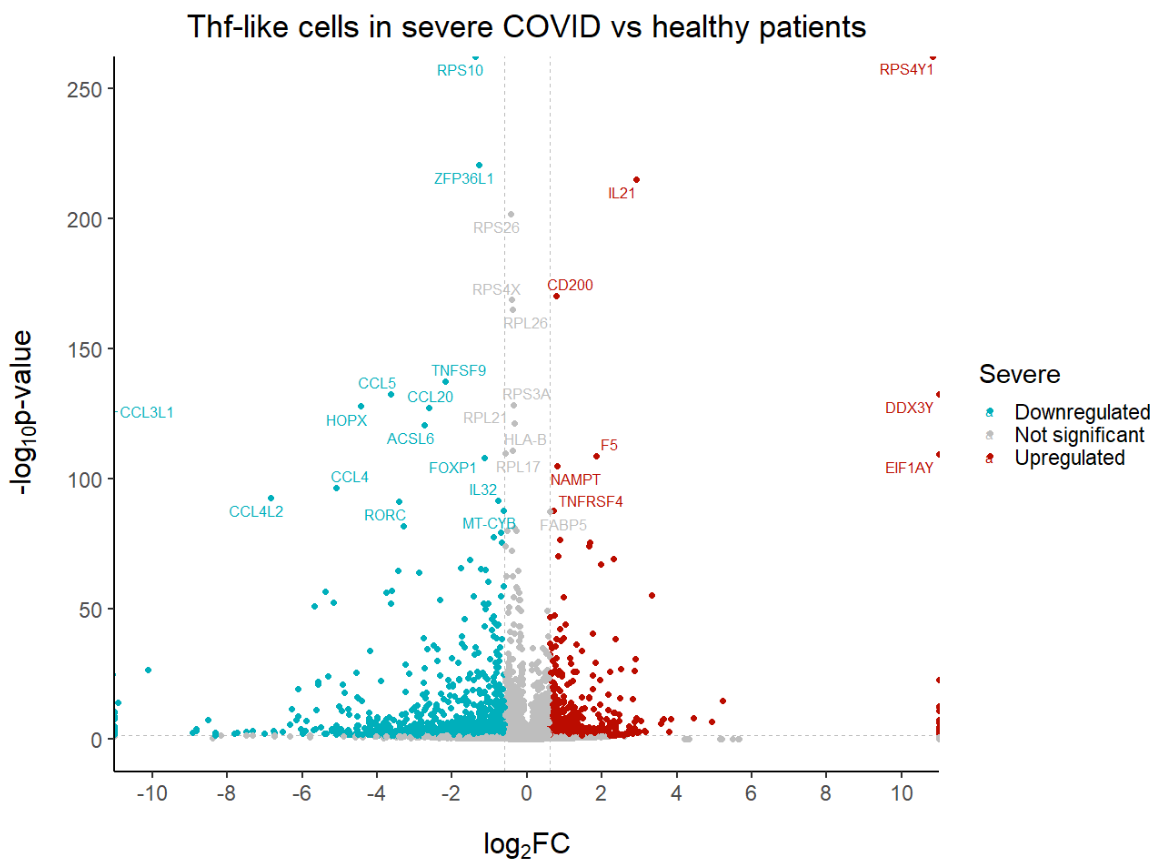
Create a volcano plot in 5 steps
The dataset
For this tutorial, I will use the human COVID T cell single-cell RNA-seq dataset from Bacher et al. (2020). You can read more about the dataset and obtain it for free here.
I already pre-processed the data and carried out the differential gene expression analysis between severe and healthy samples for Tfh-like cells. To follow this tutorial, you can just download the DGE results here. Right click, then ‘Save link as’.
Step 1: Set up your script
First, we need to load the necessary libraries:
# Loading relevant libraries
library(tidyverse) # includes ggplot2, for data visualisation. dplyr, for data manipulation.
library(RColorBrewer) # for a colourful plot
library(ggrepel) # for nice annotations
Step 2: Get the data ready
Let’s get started! The first step when making a volcano plot in R is of course to load the results from differential gene expression analysis.
# Set input path
path <- "C:/Users/Documents/Biostatsquid/Volcano_plots/Tutorial/"
setwd(path)

# Import DGE results
df <- read.csv(paste0(path, 'severevshealthy_degresults.csv'), row.names = 1)
Squidtip
If you want to check which files are in your folder, use
list.files(path)
R will print out all the files you have in your current working directory – basically the folder where R will go looking for your files. And then it is easier to copy paste the filename in the read.csv() function to avoid typos!
As you can see, the dataframe has 4 columns:
-
-
- a column with the gene symbols
- a columns with the p-values,
- a column with the p-adjusted values
- a column with the log2 fold changes.
-

For our volcano plot we will use the p-values (you can also use p-adjusted values, it depends how stringent you want to be) and log2fold change.
Step 3: Create a basic volcano plot
A volcano plot is a scatterplot. In the x axis, we will represent the log2 fold change. In the y axis we will represent the -log10pvalues. Then we call ggplot2’s geom_point() to get a scatterplot.
# Create a basic volcano plot
ggplot(data = df, aes(x = log2fc, y = -log10(pval))) +
         geom_point()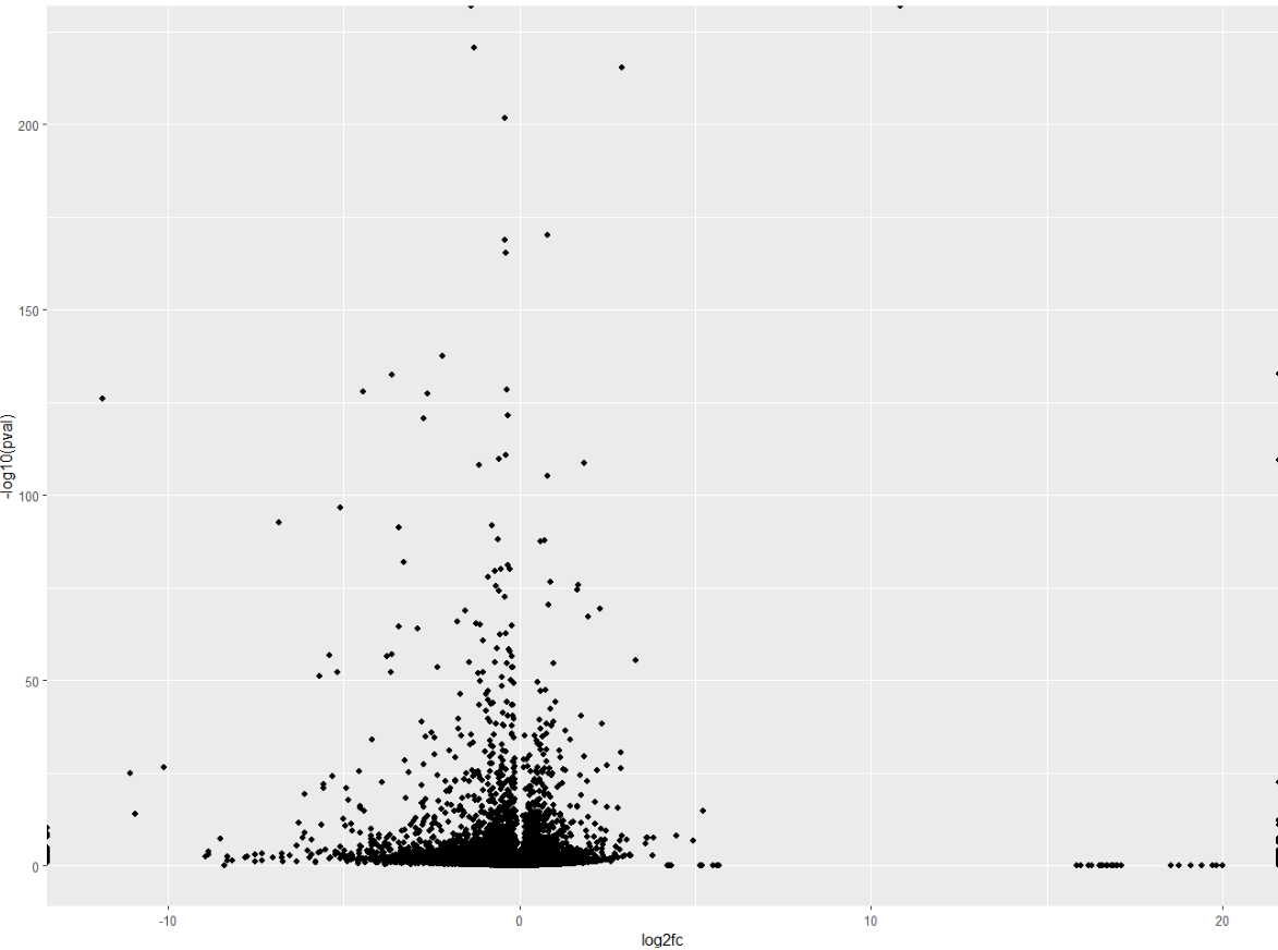
A common addition to volcano plots is to show the thresholds. Threshold lines indicate where the limits are:
- which genes are considered significant, and which are not.
- which genes are considered upregulated, which genes are considered downregulated, and which genes do not have a significant fold change.
For this we will need to add two vertical lines for log2FoldChange thresholds, and one horizontal line for the p-value threshold.
But, how do we decide which threshold to set?
Actually, you are the one who decides and sets the limits. If have a lot of genes, you might want to be more stringent with your p-value threshold. But, most of all, it depends on your data. More of that on another post!
For this example, we will consider genes to be upregulated if the log2fold change if it is > 0.6, downregulated if it is <0.6. Statistically significant genes have a p value < 0.05 (but you can also set it to 0.01 if you want to be more stringent).
We can also decide the colour and type of line.
# Add threshold lines
ggplot(data = df, aes(x = log2fc, y = -log10(pval))) +
  geom_vline(xintercept = c(-0.6, 0.6), col = "gray", linetype = 'dashed') +
  geom_hline(yintercept = -log10(0.05), col = "gray", linetype = 'dashed') +
  geom_point() +
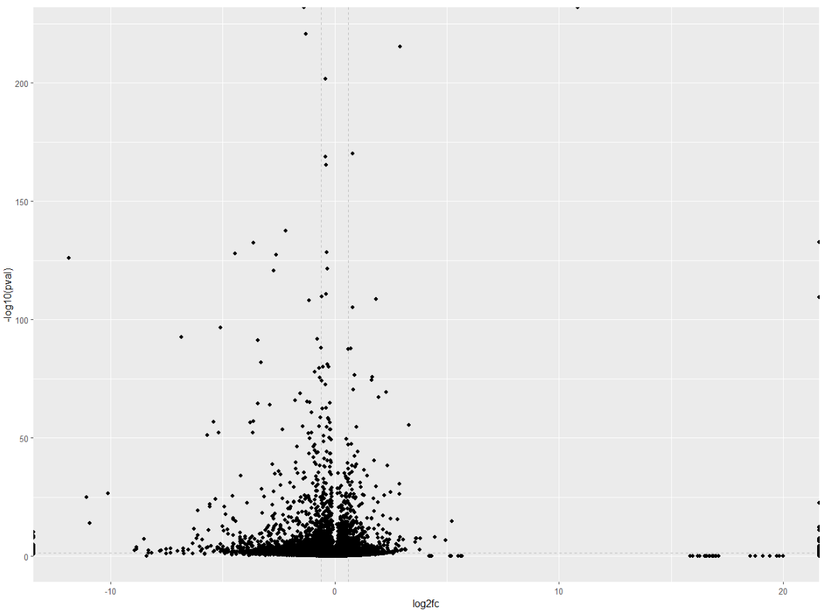
Wohoo! You now added your threshold. Volcano plot looking a bit better now right? Now comes the fun part: customising your volcano plot to make it look pretty and publication-ready!
Squidtip
By the way, did you notice how I added the geom_point() after the x- and y- limits? This is because you want the points (genes) to be places on top of the lines, not the other way around. You can test it by changing the order, you will see how ggplot adds the elements in the order you write them in your script.
Step 4: Customise it!
Now that you have the main ‘skeleton’ of your volcano plot, it is time to customise it. You will be able to edit your plot to make it pretty & publication-ready!
Set your theme
The theme sets general appearance of your plot. You can customise the thickness of the axis, the size of he axis labels, position of the legend…
If you don’t know where to start, you can find ggplot2 themes here. You can always use them as a base and then edit specific parts you want to change.
Add the following lines of code before your ggplot() object and run the script again. Alternatively, you can just add ‘+ theme()’ directly to the ggplot object to edit, but I find it cleaner to set general theme and then customise certain parts for my individual plots if I need it. This has the advantage you can just copy paste the theme to any of your R scripts to keep a consistent look across all of your plots.
# Biostatsquid theme
theme_set(theme_classic(base_size = 20) +
            theme(
              axis.title.y = element_text(face = "bold", margin = margin(0,20,0,0), size = rel(1.1), color = 'black'),
              axis.title.x = element_text(hjust = 0.5, face = "bold", margin = margin(20,0,0,0), size = rel(1.1), color = 'black'),
              plot.title = element_text(hjust = 0.5)
            ))
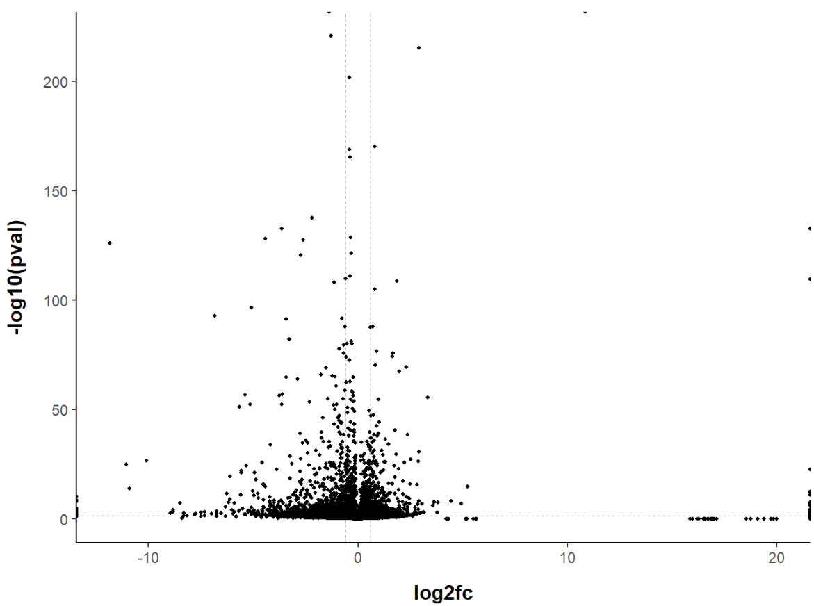
That’s better! Our volcano plot looks much more readable now. Feel free to experiment with the theme options, (almost) anything is possible! You can customise the font, the thickness of the lines, add/remove axis lines, add/remove grid lines or axis ticks…
If you are looking for something in particular, you can check how to edit different elements here (or just Google it, you will probably find a solution faster).
Change point colour and size
You might want to customise the point colour or size of your volcano plot.
For example, a popular option is to colour the genes depending if they are up or down regulated. To highlight significantly differentially expressed genes (DEGs), we will add a column to the dataframe to specify if they are UP- or DOWN-regulated (log2(Fold Change) positive or negative, respectively).
# Add a column to the data frame to specify if they are UP- or DOWN- regulated (log2fc respectively positive or negative)<br /><br /><br />
df$diffexpressed <- "NO"<br /><br /><br />
# if log2Foldchange > 0.6 and pvalue < 0.05, set as "UP"<br /><br /><br />
df$diffexpressed[df$log2fc > 0.6 & df$pval < 0.05] <- "UP"<br /><br /><br />
# if log2Foldchange < -0.6 and pvalue < 0.05, set as "DOWN"<br /><br /><br />
df$diffexpressed[df$log2fc < -0.6 & df$pval < 0.05] <- "DOWN"</p><br /><br />
<p># Explore a bit<br /><br /><br />
head(df[order(df$padj) & df$diffexpressed == 'DOWN', ])<br /><br /><br />
If you check your dataframe now, you will see the newly created column, ‘diffexpressed’, has ‘UP’, ‘DOWN’ or ‘NO’ depending if the genes are up or downregulated, or have not significantly changed. This is the column we will colour by.

Now we only need to set the colour to the column ‘diffexpressed’, and ggplot will do the rest!
With scale_color_manual we can manually edit the colours of our points. We can also override the labels (which would otherwise be ‘UP’, ‘DOWN’ and ‘NO’) with the label option.
ggplot(data = df, aes(x = log2fc, y = -log10(pval), col = diffexpressed)) +<br /><br /><br />
  geom_vline(xintercept = c(-0.6, 0.6), col = "gray", linetype = 'dashed') +<br /><br /><br />
  geom_hline(yintercept = -log10(0.05), col = "gray", linetype = 'dashed') +<br /><br /><br />
  geom_point(size = 2) +<br /><br /><br />
  scale_color_manual(values = c("#00AFBB", "grey", "#FFDB6D"), # to set the colours of our variable<br /><br /><br />
                     labels = c("Downregulated", "Not significant", "Upregulated")) # to set the labels in case we want to overwrite the categories from the dataframe (UP, DOWN, NO)</p><br /><br />
<p>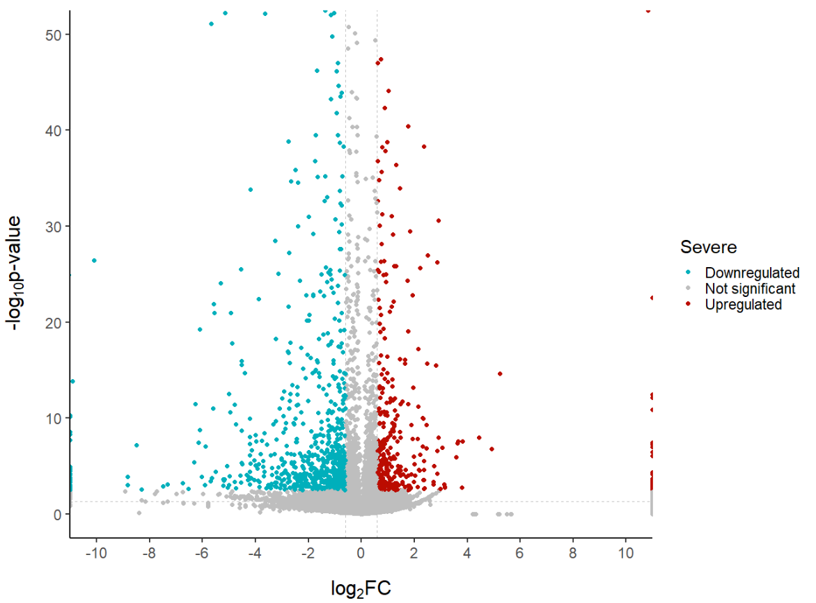
Edit axis labels and limits
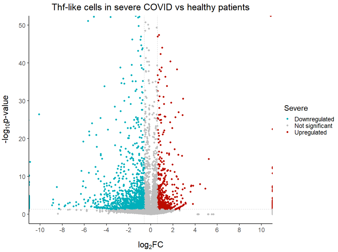
You can edit the axis labels. If you want to make the subscripts for the log2(FC) and log10(p-value) you can also do it like this:
# Edit axis labels and limits
ggplot(data = df, aes(x = log2fc, y = -log10(pval), col = diffexpressed)) +
  geom_vline(xintercept = c(-0.6, 0.6), col = "gray", linetype = 'dashed') +
  geom_hline(yintercept = -log10(0.05), col = "gray", linetype = 'dashed') +
  geom_point(size = 2) +
  scale_color_manual(values = c("#00AFBB", "grey", "#bb0c00"), # to set the colours of our variable
                     labels = c("Downregulated", "Not significant", "Upregulated")) + # to set the labels in case we want to overwrite the categories from the dataframe (UP, DOWN, NO)
  coord_cartesian(ylim = c(0, 50), xlim = c(-10, 10)) + # since some genes can have minuslog10padj of inf, we set these limits
  labs(color = 'Severe', #legend_title,
       x = expression("log"[2]*"FC"), y = expression("-log"[10]*"p-value")) +
  scale_x_continuous(breaks = seq(-10, 10, 2)) # to customise the breaks in the x axis

# Note. with coord_cartesian() even if we have genes with p-values or log2FC ourside our limits, they will still be plotted.
Add a title
Don’t forget to add a title to our plot!
Add gene annotations
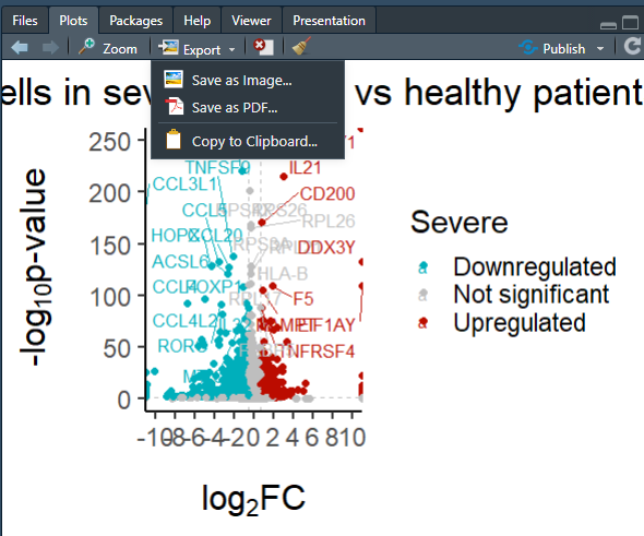
Often we want to see the names of certain genes on the plots. Remember at the start we loaded the library ggrepel? We can add annotations based on a column with geom_text_repel(). This will add the gene symbol annotations next to the points without covering each other.
You can decide which genes names to show. If you use the column ‘gene_symbol’ of our dataframe, ALL gene symbols will be displayed, the result is a bit too overwhelming (my laptop kinda collapsed so I don’t recommend you to try it).
Clearly, we do not need our 30.000 + genes to be displayed. You might want to show the top 10 upregulated genes, or ribosomal genes, or a specific list of interesting genes you want to highlight.
The way to do it is the same in all cases. You just adapt it a bit to your specific case.
Basically, you have to create a new column, which will contain the gene names of those genes you want to show, and NA if you don’t want the gene to be displayed.
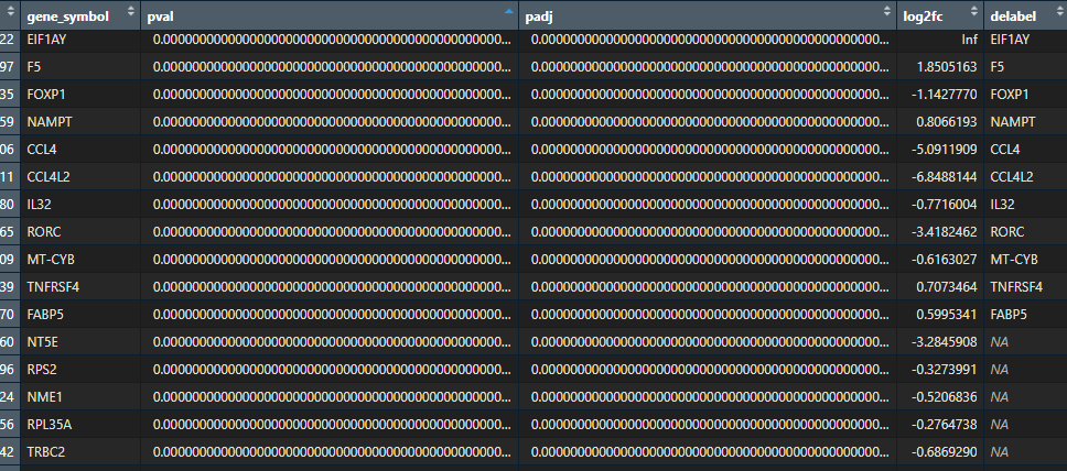
For example, let’s show the top 30 statistically significant genes that are either upregulated or not. For this we will create a new column in our dataframe which contains the names of the top 30 differentially expressed genes, and NA for all the other genes.
We can do this with one line of code:
# Create a new column "delabel" to de, that will contain the name of the top 30 differentially expressed genes (NA in case they are not)
df$delabel <- ifelse(df$gene_symbol %in% head(df[order(df$padj), "gene_symbol"], 30), df$gene_symbol, NA)
Now add the label to your ggplot object and geom_text_repel() to edit what the text looks like. You can also add a border to each of the labels, edit the colour… More on ggrepel here.
ggplot(data = df, aes(x = log2fc, y = -log10(pval), col = diffexpressed, label = delabel)) +
  geom_vline(xintercept = c(-0.6, 0.6), col = "gray", linetype = 'dashed') +
  geom_hline(yintercept = -log10(0.05), col = "gray", linetype = 'dashed') +
  geom_point(size = 2) +
  scale_color_manual(values = c("#00AFBB", "grey", "#bb0c00"), # to set the colours of our variable
                     labels = c("Downregulated", "Not significant", "Upregulated")) + # to set the labels in case we want to overwrite the categories from the dataframe (UP, DOWN, NO)
  coord_cartesian(ylim = c(0, 250), xlim = c(-10, 10)) + # since some genes can have minuslog10padj of inf, we set these limits
  labs(color = 'Severe', #legend_title,
       x = expression("log"[2]*"FC"), y = expression("-log"[10]*"p-value")) +
  scale_x_continuous(breaks = seq(-10, 10, 2)) + # to customise the breaks in the x axis
  ggtitle('Thf-like cells in severe COVID vs healthy patients') + # Plot title
  geom_text_repel(max.overlaps = Inf) # To show all labels

Step 5: Export and save your volcano plot
Once we are happy with how our volcano plot looks like, we can export it as a .pdf, .png, .tiff… You choose!
You can use the ‘Export > Save as’ option within the plots window, or use a few lines of code to customise your export. If you need help with exporting, check out this page.
myvolcanoplot <- ggplot(data = df, aes(x = log2fc, y = -log10(pval), col = diffexpressed, label = delabel)) +
  geom_vline(xintercept = c(-0.6, 0.6), col = "gray", linetype = 'dashed') +
  geom_hline(yintercept = -log10(0.05), col = "gray", linetype = 'dashed') +
  geom_point(size = 2) +
  scale_color_manual(values = c("#00AFBB", "grey", "#bb0c00"), # to set the colours of our variable
                     labels = c("Downregulated", "Not significant", "Upregulated")) + # to set the labels in case we want to overwrite the categories from the dataframe (UP, DOWN, NO)
  coord_cartesian(ylim = c(0, 250), xlim = c(-10, 10)) + # since some genes can have minuslog10padj of inf, we set these limits
  labs(color = 'Severe', #legend_title,
       x = expression("log"[2]*"FC"), y = expression("-log"[10]*"p-value")) +
  scale_x_continuous(breaks = seq(-10, 10, 2)) + # to customise the breaks in the x axis
  ggtitle('Thf-like cells in severe COVID vs healthy patients') + # Plot title
  geom_text_repel(max.overlaps = Inf) # To show all labels


# Open the file that will contain your plot (the name is up to you)
pdf(file = "myvolcanoplot.pdf", width = 8, height = 12) # you can change the size of the output file
# Execute the plot
myvolcanoplot
# Close the file that will contain the plot
dev.off()


# You can also save it as png, jpeg, tiff, bmp, svg, ps...
# For more on saving plots in R check https://biocorecrg.github.io/CRG_RIntroduction/with-the-console.html
And that is the end of this tutorial!
In this post, I explained how to create a volcano plot in R. Hope you found it useful!
Before you go, you might want to check:
Squidtastic!
You made it till the end! Hope you found this post useful.
If you have any questions, or if there are any more topics you would like to see here, leave me a comment down below.
Otherwise, have a very nice day and… see you in the next one!
Squids don't care much for coffee,
but Laura loves a hot cup in the morning!

If you like my content, you might consider buying me a coffee.
You can also leave a comment or a 'like' in my posts or Youtube channel, knowing that they're helpful really motivates me to keep going:)
Cheers and have a 'squidtastic' day!
And that is the end of this tutorial!
In this post, I explained the differences between log2FC and p-value, and why in differential gene expression analysis we don't always get both high log2FC and low p-value. Hope you found it useful!
Before you go, you might want to check:
Squidtastic!
You made it till the end! Hope you found this post useful.
If you have any questions, or if there are any more topics you would like to see here, leave me a comment down below.
Otherwise, have a very nice day and... see you in the next one!


Thank you for your help, you website interface is so good, keep uploading, This is going to help a lot of people.
Hi Sanjai, thank you so much for your kind comment! I intend to bring more materials in the future so I am glad it will be of help to some at least:)
Hey i just thought i add a little usefull info if you use this guid you get an overlapp with letters in the legend ( the small a) you can see it in some of the pictures.
The guid was super helpfull thanks alot for putting it together 🙂
to get rid of it:
add key_glyph = draw_key_point in the geom_text_repel or geom_lable_repel which you can also use.
geom_label_repel(max.overlaps = Inf,key_glyph = draw_key_point)
Hi Frederik, thanks so much, great input! It is always nice to get to know new ways to improve my code so I really appreciate you sharing this:)
Hi!
As a dummy, I follow all your steps (thank you for that!). I have a question regarding adding the additional column to my dataset. If i use this code: df$diffexpressed <- "NO" it gives a error.
Error: unexpected ‘>’ in ” df$diffexpressed <- "NO" ”
Can you tell me what’s going wrong? I just copied your code.
Hello! It is hard to know without seeing what you are actually running (and what you ran before that) – but perhaps RStudio did not recognise the ‘<' symbol as part of the arrow? Perhaps try to retype it, might just work... otherwise I would recommend to search the code for symbols like that '>‘ to see where something could have gone wrong. Good luck!!
Hi Martine,
did you solve the problem?
I get the same error and did not find a solution for it.
Hi,
thanks a lot for this tut.
At the last step, plot not working, to plot with labels, I get this error msg:
Error in grid.Call(C_convert, x, as.integer(whatfrom), as.integer(whatto), :
Viewport has zero dimension(s)
In addition: Warning message:
Removed 33508 rows containing missing values (`geom_text_repel()`).
Hi Abel, no worries, hope it was useful! I would need more info to properly debug your issue, but it seems suspiciously similar to this: https://stackoverflow.com/questions/73935357/error-in-grid-callc-convert-x-as-integerwhatfrom-as-integerwhatto-vie
Seems like increasing the viewer window did the trick.
The warning message is just a warning, telling you that the column you used to add labels to the dots has missing values (which if you followed the tutorial, is true, and just a trick we use to only show the top 10 DEGs…). Let me know if this helped!
I had a problem downloading the file as csv extension. it is always downloaded as txt. I also tried to convert it from txt to csv but didn’t work well. Could you please send me the csv file?
Hi! Thank you for your comment. Could you try right clicking on the button, and selecting “Save link as”? This will hopefully save it as a .csv. Hopefully this will do the trick! Otherwise, you can download the data directly from here, it might be easier: https://rdrr.io/github/LTLA/scRNAseq/man/BacherTCellData.html
I have a specific list of genes which I want labelled on the plot. Could you guide me on how to go about with that?
Hi! Of course! So there are different ways of doing this, but the easiest (at least for me!) is to create a new column in your dataframe, e.g., called ‘gene_labels’. This column will have the gene symbol (or whichever label you want to give to specific genes) for all the genes you want labelled, and NA for all the rest.
In the tutorial, I create the column delabel and use ifelse() to do this, but there are other strategies.
For example,
list_of_specific_genes <- c('TP53', 'AKT2', 'CCNE1', 'BRCA1') df <- df %>% mutate(label = ifelse(df$gene_symbol %in% list_of_specific_genes, df$gene_symbol, NA))
But depending on which genes you would like labelled, might make sense to use a different strategy:
df %>% mutate(label = case_when(endsWith(gene_symbol, “R”) ~ “genes_ending_in_R”,
endsWith(gene_symbol, “S”) ~ “genes_ending_in_S”))
Hope this helped!!
Hi Thank you very much for your this tutorial. However I am stuck on this part.
# Create a new column “delabel” to de, that will contain the name of the top 30 differentially expressed genes (NA in case they are not)
df$delabel <- ifelse(df$gene_symbol %in% head(df[order(df$pval), "gene_symbol"], 30), df$gene_symbol, NA)
For me it did create a delabel column but everything is NA instead of the top 30. I did watch the tutorial video and follow every step but I still get the same result 🙁
Hi! Thanks for your comment!
That’s weird – let’s try to debug it step by step. First, check that you have the columns gene_symbol and pval (not p-val, or p-value…)
What do you get when you run
head(df[order(df$pval), "gene_symbol"], 30)? You should get a vector of gene symbols.You can also try to run
ifelse(df$gene_symbol %in% c('TP53', 'MARCO', 'BRCA1'), 30), df$gene_symbol, NA)– or choose a few genes. When the delabel column is created, they should be marked with the gene symbol instead of NA.Otherwise, there are different ways you can create a delabel column, for example, using tidyverse::mutate() function in combination with case_when().
Hope this helps! Good luck!
I am also coming across same issue, either delabel column is giving all NA or giving gene names for which the required logFC , padj, pvalue conditions are not met.
Please guide with this issue, command line used:
1.) df$delabel <- ifelse(df$Genes %in% head(df[order(df$pval), "Genes"], 30), df$Genes, NA)
2.) vol$delabel <- ifelse(vol$Genes %in% head(vol[sort(vol$padj), "Genes"], 30), vol$Genes, NA)
Hi! Thanks for your comment. What does head(df[order(df$pval), “Genes”], 30) return? They should be the genes that you want to highlight, it should return a vector like c(‘GENE1’, ‘GENE2’, ‘GENE3’). If it doesn’t, then there’s your issue.
Note that here we are ordering the dataframe by pvalue in ascending order (so rows with smaller p-values first), taking the column ‘Genes’ (which has your gene names) and then taking the head() with n = 30, so the first 30 gene names. We are not selecting by logFC, padj. You can of course do that by changing the genes you select.
I suggest you do it in 2 steps:
selected_genes <- df %>% filter(padj < 0.05 & log2FC > 2.5) %>% select(Genes) #!! Please double check this – the syntax might be wrong
df$delabel <- ifelse(df$Genes %in% selected_genes, df$Genes, NA) Hope this helps!
Hi,
When I run the commend
> df$diffexpressed <- "NO"
I noticed the below error
Error: unexpected ‘>’ in “df$diffexpressed <- "NO"”
Please help me to resolve the issue
Hi Thiru – thanks for your comment! That’s probably because you are copying the ‘>’ symbol which is not needed (it just shows in the console when you print the output, which is probably why I have it in the snippet)
Try just this: df$diffexpressed <- "NO" Cheers
Hello! Thanks for this tutorial, it is amazing!! How can I get points with a color on the front, in my volcanoes, grays (not significant) are overlapping red (up) and blue (down), very close to the threshold… Is there a way to send blue and red points to the front?
Hi thanks so much for your feedback! That’s a great question, I’ve often wondered myself, and seems like it’s possible! You just need to arrange the points first: https://stackoverflow.com/questions/15706281/controlling-the-order-of-points-in-ggplot2
You can do it directly in the ggplot() object or separately,
df <- df %>% arrange(label)
ggplot(df, aes(x = x, y = y, color = label, size = size)) +
geom_point()
Otherwise I usually tune the alpha parameter for transparency, so I can see points that are behind other points.
Hey, thanks for the great tutorial, I used your code with my data but I cannot visualise any non-significant gene, codes look okay but it feels like in scale_color_manual, its not taking 3rd option.Im not understanding why
Hi thanks for your feedback! Sorry I cannot help you, need more info about the specific error. Are you sure you have non-significant genes? try calling unique(df$diffexpressed) – do you get all 3 values, ‘UP’, ‘DOWN’ and ‘NO’ ?
Hi! Thank you very much for this guide!! I have a question about the X axis display.
How can I show a range of the X axis and still display all the data points accumulating at the margins?
I noticed that after changing the color for the differentially expressed genes, there is a change also in the x axis size, which goes from -10 to 10 (instead of -10 to 20, like in the previous plots).
I have tried to set min and max for the X axis, but I lose all the points that are outside of this limit, instead of being “squeezed” at the margin of the plot (like in the figures).
Hi! Hmmm not sure what data you are using, but that’s a bit weird – the colour shouldn’t affect the scales.
So how I change the axis limits is by setting the breaks with
scale_x_continuous(breaks = seq(-10, 10, 2))
This means I will display x axis breaks from -10 to 10, in intervals of 2 (so -10, -8, -6…). In hindsight I would probably change this and make it a bit wider, to make the points not ‘squeeze’ if possible and show the real log2FC. So I think what you are looking for is scale_x_continuous(breaks = seq(-30, 30, 2) for example.
Note that this is different from xlim — with xlim you are cutting off whatever is outside the minimum or the maximum!! This is not recommended as you are hiding data!
Hope this answered your question!:)
Hi, this is a terrific guide!
May I ask for your guidance on the following issues:
1) How can we name the top 10 genes in each of the upregulated and downregulated groups, instead of top 20 regardless of up- or downregulated?
2) Is the there a remedy to labels overlapping with data point on the plot?
3) For the legend by the side, instead of a dot that represents a data point, its showing as “a”, was there an error on my part?
Thank you!
Hi! Thanks for your comment! Great questions! From the top of my head (you might need to tweak things a bit to make them work):
1) Let’s do it in several steps,
# Arrange the dataframe by p value within each group of ‘diffexpressed’
df <- df %>% arrange(diffexpressed, padj)
# Group by ‘diffexpressed’ and filter the top 10 rows, then select the gene symbols
top_gene_symbols <- df %>% group_by(diffexpressed) %>% slice_head(n = 10) %>% select(gene_symbol)
# Create a new column ‘delabel’ where gene symbols match the top ones
df <- df %>% mutate(delabel = ifelse(gene_symbol %in% top_gene_symbols, gene_symbol, NA))
2) Yes, definitely – inside geom_text_repel(), use the arguments nudge_x = 0.2, nudge_y = 0.2. Adjust nudge values as needed to fine-tune label positions
3) Nope – this is an error on my side. It’s using a because the legend is about the labels (‘a’ is for text). Try following this blogpost here:
https://stackoverflow.com/questions/18337653/remove-a-from-legend-when-using-aesthetics-and-geom-text
I need to update the tutorial for this so thanks for the reminder!
Let me know how it goes:)
Hi .
This tutorial is awsome and so helpful for me.
Thank you so much .
I just have a problem in one of the las steps , when I am runninng geom_text_repel() code ,
I got this and I dont know why is that :
Error in `geom_text_repel()`:
! Problem while setting up geom.
ℹ Error occurred in the 1st layer.
Caused by error in `compute_geom_1()`:
! `geom_text_repel()` requires the following missing aesthetics: label.
Run `rlang::last_trace()` to see where the error occurred.
Hi, thanks for your comment! Looks like you are missing the actual labels in your code. There are different ways to add them, e.g., with labs or geom_text or inside the ggplot(aes(label = …)) or geom_text_repel(aes(label = …)). You can check examples here: https://ggrepel.slowkow.com/articles/examples
Hi Biostatsquid!
I love your tutorials – they’re always so helpful!
This might be a silly question but can this volcano plot code/tutorial be applied to bulk RNA seq data if I have processed detab file (containing avglog2CPM, avglog2FC, P value, FDR)
Thanks in advance!
R newbie
Thank you so much for your feedback:) Glad you like my content! And for sure! You might need to change the column names to match the ones you have but the code is essentially the same:)
Extremely usefule tutorial for me. Bought you a coffee for it. Keep posting and updating this website, as a budding biostats person in a Chem department it is invaluable. I hope you are able to make this a more full-time gig, if you want it to be! Was going to say the same thing through your contact form, but I think it may be bugged. It threw an error when I tried to use it.
Thanks again.
This is so helpful! Thank you so much for the detailed explanation and your tutorials. If possible, could you please let me know that how you preprocessed data? How you got pvalue and log2FC from raw files?
Hi, I was able to add the delabel column to my data.frame, however, when I run the script to label the top 30, I get this error message:
df$delabel <- ifelse(df$gene_symbol %in% head(df[order(df$padj), "gene_symbol"], 30), df$gene_symbol, NA)
Error in `$<-.data.frame`(`*tmp*`, delabel, value = logical(0)) :
replacement has 0 rows, data has 2389
When I ran head(df), I noticed that the first column is missing it's header, that is "gene_symbol" Is this the reason for the error? How do I fix it?
Hard to say without seeing the data but that definitely would be a reason. Make sure your df dataset has the column names gene_symbol, padj… etc kjust like the tutorial shows. You can check by calling colnames(df). Good luck!
Hi,
I’m encountering an issue while trying to add certain labels to my plot. I’ve created a column that contains names for the genes I want to annotate and uses NA for everything else. However, when I run the final code, I get the following error:
Error in replace_null(unclass(data), label = “a”, angle = 0) :
could not find function “replace_null”
In addition: Warning message:
Removed 1739 rows containing missing values (`geom_text_repel()`).
Error during wrapup: ‘length = 2’ in coercion to ‘logical(1)’
Error: no more error handlers available (recursive errors?); invoking ‘abort’ restart
From what I understand, the issue might be related to the code assuming there are no labels for the NA values, which is causing problems.
Could you suggest the best way to resolve this? Any help would be greatly appreciated!
Thank you!
Hey! Thanks for your comment. Seems like you are using a function (replace_null) that doesn’t exist. If it’s this one: https://www.rdocumentation.org/packages/roomba/versions/0.1.0/topics/replace_null
Make sure you have roomba installed and loaded:
install.packages(‘roomba’)
library(roomba)
Otherwise in my tutorial I use a simple ifelse statement to replace NA values. Hope this helps!
Thanks for the tutorial. This is extremely helpful for generating a well-customized and beautiful plot!! Really appreciate it!
Thank you so much!!
good tutorial, very cute and simple. Thanks
Thanks so much!:)
Dear BiostatSquid,
Thank you for the tutoral, very helpful. I wanted to ask since the volcano title says ‘Thf-like cells in severe COVID vs healthy patients’ and we see the Severe downregulated and upregulated genes. Do we also have to de for the healthy controls so that we can see the differnces in diffrentiated genes.
I am not sure if l am missing the point but your help is higly appreciated.
Hi! Great question, let me see if I can clarify it for you. We’ve run differential expression (DE) analysis between these two groups (severe vs healthy). The plot shows which genes are upregulated in severe patients (positive log fold-change) and which are downregulated in severe patients (negative log fold-change). This comparison is bidirectional:
Genes upregulated in severe= downregulated in healthy
Genes downregulated in severe = upregulated in healthy
So, there’s no need to repeat the DE analysis in the opposite direction (healthy vs severe) — it’s the same analysis, just flipped in interpretation.
If you do it you would just get the volcano plot, mirrored!
Hope this helped:)
Awesome! Its genuinely remarkable post, I have got much clear idea regarding from this post