
Comparing top integration methods for scRNAseq data
When we want to combine multiple scRNA-seq datasets to answer bigger questions, we encounter batch effects – unwanted technical variations that arise from differences in how the experiments were performed. These batch effects can obscure the real biological signals we’re trying to detect.
To solve this problem and make datasets comparable, we need single-cell integration methods. Integration methods essentially try to correct batch effects whilst preserving as much biological signal as possible.
In part 1, we presented some of the most popular integration methods for single-cell RNAseq.
So now that it is time to integrate your data, how do you know which method is best?
In part 2, we will compare some of the most popular methods for single-cell RNAseq integration.
To compare methods more objectively, several benchmarking studies have been published. Most of this content of this video is based on the Luecken et al Nature methods paper from 2022 which you can access here.
So if you are ready… let’s dive in!
Keep reading or click on the video to find out which is the best single-cell integration method for your data!
Benchmarking integration methods
Integration methods essentially try to correct batch effects whilst preserving as much biological signal as possible.
So when we want to “score” integration methods and find out which one works best, we essentially want to know how each method scores on how well it preserves biological signal and how well it removes the technical effects.

Malte Luecken and colleagues did an excellent job at benchmarking 16 popular integration methods across different integration tasks (you can access the publication here). Their study provides a more objective guide on which methods work best under different scenarios, which is great, because as you will see, different tools perform best with different integration challenges.
Step 1: define your integration task
So the first thing is to define these integration challenges, or integration tasks.
Each integration task represents a different source of variation or batch effect you’d like to correct for. Are you trying to integrate data from different institutes? Are you doing a cross-species comparison? Do you have data from different tissue sites of the same patient?
Your first step is to identify what are your batch effects. That will help you focus on the benchmarking results for that integration task. In the Luecken paper, the main integration tasks included:
– Simple datasets with clear cell types. Here, the challenge is to integrate datasets from different batches which may have been processed at different times, or by different labs or people, or they may come from different tissue sites, but we expect very similar cell types and all genes are human genes.
– Complex datasets with nested batch effects (like mouse brain data with 1 million cells).

Squidtip
Nested batch effects occur when there are multiple levels of unwanted technical variation in data, such as when samples from different experiments are processed in different batches, and those same experiments are also organized into different lab groups.
– Data with strong biological variations (different species, tissues, or disease states). The authors found that the most challenging batch effects across the integration tasks were due to species, sampling locations and single-nucleus versus single-cell data. So, for example, the human and mouse immune datasets gets a bit trickier because we are integrating data from two different species, so even the same cell types have different gene expression profiles with some genes being species-specific and there will be unique cell types to a species.
-Different data modalities (scRNA-seq and scATAC-seq for chromatin accessibility)

Why is it important to define your integration task well?
As you will see, one of the key takeaways of this publication is that method performance is dependent on the complexity of the integration task. So, depending on what batch effects you are trying to correct, one method will be better at correcting it than another.
For example, Harmony works really well on simple integration tasks but on more complex integration tasks it doesn’t rank top 3, there you might be better off choosing a method like Scanorama (embeddings) or scVI. But we’ll get into the results in just a minute.

Step 2: define your integration performance metrics
How do you know whether your cells are well integrated or not?
The next step is to figure out how exactly do we measure whether a specific integration method performs better than another. So a good integration method should merge and transform the data in a way that it removes the batch effects between the different datasets whilst keeping as much of the real biological signal as possible.
But don’t worry! Luecken and colleages already did the hard work for us and scored the 16 integration methods across a wide variety of performance metrics. So depending on what’s important to you, if you want high biological conservation, or high technical batch effects removal, or the best of both worlds, you can objectively compare the performance scores for all methods.
Experiment design is key!
Note that a big part of how well we can remove batch effects computationally is tied to how the experiment was designed.
For example, let’s say we want to test for differences between blue and pink lymphocytes, represented by stars.
If we process all blue samples in one batch and all pink samples in another batch, it means batch and condition (colour) is confounded. It’s going to be very difficult to correct for batch differences, so purely technical differences, and see the actual biological differences between blue and pink stars (or lymphocytes).

If we don’t correct, we won’t be sure whether the differences we’re seeing are due to batch effects (technical differences) between both batches.
And if we apply a correction method, it might overcorrect the data; so we get a good overlap between batches, but we’re losing the biological signals. In this simple example, we cannot distinguish stars from circles anymore.

A good experimental design will enable you to correct for batch effects, but keep the biological signals, in this case, stars versus circles, that you want to observe.
All this is to say that batch correction methods are a great bioinformatic tool to have but they cannot do miracles, and often if you don’t use them properly they can actually be harmful for the analysis you want to do.

How do we measure the performance of an integration method?
Essentially, we want to quantify how different methods remove technical effects and keep biological signals.
The researchers used 14 metrics divided into two categories:
- Batch Effect Removal Metrics assess how well methods mix cells from different batches. You don’t need to understand how each of these metrics works to be able to choose a good integration method for your data, but here’s a brief overview of what they do.
- kBET (k-nearest neighbour Batch Effect Test): Checks if a cell’s neighbours come from multiple batches
- Graph iLISI (integration Local Inverse Simpson’s Index): Measures diversity of batches in cell neighbourhoods
- ASW (Average Silhouette Width): Measures how separated batches are
- Graph connectivity: Checks if cells with the same identity are connected across batches
- PCR (Principal Component Regression): Measures variance explained by batch

- Biological Conservation Metrics, which assess how well methods preserve real biological differences. Here we can distinguish two categories, depending whether we know or not the cell types already.
2.1. Label conservation metrics harness the known labels or cell types to measure how well they are clustering together. Basically we know that tumour cells should cluster together with tumour cells from other samples or batches. So similar to batch effect correction metrics, we have different ways of measuring this clustering at cell type level.
- NMI (Normalized Mutual Information) and ARI (Adjusted Rand Index): Compare clustering results to known cell types
- Cell-type ASW: Measures how well cell types are separated
- Graph cLISI: Measures how well cells of the same type cluster together
- Isolated label scores: Assess preservation of rare cell types
2.2. Label-free conservation metrics: these metrics go beyond cell type labels
- Cell-cycle conservation: Preserves cell cycle variation
- HVG conservation: Retains informative genes after integration
- Trajectory conservation: Maintains developmental or differentiation paths

So for each method and each integration task we’ll get a score for each metric. If you’re interested in a feature you can always look at specific scores for one of the metrics.
For example, if it’s very important for you to retain cell cycle variation, then you might want to use the top scoring method for the cell cycle conservation metric, if you’re interested in maintaining developmental or differentiation paths, then you would look for the methods with the highest scores for trajectory conservation.
Otherwise, if you want to focus on the overall score of the method for a particular task, the authors also report an overall score which summarises all this by giving 60% weight to the biological conservation metrics, and 40% weight to the batch correction metrics.
This basically reflects that preserving biology is more important than removing batch effects.

The trade-off between biological preservation and bach effect removal
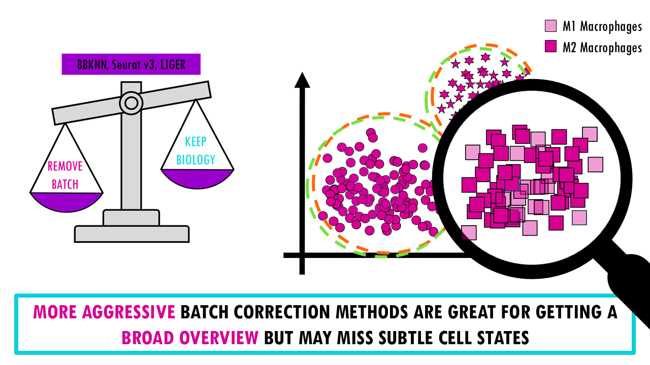
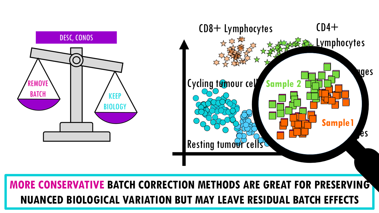
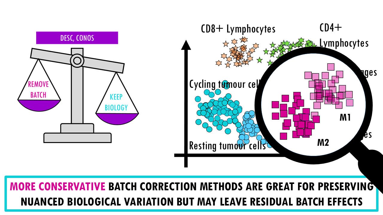
There’s a reason why I present this as a weighing scale, A key point of the benchmarking study is that there’s an inherent trade-off between removing batch effects and preserving biological variation; meaning we can’t really get the very best of both worlds.
- More aggressive batch correction methods (like BBKNN, Seurat v3, LIGER) do a good job at mixing cells from different batches and they are great for getting a broad overview. However, because we are being more aggressive with the batch correction, there’s a higher chance we’re removing real biological differences. So these methods can merge subtly different cell states, especially if there’s very little difference between them.
- If we take the opposite, conservative methods (like DESC, Conos), we find that they’re better at preserving nuanced biological variation and retaining rare cell types but of course, they may leave residual batch structure, meaning cells from different batches might not fully integrate. For example, you might see a clear separation between M1 and M2 macrophages in two distinct clusters but when we look closely, we realise that within each group they’re not really integrated well and are separating by sample.
- There are also more balanced methods (like Scanorama, scVI, FastMNN) which achieve a good compromise between both objectives and work well across diverse scenarios.
But before you go completely discard the more conservative or aggressive integration methods, you need to understand that sometimes they might be the right choice for your data too.
If you have strong, obvious batch effects need correction (e.g., cross-species comparison) or you just want a high-level overview of major cell types, then a more aggressive batch removal method might be right for you.
If you are dealing with subtle cell states or rare populations, developmental trajectories, or if biological variation might be confounded with batch effects, then you might want a more conservative approach, knowing that some batch effects will remain.
Figure 3 in the publication shows a nice scatterplot of the mean overall batch correction score against mean overall bio-conservation score for a few selected methods on RNA tasks. Ideally you want a method that’s in the top right corner, meaning it scores highly both for batch correction and bio-conservation. But as you can see from the error bars, these scores change depending on the task.
For example, if we zoom in on Conos (light purple, top leftmost point), it might perform really well in terms of conserving the biology for some tasks, but poorly for others. So again, you’ll get a better estimate of how each method will perform on your data if you check the stats for a similar task. We’ll see how to do this in just a bit.

Nice! As a recap, we’ve talked about different integration tasks, different methods we can use to overcome these integration challenges, and we’ve also mentioned the ways we can measure how well each method performed.
To scale or not to scale
If you have already used any integration tool, you might already know that there are different ways to run the tools; many have different parameters you an optimise.
This publication focused on two main ones: using scaled or unscaled data, highly variable genes (HVG) or the full gene set… The general trend that this benchmark study observed was that
- most methods improved when Highly Variable Gene (HVG) were selected before integration. They got better overall scores than when using all genes.
- scaling (z-score normalization) showed better batch removal but worse biological conservation.
So the (very) general recommendation is to use HVG selection, avoid scaling unless batch effects are very strong.

So… how do I choose the best integration method for my data?
Ok, so let’s say you have an integration task at hand – you have several datasets you’d like to integrate. How to decide?
I would recommend you to check out figure 5, which is a fantastic table the authors put together where they present general guidelines to choose an integration method.

- Inputs: depending on if you are more used to R or Python, and if you have cell type labels – scANVI and scGen need cell type labels for integration, so you have to have annotated your cells first.
- Integration scores across the different integration tasks. We have top performers for smaller or simpler tasks, like Scanorama (embedding), FASMNN with embedding, scGen and Harmony. And top performers on larger or more complex tasks like scANVI, scVI, Scanorama and scGen. And for ATAC-seq integration jobs we have Harmony and LIGER.
- Task-related details, like which one is the best for very strong batch effects, which one is the best at distinguishing biological and technical differences, which one is best for trajectories or for datasets with different compositions… So this section of the table is very useful if you have a specific issue or task at hand.
- Scalability and speed. Apart from the expected performance we’ve already talked about, you also want to know whether your method is scalable, especially for tasks where you want to integrate a large number of datasets. With single cell these can become huge, so you might need more computational power or you might be interested in faster methods or more memory efficient methods – some methods have GPU support, for example. The authors also scored their usability, meaning how well they are documented, if there’s tutorials and active development for the tool.
- Ouput. If you’re looking to do specific downstream analyses like trajectory inference, then you need corrected gene expression values so methods that output a graph won’t be adequate.
Example: choosing an integration method
Let’s say we have a simple integration task where we want to see whether there are differences in immune cells of mice that have had the flu versus healthy controls. So we have several donors or mice in each group, control and condition, we take blood samples, and because of whatever reason (time constraints, or the sequences can only take a certain number of samples at a time…) we sequence them in two batches. When we process our single-cell data and get our UMAP, we see clusters of different immune cells, as we expect. Great! We can now move on to DGE analysis.
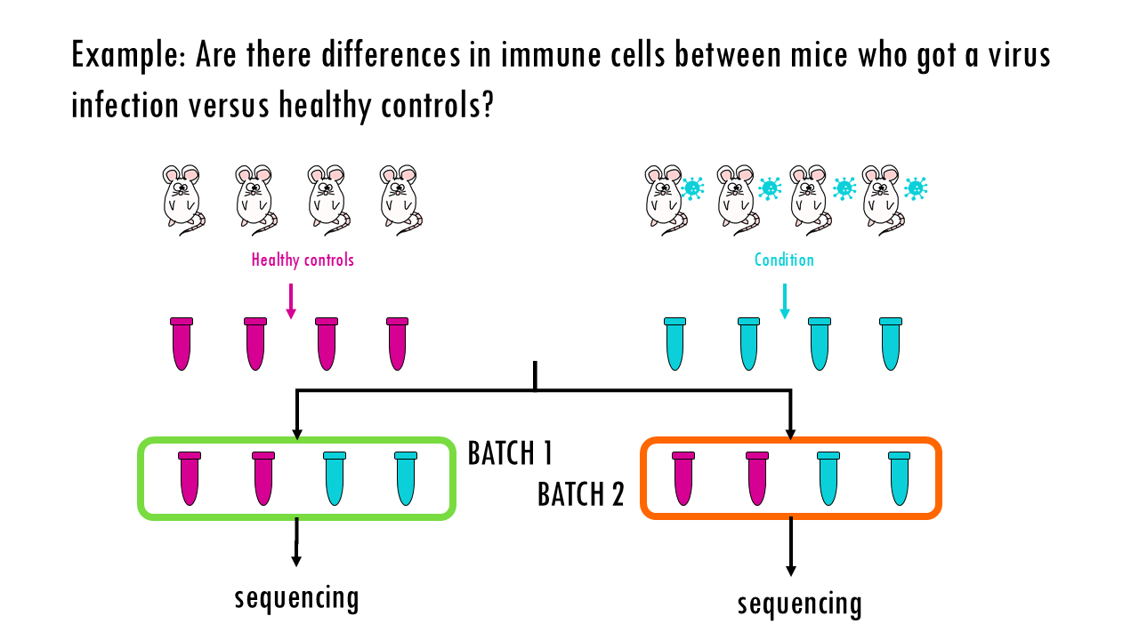
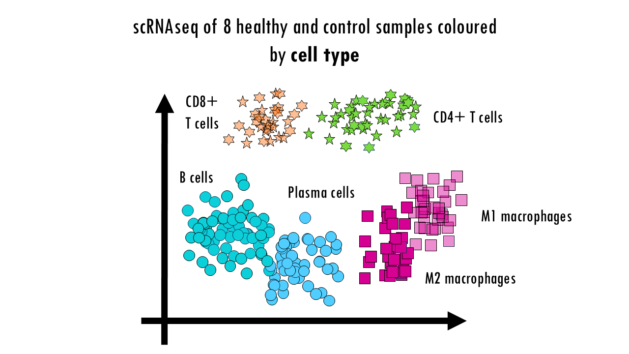
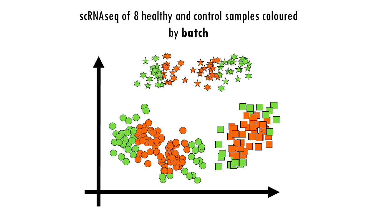
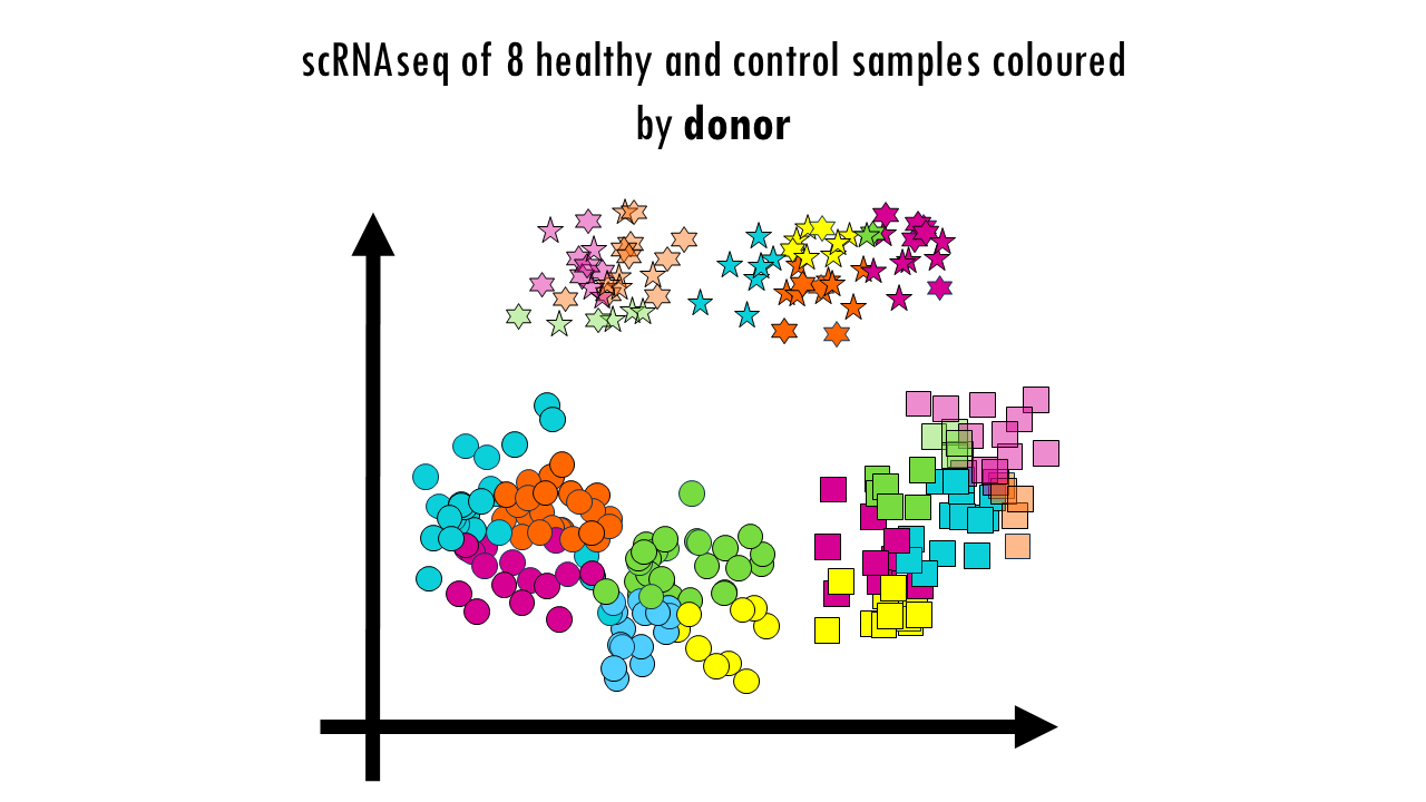
But wait a minute… Let’s colour these cells by batch. We see a clear separation of samples by batch, so the data is not well integrated. We can also colour them by donor, meaning the actual mouse the sample came from. We can also observe sample-specific clusters. It can be ok to have sample-specific clusters if, for example, a specific subtype of patients has a rare cell type population. For example, maybe the viral infection caused an increase in Plasma cells, which are not present in the control samples, or are present in negligible numbers. But in general, we want our cells clustering by cell type and not by sample. We cannot compare cell types between control or healthy samples because we wouldn’t be sure whether we’re observing true biological differences or differences due to the fact that some samples where sequences in one batch versus another. Based on this UMAP, we would need to improve the integration a bit.
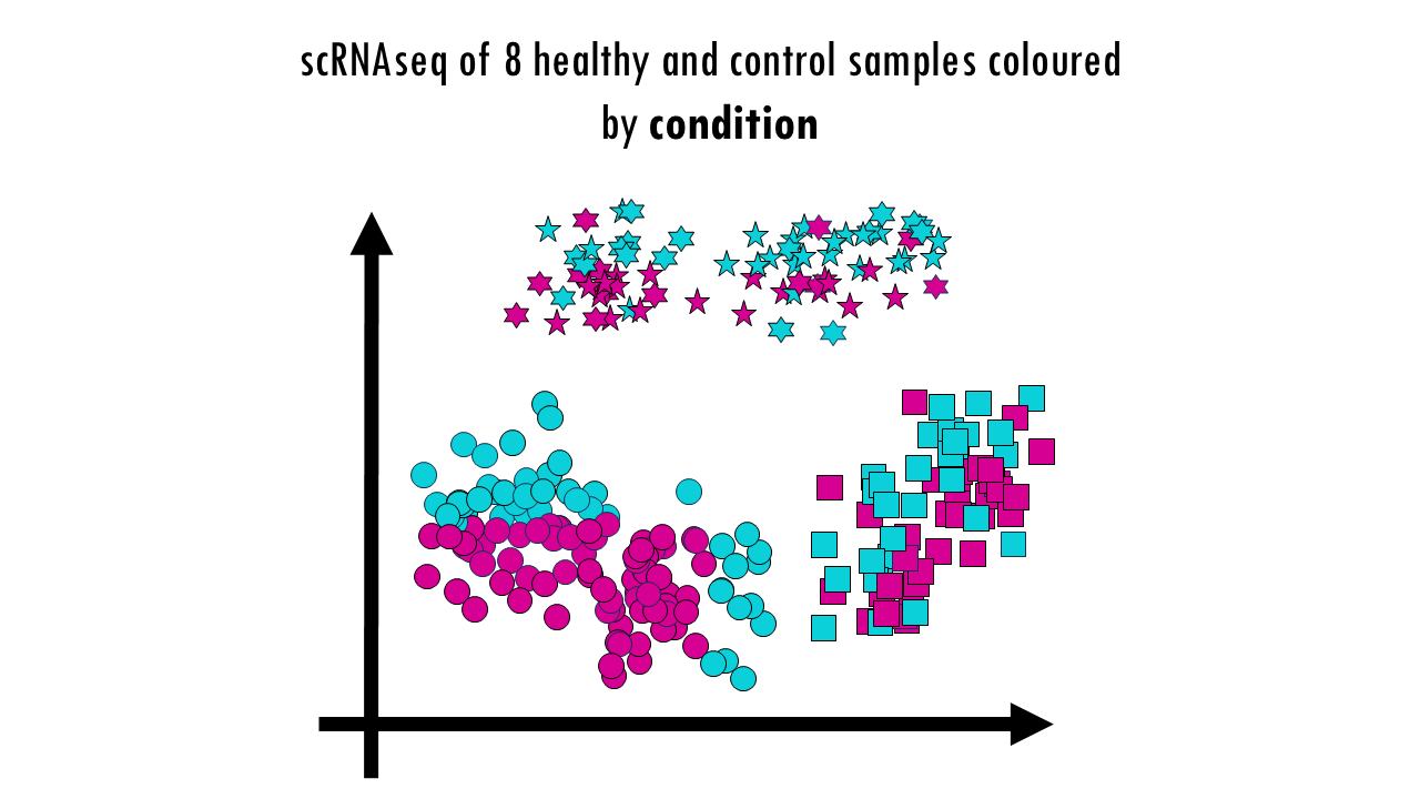
Finally, we can colour them by condition. No here, we’re not expecting a full integration because it’s actually the condition we’re investigating. So some cell types might be better integrated than others; and the UMAP might already give you some clues as to which cell types are most affected or most different as a results of the virus infection; but it doesn’t need to be a perfectly integrated data. Later on when we do DGE analysis and other downstream analyses we’ll find out what’s different between healthy samples and controls. But to be able to compare those groups, we first need to make sure we’re not observing differences based on the actual sample they came from or the batch.
So what do we do now?
Well, we need to integrate our data.
To choose an integration method, we can go to our benchmarking study. This set-up – two batches with different donors – is similar to the human pancreas task, which comprises six human pancreas datasets; so same species, same tissue, and just different donors. So we’ll focus on the results for that integration task. The authors created some really nice summary tables, in the supplementary material we can find the one for the pancreas dataset.

From their benchmarking results, we can see that Harmony and Seurat’s RPCA and CCA performed best overall, followed closely by fastMNN and scGen. Make sure to also check out the preprocessing options. We can see that it’s best to use HVGs and scaling works ok in this case for most of the top scorers. If our dataset has any particularities, for example, if we have particular interest in cell cycle conservation, then we might want to check out the particular score for that metric, but otherwise, you can focus on the overall score, as well as the scores for batch correction and bio conservation.
Interestingly, for this task some methods perform even worse than not doing anything at all. That’s why it’s important to choose your integration method carefully. So again, these are the results for a very simple integration task, but if you have more complex scenarios, then check out the integration task that’s more similar to your own. For example, if you have data from different tissue sites, then the human immune task is for you, or if you want to integrate cross-species, then check out the human and mouse integration task results.
Check this out!
Not only can you check the summary tables in the publication itself, but the authors also provided a fantastic website to explore the results in a more interactive way, which really help compare different methods. You can click on particular methods you are interested in, or particular datasets / tasks you would like to know the stats of. You can check it out here.
I hope this helps you in deciding which method is most adequate for your integration task.
Final notes
So these are the main findings of this publication, but I will leave some other benchmarking studies in the blogpost in case you’d like further reading. And of course, I really encourage you to read the actual paper, I’m just summarising some of the main points here. And I should mention that Luecken’s benchmarking study was published in 2022 so it might be missing some newer tools.
So yeah, hopefully this will make your life much easier when trying to decide on an integration method. And that’s it for today, squidtastic!
Want to know more?
Additional resources
If you would like to know more about single-cell integration methods, check out:
- Benchmarking atlas-level data integration in single-cell genomics
- A comparison of integration methods for single-cell RNA sequencing data and ATAC sequencing data
- Benchmarking cross-species single-cell RNA-seq data integration methods: towards a cell type tree of life
You might be interested in…
Squidtastic!
Wohoo! You made it 'til the end!
Hope you found this post useful. If you have any questions, or if there are any more topics you would like to see here, leave me a comment down below. Your feedback is really appreciated and it helps me create more useful content:)
Otherwise, have a very nice day and... see you in the next one!
Before you go, you might want to check:
Squids don't care much for coffee,
but Laura loves a hot cup in the morning!

If you like my content, you might consider buying me a coffee.
You can also leave a comment or a 'like' in my posts or Youtube channel, knowing that they're helpful really motivates me to keep going:)
Cheers and have a 'squidtastic' day!
