A simple explanation of Kaplan-Meier curves and how to interpret them!
In my previous blogpost, we talked about survival time analysis. In a nutshell, survival time analysis, is a group of statistical methods we use to investigate the time it takes for an event of interest to occur. A typical example is in a clinical trial, where the event of interest is death.
One of the statistical methods we can use is the Kaplan-Meier curve. In this post, we will discuss the main concepts behind Kaplan Meier curves and I will give you simple guidelines on how to interpret a Kaplan-Meier curve.
So if you are ready… let’s dive in!
Keep reading or click on the video to learn about Kaplan-Meier curves!
What is a Kaplan-Meier curve?
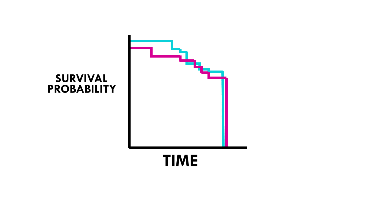
The Kaplan Meier curve is used to graphically represent the survival rate or survival function.
- In the x-axis, we have time.
- In the y-axis, we plot probability of survival or survival rate.
How to interpret the Kaplan-Meier curve?
Here are some simple guidelines on how to interpret the Kaplan-Meier curve.
1. Check the axes
To interpret the K-M curve, we first need to look at the axes. The horizontal axis represents time, usually measured in months or years. The vertical axis represents the estimated probability of an event. So the first step is to identify what is the event of interest and the units of measurement along the axes.

2. Check the shape of the curve
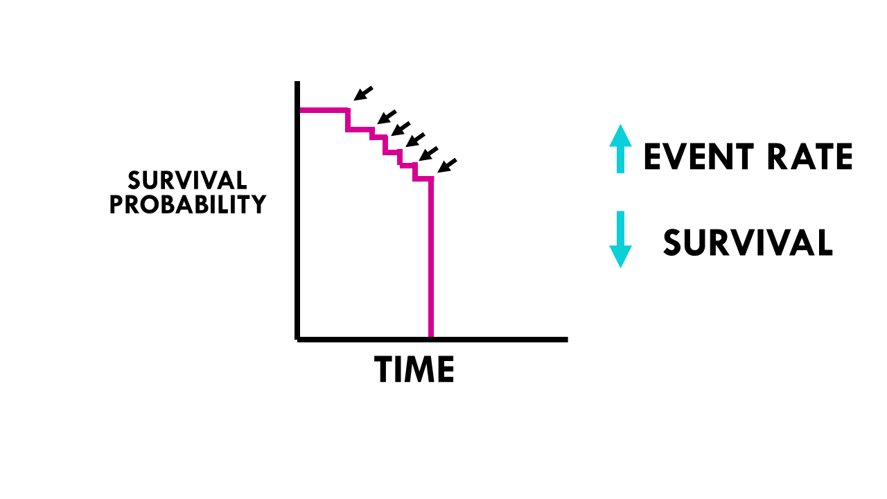
At a first glance, the shape of a Kaplan-Meier curve can already give you a lot of information.
- A steeper slope indicates a higher event rate. If the event is death, then it means worse survival.
- A flatter slope indicates a lower event rate. In other words, a better survival prognosis.

3. Survival at specific timepoints
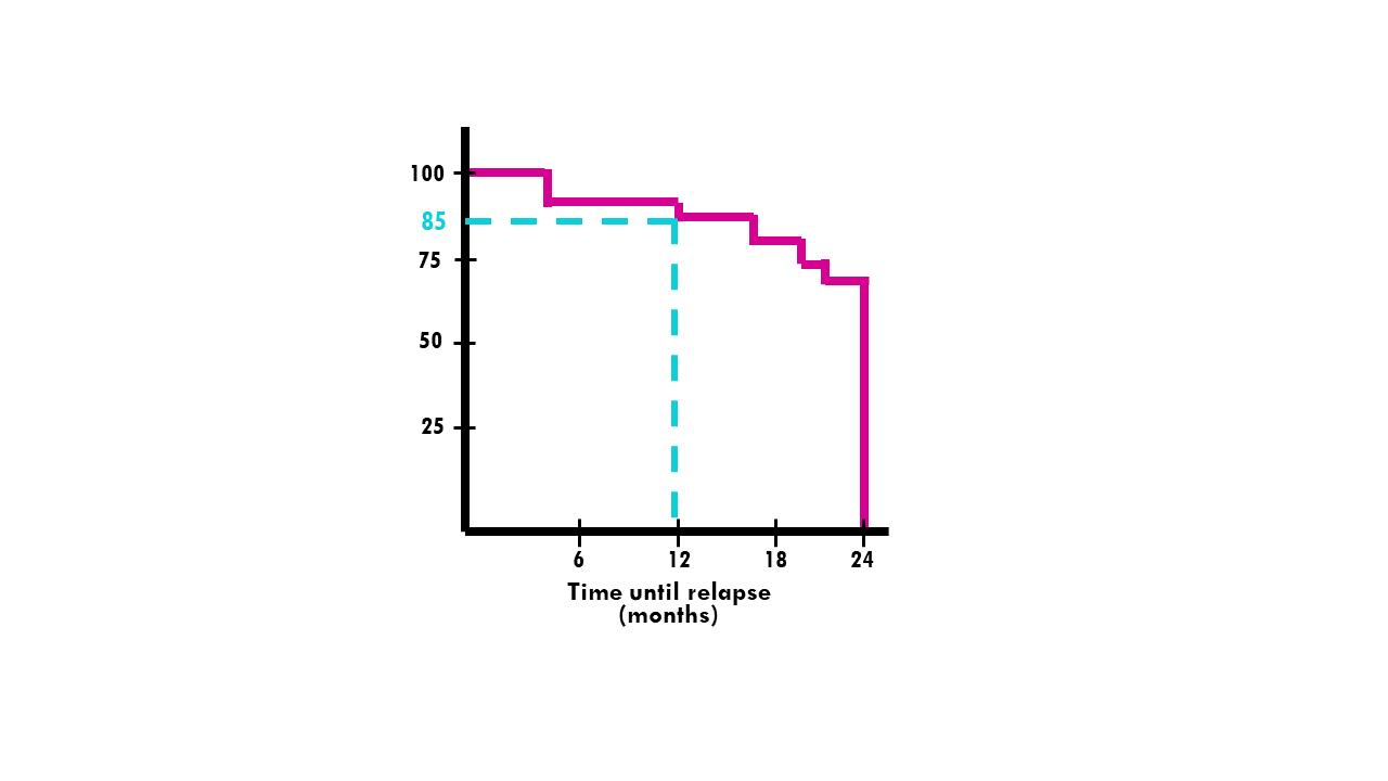
Sometimes we are interested in the survival probability at a specific timepoint. For example, what is the probability of a patient surviving 5 years after being diagnosed with lung cancer? At specific time points, you can estimate the survival probability by locating the time point on the horizontal axis and dropping a vertical line to the curve. Then, read the corresponding survival probability from the vertical axis. If you are looking for bracelet. There’s something to suit every look, from body-hugging to structured, from cuffs to chain and cuffs.
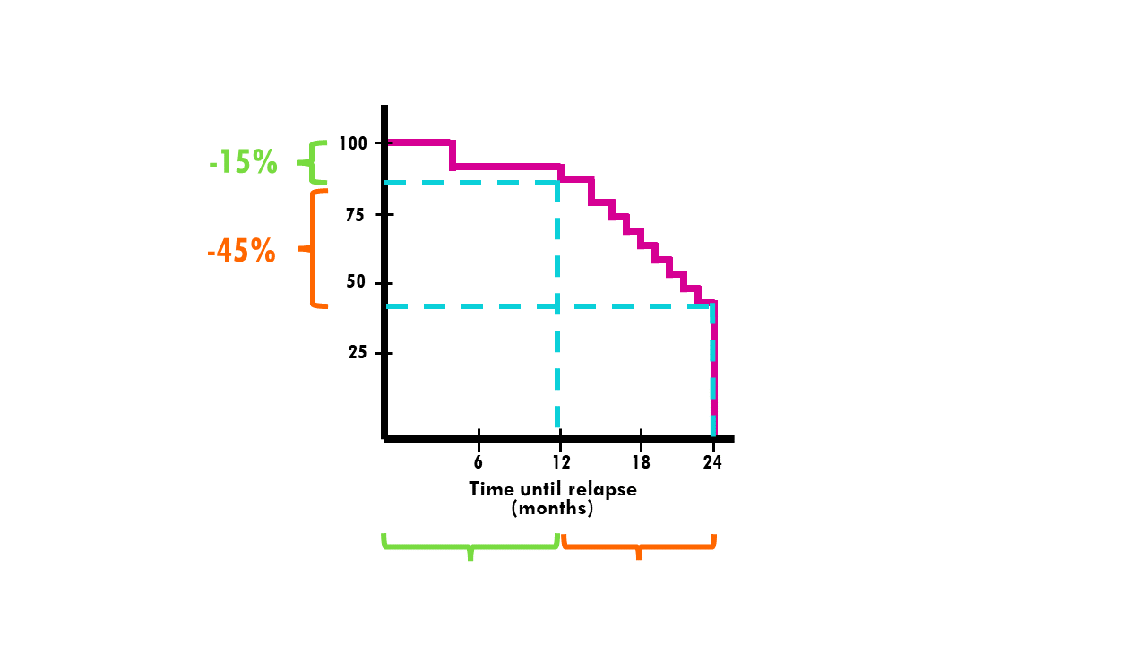
In the curve below, the probability of a patient relapsing after 12 or more months is 85%. In other words, 15% of patients relapse within a year or less.
4. Survival duration and censoring
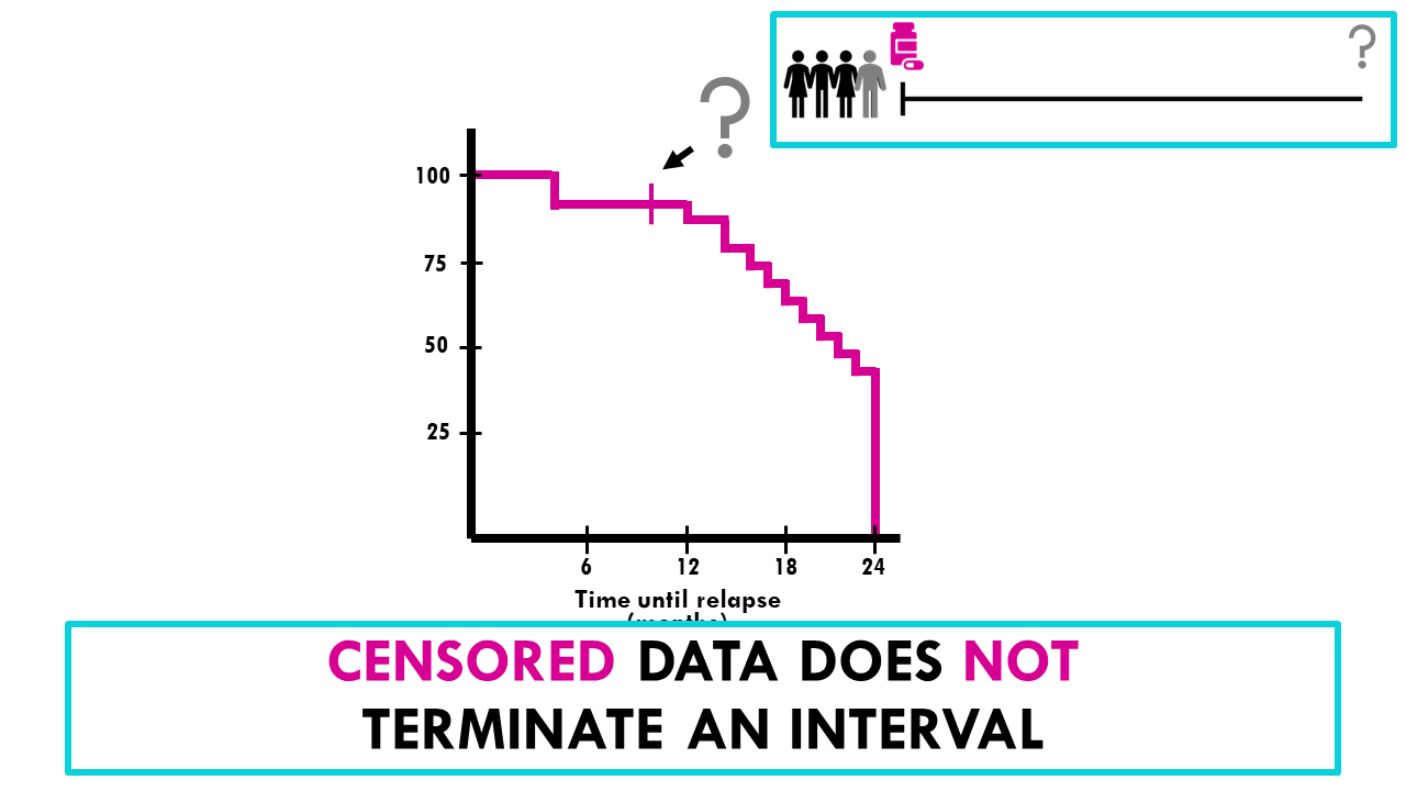
The lengths of the horizontal lines along the X-axis of serial times represent the survival duration for that interval. It’s important to know that known survival time intervals are defined by the event happening. In this case, the relapse of a patient marks the end of an interval. If a patient is censored, for example, because he or she drops out of the study, we see this as tick marks, but censored data does not terminate the interval.
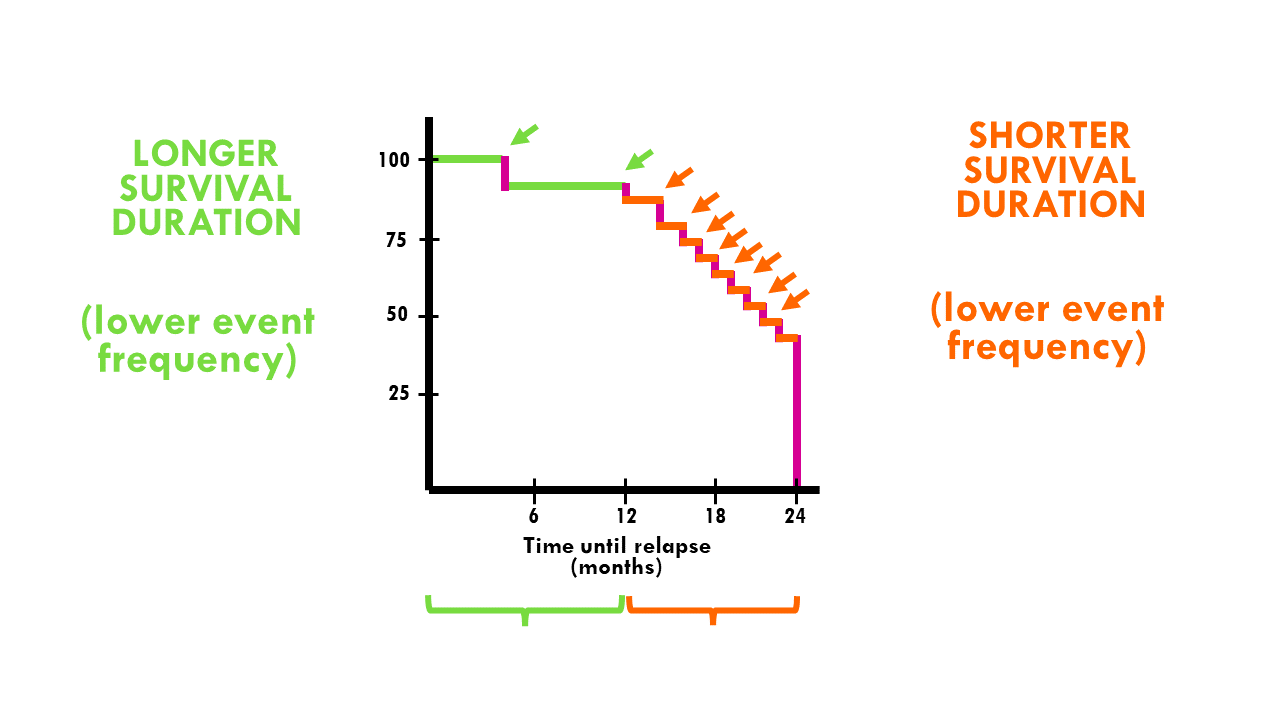
In this example, in the first year the survival probability dropped 15%. However, in the second year, the survival probability dropped from 85 to 40%.
In other words, the probability of surviving the first year after being diagnosed is 85%, but the probability of surviving more than 2 years is 40%.
If there is censored data, we will see it as tick marks:
Squidtip
Survival time intervals (the length of the horizontal lines in a Kaplan-Meier curve) are defined by an event happening. If your event of interest is death, this means that when the line ends and drops a level, a patient passed away.
Censored data is seen as tick marks, it does not terminate the interval. If a patient drops from the study, we will add a tick mark to our survival time interval line.
5. Comparing different groups
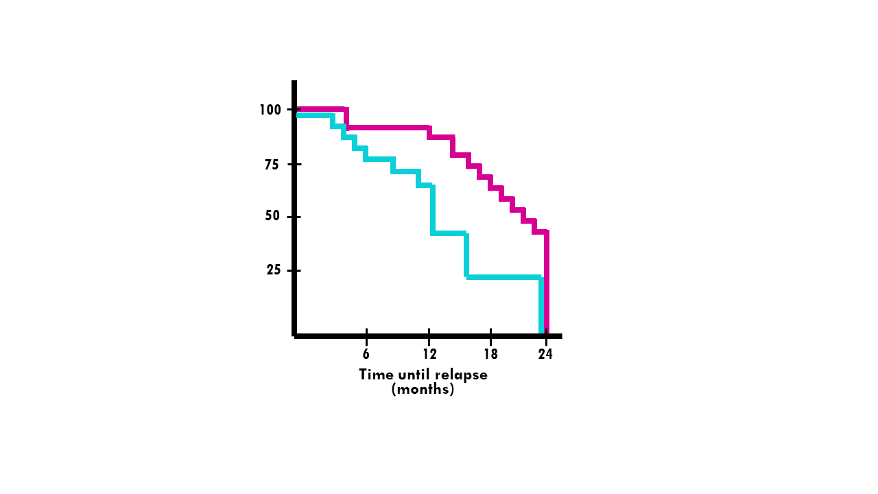
You can also plot multiple curves representing different groups, to compare their shapes and patterns. If the curves are parallel, it suggests that the groups have similar survival rates. If the curves diverge or cross, it indicates differences in survival between the groups.

6. Median survival
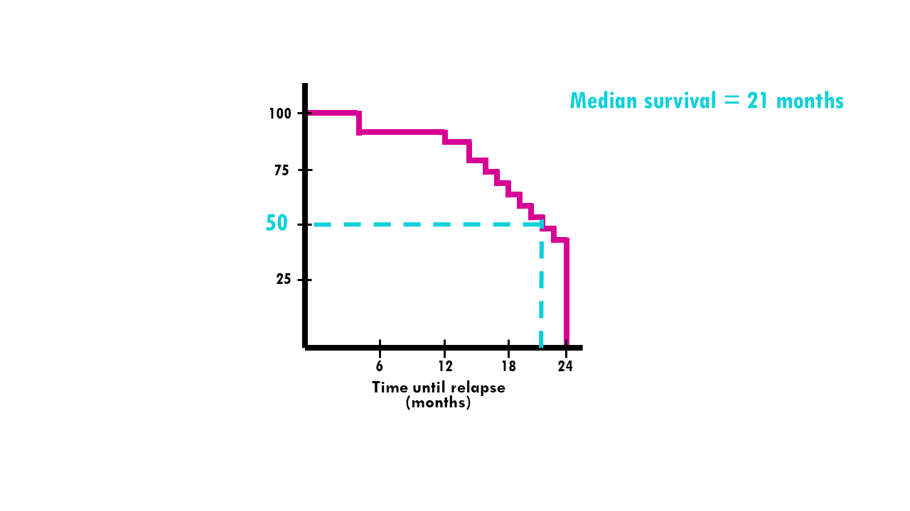
Another interesting metric is median survival. Median survival is the time — expressed in months or years — when half of the patients are expected to be alive. It means that the chance of surviving beyond that time is 50%. It can be a useful summary measure as it gives an approximate indication of survival.
Median survival can be read from the Kaplan-Meier curve at the 50% survival’ mark on the y-axis. If you draw a vertical line you can compare the median survival between two treatments, for example:
Kaplan-Meier curve simply explained with an example
Let’s go to the classic example of a clinical trial. Consider this curve:

In pink, we have the survival curve for patients who received chemotherapy treatment.
In blue, we see the Kaplan-Meier curve for patients who received radiotherapy.
Can you tell…
- What is the probability that a patient who received chemotherapy relapses in 6 months or less?
- What is the median survival of patients who received radiotherapy?
- Is there a difference in time-to-relapse between treatments?
Try to figure it out!
The probability that a patient who received chemotherapy (pink line) relapses in 6 months or less is approximately 90%. The median survival (50% mark) of patients who received radiotherapy is 12 months. Note that we still use the term median survival even if our event of interest is relapse (not death).
There seems to be a significant difference between treatments in the first 2 years, with median survival being 12 (radio) and 22 (chemo) months approximately. We see the curve is much steeper for patients treated with radiotherapy, meaning the event rate (relapse rate) is higher than for patients treated with chemotherapy. However, after 12 months, the relapse rate in chemotherapy patients increases a lot – maybe they became resistant to the treatment?
Watch out! Kaplan-Meier curve considerations and pitfalls
It’s easy to interpret the Kaplan-Meier curve, but you should also be aware of several things to avoid misinterpretations.
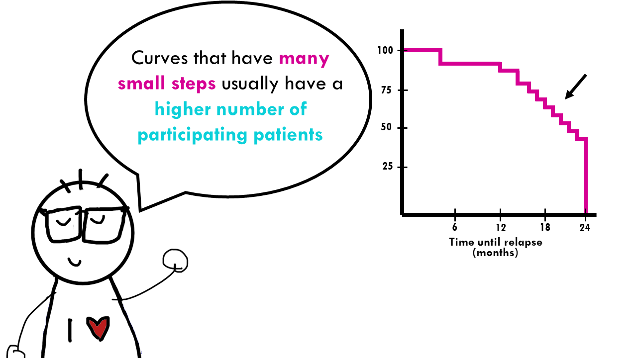
It’s important to check out the shape of the curve. Curves that have many small steps usually have a higher number of participating patients, whereas curves with large steps usually have a limited number of patients and are not as accurate.
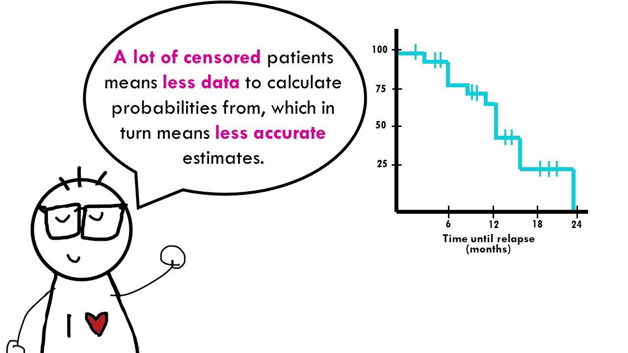
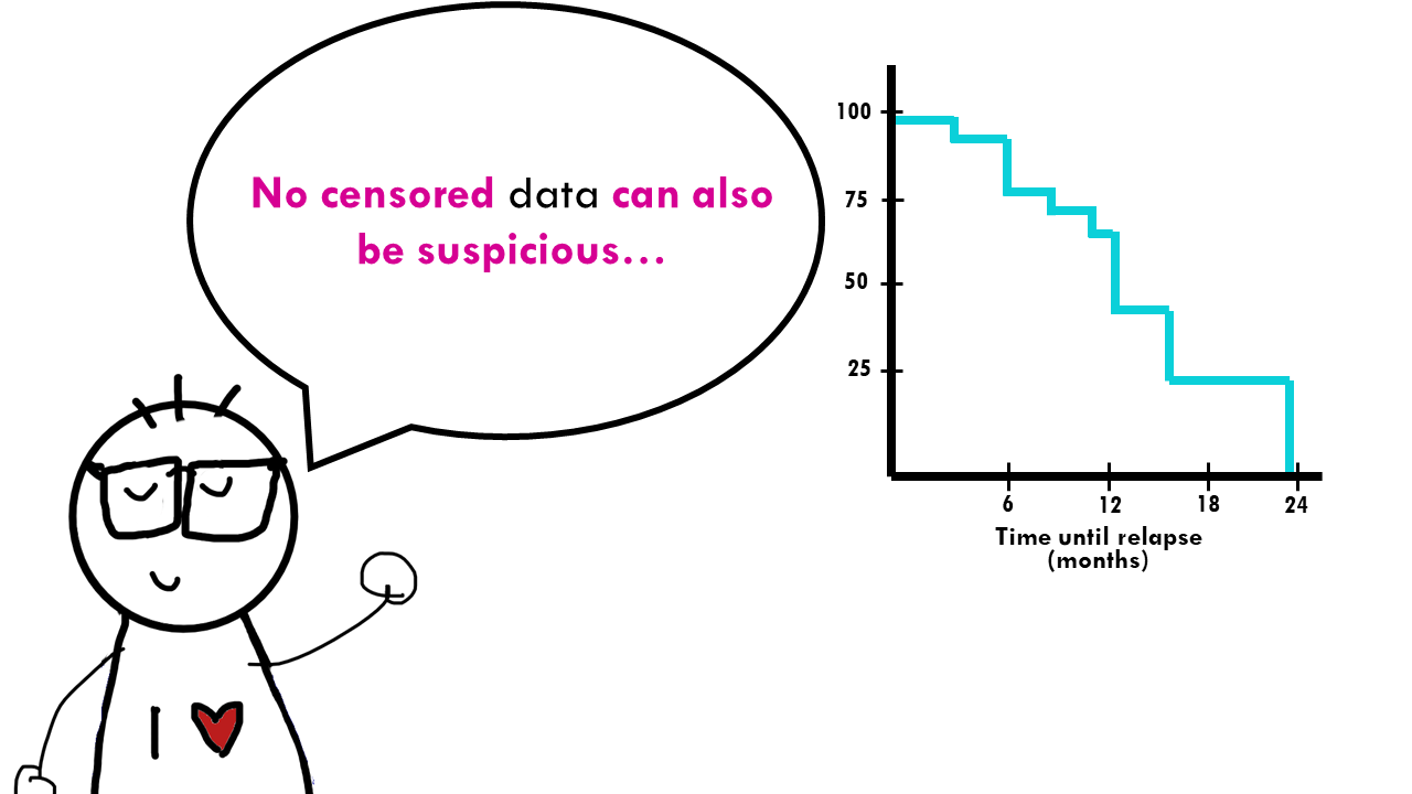
In relation to this, the amount of censored data and the distribution of censored patients is also important. On the one hand, a lot of censored patients means less data to calculate probabilities from, which in turn means less accurate estimates. But looking at this from a more ‘clinical’ point of view, if there is a lot of censored patients, you might want to question how the study was carried out or if the treatment was ineffective resulting in patients leaving the study to try different therapies. On the other hand, a curve that does not have censored patients is definitely suspicious…
How to calculate the Kaplan-Meier curve
The Kaplan-Meier curve shows cumulative survival probabilities. If you are interested in knowing how they are calculated, I recommend this website, where they explain it step by step.
What about statistical tests?
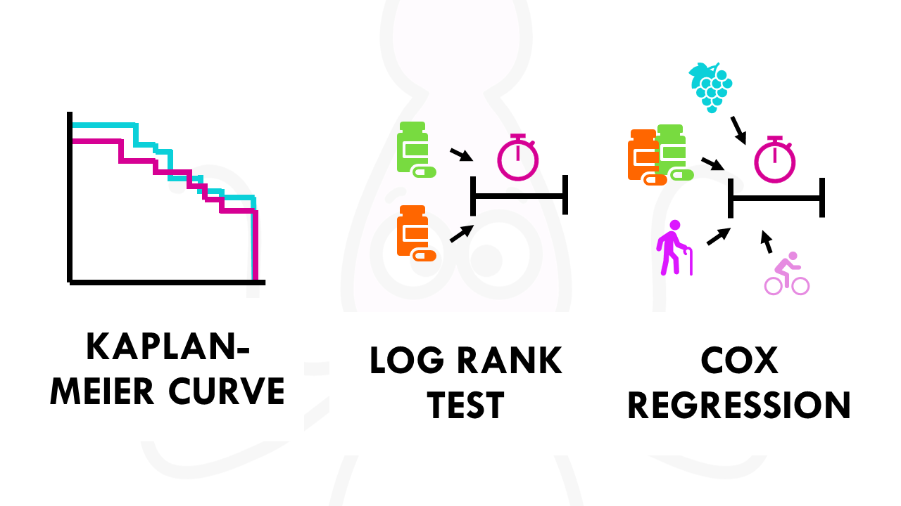
Kaplan-Meier curves are great to visualise the differences between two groups. But if you want to quantify that difference, we need statistical tests.
If you are comparing two groups (for example, two different treatments) and want to test whether the curves are statistically different, you need the X2 from the log-rank test. Check out my other post to find out more! The Cox proportional hazards will show the increased rate of having an event in one curve versus the other.
Want to know more?
If you would like to know more about common survival time analysis, check out:
You might also want to check my other blogposts:
Ending notes
Wohoo! You made it ’til the end!
In this post, I shared some insights on Kaplan-Meier curves.
Hopefully you found some of my notes and resources useful! Don’t hesitate to leave a comment if there is anything unclear, that you would like explained differently/ further, or if you’re looking for more resources on biostatistics! Your feedback is really appreciated and it helps me create more useful content:)
Before you go, you might want to check:
Squidtastic!
You made it till the end! Hope you found this post useful.
If you have any questions, or if there are any more topics you would like to see here, leave me a comment down below.
Otherwise, have a very nice day and… see you in the next one!
Squids don't care much for coffee,
but Laura loves a hot cup in the morning!

If you like my content, you might consider buying me a coffee.
You can also leave a comment or a 'like' in my posts or Youtube channel, knowing that they're helpful really motivates me to keep going:)
Cheers and have a 'squidtastic' day!
And that is the end of this tutorial!
In this post, I explained the differences between log2FC and p-value, and why in differential gene expression analysis we don't always get both high log2FC and low p-value. Hope you found it useful!
Before you go, you might want to check:
Squidtastic!
You made it till the end! Hope you found this post useful.
If you have any questions, or if there are any more topics you would like to see here, leave me a comment down below.
Otherwise, have a very nice day and... see you in the next one!


Thanks for the simple explanation of this complex topic. I want to know if there is a way where we can estimate the number at risk patients for km curves based on A) if a study report x% of patients died till 2 years or at 2 years survival was x%, and then we will also subtract the number of cencored lines on the km curves. B) if a study report median survival time and we also subtract each dip in the curve. I would look forward to hear from you on this. Thank you very much.
Hi! Thanks for your comment, very good questions. Estimating the Number at Risk (NAR) from published KM curves is a common challenge in meta-analyses, especially when the original patient-level data isn’t available. You’ve identified the two main components of the “leakage” from the risk pool: events (dips) and censoring (tick marks).
Re: method A) If a study reports x% survival at 2 years and you subtract censored lines. This is a solid logical start, but it has a mathematical trap. The “number at risk” at a specific time point is not simply the starting N minus the deaths. It must account for the fact that censored patients are no longer “at risk” of being observed to have an event. If you start with 100 patients (N0 = 100) and at 2 years the survival is 80%, you might assume 20 people died. However, if 10 people were censored (dropped out) before year 2, the 80% survival is calculated based on a shrinking denominator. So this method works as a “rough check,” but because censoring often happens at the same time as events, simply subtracting tick marks from a percentage-based estimate usually leads to cumulative errors.
Re: method B) Using Median Survival and “Dips”. This is more granular and closer to how modern software handles it. Every “dip” in a KM curve represents one or more events (deaths). If the curve is high quality, you can count the number of vertical drops. If the total N is known, each drop reduces the N at risk for the next step. The median survival (where the curve crosses 50%) is a useful “anchor point.” If the study says the median is 12 months, you know that exactly half of your population (adjusted for censoring) has experienced the event by that point. So yes, this method is more accurate for “reconstructing” the curve, but it is visually difficult to do by hand because multiple events can happen at the same time, looking like one large dip.
So conclusion is: in formal research, we don’t usually do this by hand. We use an algorithm (like the Guyot iterative algorithm) which combines both of your ideas. Here’s a few resources I hope might help:
https://pubmed.ncbi.nlm.nih.gov/31134735/
https://pharmasug.org/proceedings/2024/RW/PharmaSUG-2024-RW-125.pdf
Hope this helps!