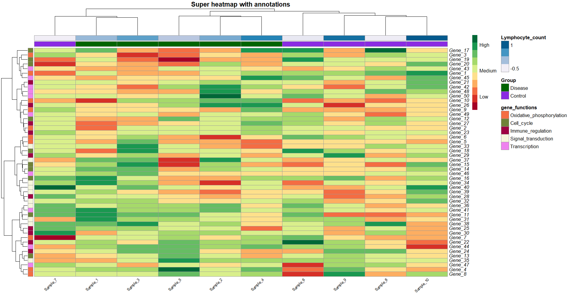
In this post, I will show you how to use italics in plots in R. This is very useful when you want to display gene names or species names correctly. You can easily customise your text in R plots to include italics, bold and more!
To show you how you can italicize text in the main title, axis labels or any text annotation, I will use the heatmap we created in this previous tutorial as an example. But the principles are just the same! You can apply the same code structure to your ‘ylab’, ‘geom_text’ or whichever part of your plot you’d like.
If you would like to reproduce my code, you will need to follow the steps in this heatmaps with pheatmap() tutorial first. We used the R package pheatmap(). Otherwise, keep reading and follow my step-by-step guide to italicize your own plots!
For this tutorial you will need R, or Rstudio.
In this Youtube video, I explain how to create a heatmap with the R package pheatmap()!
Italics with bquote() and as.expression()
If we want to apply italics to many annotations in our plot, bquote() and as.expression() are the way to go. For example, this is useful when the row labels of a heatmap show gene names, which we can italicize easily with just a bit of code.
gene_names_italics <- lapply(rownames(data), function(x) bquote(italic(.(x))))Let’s have a look at what our function did:
> gene_names_italics[1:5]
[[1]]
italic("Gene_1")

[[2]]
italic("Gene_2")

[[3]]
italic("Gene_3")

[[4]]
italic("Gene_4")

[[5]]
italic("Gene_5")
Our function basically wrapped the gene names, the strings, with italic().
Then, we pass the italicized names to ‘as.expression’ in the labels_row argument. In the background you have bquote() which is used in R for special characters (for example, math characters, to exponentiate a character…). Check out this post to know more about bquote()!
Now, we just need to wrap our new names with as.expression().
heat_plot <- pheatmap(data,
                      col = brewer.pal(10, 'RdYlGn'), # choose a colour scale for your data
                      cluster_rows = T, cluster_cols = T, # set to FALSE if you want to remove the dendograms
                      clustering_distance_cols = 'euclidean',
                      clustering_distance_rows = 'euclidean',
                      clustering_method = 'ward.D',
                      annotation_row = gene_functions_df, # row (gene) annotations
                      annotation_col = ann_df, # column (sample) annotations
                      annotation_colors = ann_colors, # colours for your annotations
                      annotation_names_row = F,
                      annotation_names_col = F,
                      fontsize_row = 10,          # row label font size
                      fontsize_col = 7,          # column label font size
                      angle_col = 45, # sample names at an angle
                      legend_breaks = c(-2, 0, 2), # legend customisation
                      legend_labels = c("Low", "Medium", "High"), # legend customisation
                      show_colnames = T, show_rownames = T, # displaying column and row names
                      labels_row = as.expression(gene_names_italics),
                      main = "Super heatmap with annotations") # a title for our heatmap
I’ll create some random strings as fake gene names:
rownames(data) <- stringi::stri_rand_strings(nrow(data), 5, '[A-Z]')
> rownames(data)[1:5]
[1] "ATJMD" "YCKUQ" "RRUQQ" "CEZRC" "MFAVZ"
Italicize plot titles with expression()
For main titles, x and y titles, labels, etc which are just a single string of text, it might be easier to use expression() combined with ‘~’.
For example:
expression('This is normal text'~bolditalic(and this will be in bold and italics!)~'')Let’s apply it to the title in our heatmap.
gene_names_italics <- lapply(rownames(data), function(x) bquote(italic(.(x))))
heat_plot <- pheatmap(data,
                      col = brewer.pal(10, 'RdYlGn'), # choose a colour scale for your data
                      cluster_rows = T, cluster_cols = T, # set to FALSE if you want to remove the dendograms
                      clustering_distance_cols = 'euclidean',
                      clustering_distance_rows = 'euclidean',
                      clustering_method = 'ward.D',
                      annotation_row = gene_functions_df, # row (gene) annotations
                      annotation_col = ann_df, # column (sample) annotations
                      annotation_colors = ann_colors, # colours for your annotations
                      annotation_names_row = F,
                      annotation_names_col = F,
                      fontsize_row = 10,          # row label font size
                      fontsize_col = 7,          # column label font size
                      angle_col = 45, # sample names at an angle
                      legend_breaks = c(-2, 0, 2), # legend customisation
                      legend_labels = c("Low", "Medium", "High"), # legend customisation
                      show_colnames = T, show_rownames = T, # displaying column and row names
                      labels_row = as.expression(gene_names_italics),
                      main = expression('Super heatmap showing upregulation of gene'~bolditalic(SUPERGENENAME)~'')) # a title for our heatmap
heat_plot
You can also use bolditalic() or just bold() if you need to!
gene_names_italics <- lapply(rownames(data), function(x) bquote(bolditalic(.(x))))
heat_plot <- pheatmap(data,
                      col = brewer.pal(10, 'RdYlGn'), # choose a colour scale for your data
                      cluster_rows = T, cluster_cols = T, # set to FALSE if you want to remove the dendograms
                      clustering_distance_cols = 'euclidean',
                      clustering_distance_rows = 'euclidean',
                      clustering_method = 'ward.D',
                      annotation_row = gene_functions_df, # row (gene) annotations
                      annotation_col = ann_df, # column (sample) annotations
                      annotation_colors = ann_colors, # colours for your annotations
                      annotation_names_row = F,
                      annotation_names_col = F,
                      fontsize_row = 10,          # row label font size
                      fontsize_col = 7,          # column label font size
                      angle_col = 45, # sample names at an angle
                      legend_breaks = c(-2, 0, 2), # legend customisation
                      legend_labels = c("Low", "Medium", "High"), # legend customisation
                      show_colnames = T, show_rownames = T, # displaying column and row names
                      labels_row = as.expression(gene_names_italics),
                      main = expression('Super heatmap showing upregulation of gene'~bolditalic(SUPERGENENAME)~'')) # a title for our heatmap
heat_plot

And that is all for today! At least, concerning italicizing your plots. Squidtastic!
Did you find this post useful? Is there any more topics you would like to see here?
Let me know what you think in the comments down below!


hi! thank you for awesome videos! I really need your help about customizing my heatmap using pheatmap package, is there any function that I can use for customize the kind of font? What’s “fontfamily” for?
Thank you in advance